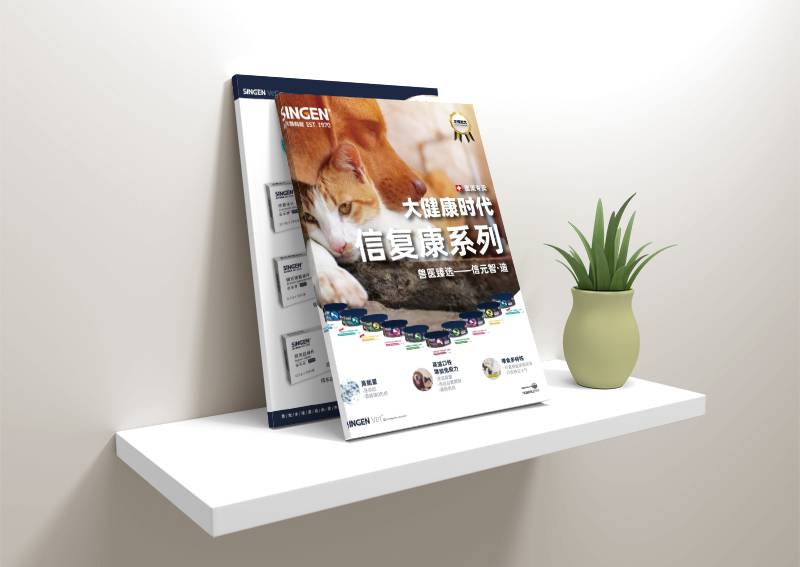
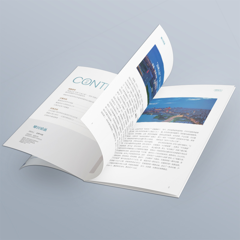
Cover Design Album Company Confession Bureau: These 5 Types of Covers Are Ruining Your Inner Page Content
Xiaobian has been working on cover design for more than ten years, and has seen too many bosses holding "amazing" covers, but shaking their heads when opening the inner pages. Tell me some big truth today-some covers are not facades, they are "teardown kings"! If you are worried about the effect of your picture album, this article may help you save money.

1. Cover of "Excessive Showing Skills": The designer is self-satisfied, but the boss can't understand it
Case: The cover of a technology company uses holographic laser dynamic hollowing out, and the product parameters on the inner page are crowded like ants moving. Customer feedback: "The cover is dazzling, but do you sell technology or craftsmanship?"
Truth: Visual bombing robs the play of content. When the cover is complicated enough to require an "instruction manual", who cares about the professional dry goods on the inner pages?
Summary: Show off skills ≠ effective communication. When the cover dominates the host, the professionalism of the inner pages instantly returns to zero.

2. Cover of "Information Black Hole": Beauty is beautiful, but I don't know what to say
Scene: The cover of a high-end homestay album only has artistic conception and landscape pictures. It took three pages to find the name and address. Potential customer: "It's beautiful, but which one is this? How to contact?"
Pain point: Pursuing "high-end sense" but forgetting basic functions. The cover does not convey the core information, and the content of the inner pages is like a headless fly no matter how exquisite it is.
Summary: The cover is a road sign, not a puzzle. Missing the "beauty" of key information directly abolishes the transformation power of the inner pages.

3. Cover of "Wrong Goods": Selling dog meat with sheep's head, trust collapses
Rollover scene: The cover is minimalist and modern, but the inner pages are thick classical typesetting. The customer spit out: "I thought I had changed a booklet! The style ripping is too dramatic."
Consequence: The "personality" promised on the cover cannot be fulfilled on the inner pages. This sense of fragmentation will cause users to have deep doubts about brand consistency.
Summary: The cover is the "signature page" of the brand contract. When the temperament of the cover and inner pages is split, the trust of users is also torn apart.

4. "Talk to Yourself" cover: only the boss in the eyes, no users
Typical operation: The cover is filled with award-winning photos of the chairman and corporate slogans, but the real pain points of users are not mentioned. Market feedback: "You guys are great, but what does it have to do with me?"
Essential problem: treat the album as an enterprise honor roll, not a user solution. If the cover can't arouse resonance, no matter how high the value of the inner pages is, it will be difficult to open.
Summary: The user doesn't care about your trophy, only what you can do for him. The cover ignores the user, and the inside page becomes a one-man show.

5. Cover of "Unchanged for Ten Thousand Years": A set of templates dominates the world, and the inner pages are like unearthed cultural relics no matter how new they are
A common problem in the industry: the cover of the national trend five years ago is hard to cover the inner page of this year's new data. Sales complaint: "Customers say our information is like antiques and dare not use it."
Chain reaction: The outdated cover conveys a rigid brand image. Even if the inner pages are updated and iterated, the user's perception still stays in the old times.
Summary: The cover is a brand "expression pack". Using old templates to install new content will only make users feel that you are living in the past.

The truth of the cover album company: a good cover never "steals the show"
A truly professional cover design album company knows a cruel truth: the cover is not the end, but the "guide" of the value of the inner pages. We refuse to cover up the pale content with grandiose design, and are more wary of sacrificing information clarity with "artistic sense". Every time you write, ask yourself: Does this element help users understand the inner pages faster? Can this style run through the album?
Select the rightCover Design Album Company, is to make the cover the "best guide" for the inner pages-not only to hide the sharpness of the content, but also to accurately screen the target readers. When the cover and inner pages breathe at the same frequency, the brand story has the power to penetrate the back of the paper and reach people's hearts.


