

Mechanical album design: technical drawings and real pictures, this match is called the "golden ratio"!
Xiaobian said: Recently, I looked through the albums of many machinery companies and found a quite common phenomenon: either the albums are full of cold technical drawings, which makes people dazzling, like reading a gobbledygook; Either it's all cool real-life big pictures. At first glance, it's quite lively, but after careful consideration, I don't know what's so powerful about this machine. It's like only sending resumes without photos on a blind date, or only sending beauty photos without mentioning professional education. I always feel that something is missing, right? Today, let's talk about how to find the most comfortable balance between hard-core "technical drawings" and eye-catching "real pictures" in mechanical album design, so that your album can be professional and beautiful, and really impress the target customer!

1. Why is balance so terrible? The picture album is not a technical specification!
We have to understand one thing first: What is the core goal of mechanical album design? It is not a technical document circulated internally by engineers, its ultimate mission is to convince potential customers to choose you! It is a super selling tool to build trust, demonstrate strength, and stimulate interest.
The "hardcore" value of technical drawings: this is the ironclad proof of your professionalism! The cross-sectional diagram shows the precise internal structure, the dimensional diagram reflects the rigorous craftsmanship, and the schematic diagram illustrates the unique working logic. It tells knowledgeable customers: "Look, we are real and skilled!" Without it, the giclee loses the foundation of convincing professional clients.
The "temperature" charm of real pictures: cold machines need scenes to activate! The shocking panoramic view of the production line, the moment of efficient operation of the equipment, the successful application of the customer's factory, and even the close-up of the engineer's focus on debugging... these pictures can instantly narrow the distance and convey a sense of scale, reliability and brand temperature. They make customers feel intuitively: "Oh, so it works so well in the real world!" Without it, the picture album becomes a boring instruction book, which is difficult to arouse emotional resonance.
Have you eaten the bitter fruit of imbalance?
Drawings piled up into mountains: information overload! Non-professional customers (especially decision-makers) look at it big and instantly lose interest. Professional customers may also get lost in the details and fail to grasp the core strengths. The album became a refusal.
Beautiful pictures fill the screen: flashy! After reading it, customers only remember "the picture is beautiful", but they are confused about the core capabilities and technical advantages of your machine. Lack of substantive content support, it is empty and difficult to build deep trust. Professional customers will think: "It's fancy and unprofessional!"
Chaos: drawings and pictures are randomly interspersed with no logical connection. Customers understand that the cost has increased dramatically, and they cannot obtain key information smoothly, thus greatly reducing their brand impression.
Second, find your "golden section point": balance is not a dead rule, but a dynamic art!
Don't expect to find a universal formula of "40% for drawings and 60% for real scenes" that is universally applicable. Successful mechanical album design, its graphic balance is a "dynamic art", which needs to be tailored. The key lies in understanding your core goals and target audience.
Rule 1: Look at "people" ordering dishes-the target reader determines the balance tendency
Is the audience the chief technical engineer and purchasing engineer? They are demanding on technical details. The weight and depth of technical drawings can be moderately increased (e.g. precision drawings of critical components, schematics of complex systems). But remember, real-life pictures (especially application scenarios and reliability displays) are still an indispensable part of building overall trust, so as to avoid the album becoming a purely technical manual.
Are the audiences business owners, decision-makers, and customers with non-technical backgrounds? They are more focused on results, benefits and brand strength. At this time, the proportion and visual impact of high-quality real-life images should be significantly improved (large-scale project sites, efficient operation video screenshots, customer success cases). Technical drawings need to be simplified and selected, and clear and easy-to-understand schematic diagrams and core parameter charts should be used to support your advantages and profound details should be avoided.
The audience is a channel agent? They need to quickly understand the product line and selling points. Emphasize the combination of the overall feeling of the product series (real pictures) and the comparison of core parameters (diagrammatic drawings) to facilitate its promotion.
Rule 2: Navigate for the "target"-album usage guidance content proportion
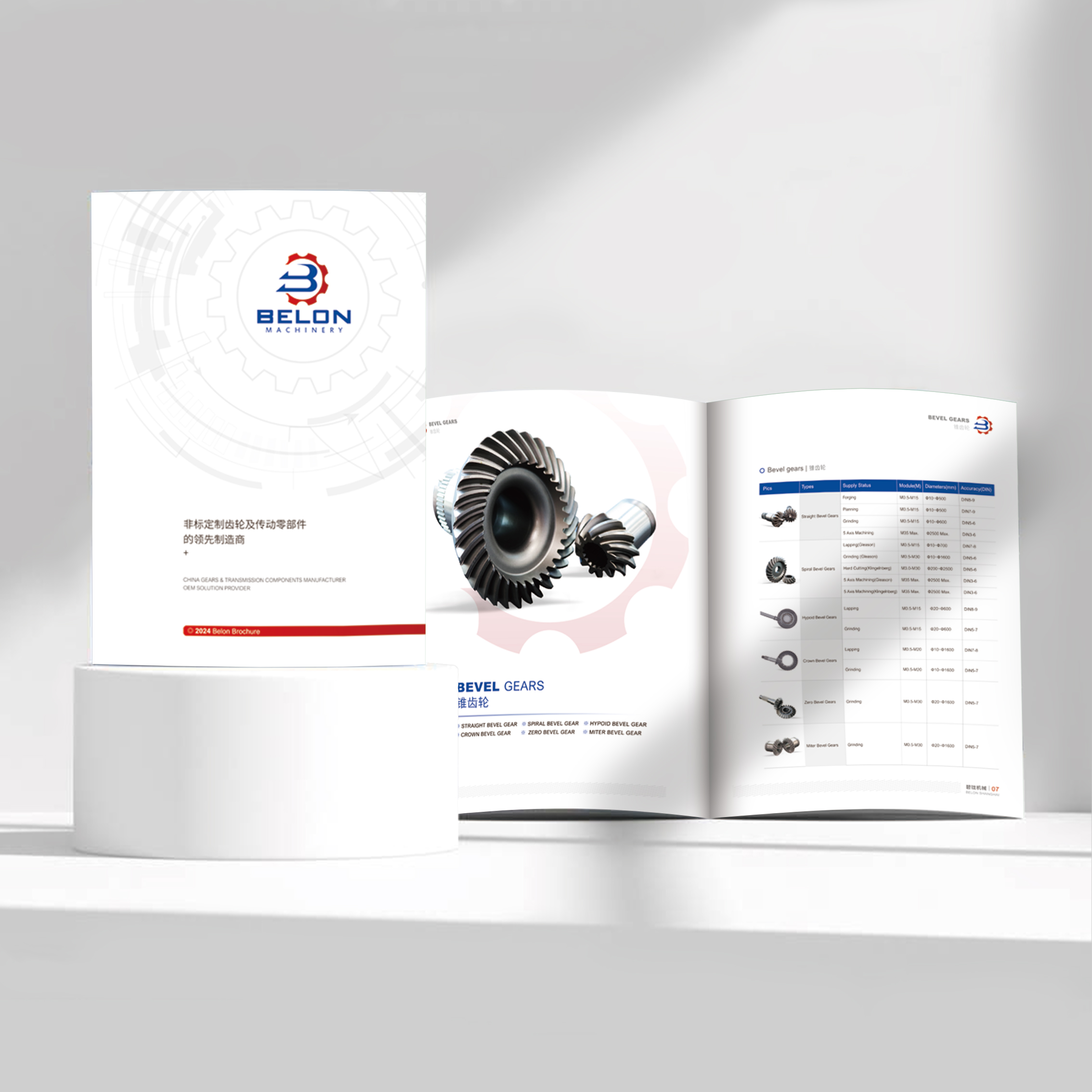
The main exhibition is eye-catching? Visual impact comes first! The cover and core spreads must use shocking real-life large pictures (equipment operation, macro scale). The inner page needs to quickly use refined technical charts (core advantage data charts, simple structure charts) to convey key information after attracting people to stop. The proportion of real-life images is usually higher.
For in-depth bidding? Professionalism and detail conquest are key. It is necessary to systematically demonstrate technical depth (more key drawings, rigorous parameter tables) and powerful application examples (detailed customer cases, including scene diagrams and effect data). The two need to be closely combined, the pictures and texts confirm each other, and the balance requirements are higher.
As a long-term customer communication manual? Brand tonality, comprehensive product information and legibility need to be taken into account. Establish a clear visual hierarchy: high-quality scene diagrams are used for chapter guidance, and the product introduction page adopts the mode of "charting core parameters/technical highlights of main visual real scene diagrams". Balance is the norm.
Rule 3: "Sanqi" base, dynamic adjustment-a practical starting point framework
In the absence of a particularly clear tendency, a relatively robust starting point is the "Panax notoginseng dynamic balance law":
Real-life application pictures (about 70%): undertake the core tasks of creating atmosphere, establishing scenes, displaying effects and conveying brand image. This includes: overall/detailed appearance of equipment, production/work scenarios, customer case sites, team/service scenarios, and atmosphere diagrams reflecting scale and texture.
Technical information vision (about 30%): responsible for transmitting core parameters, displaying technical principles and confirming professional strength. This includes: simplified schematic diagram (non-complex engineering drawing), core parameter table/infographic, key advantage comparison chart, refined structural explosion diagram/section diagram (select the part that most reflects the advantage).
"Dynamic" means that according to the aforementioned "target audience" and "core purpose", this ratio can be flexibly adjusted between 60: 40 and 80: 20. For example, a brand album for decision-making level may be close to 80: 20 (real scene: technology); A detailed product technical white paper (also in the category of picture album) may be close to 60: 40 or even 55: 45.
Third, let pictures and texts "fall in love": balance is not only a proportion, but also a clever integration!
Solving the proportion problem is only half the battle. How to make technical drawings and real pictures coexist harmoniously and add points to each other on the page is a higher level of mechanical album design.
Skill 1: "Mutual verification" of pictures and texts, 1 1 > 2
Next to the real picture, there must be a "finishing touch" explanation: next to a large scene picture showing the efficient operation of the equipment, there is a concise information graphic frame, highlighting the key data such as "energy saving XX%" and "efficiency improvement XX times" brought by it.
Immediately below the technical drawings, the "application" effect is followed: after showing the precise construction drawing of a unique component, a close-up of the component's stable operation at the customer's site is immediately used to prove its reliability and value. Let customers see how technology is translating into real benefits.
Skill 2: Information layering, visual guidance
First look: big real pictures catch the eye. Build a first impression with high-quality real-life pictures and entice readers to stay.
The second layer: visualization of core advantage technologies. Near the real picture or after turning the page, use charts and schematic diagrams to clearly convey the core selling points (such as "How exclusive sealing technology reduces energy consumption").
The third layer: in-depth technical information for future reference. For customers who are particularly professional or need in-depth understanding, complex drawings and detailed parameter tables can be placed in appendices or provided through QR code links to maintain a smooth reading experience of the main book.
Tip 3: Unify the design language and upgrade the texture
Technical drawings "remove roughness and preserve refinement": avoid directly pasting rough CAD screenshots. Carry out professional beautification treatment: unify the thickness and color of lines, add moderate shadows or perspective to enhance the three-dimensional sense, add concise annotations, and place them on a clean background. Let the drawings themselves be part of the design.
Real picture YEATION refined: Picture quality is the lifeline! Avoid photos that are blurry, poorly lit, and randomly composed. Professional photographic refining is essential. Unify the tone and style (such as industrial style, sense of science and technology) to enhance the texture of the overall album.
Layout white space breathing: Whether it is a drawing or a real picture, give enough white space around it. Avoid overcrowded pages, give information a breathing space, and enhance the sense of premium and readability.
4. Good design, you can speak by yourself!
No matter how many rules you talk about, it is better to look at the actual effect. We once created a picture book for an industrial pump giant:
Challenge: The product technology is complex and the application fields are diverse (chemical industry, energy, municipal administration), so it is necessary to impress technical decision makers and senior managers at the same time.
Solution method :
The structure is clear and layered: the opening chapter is shocking across pages (real scene of a large pumping station) to establish brand strength; Divide chapters according to application fields, and each chapter begins with a large picture of representative scenarios in this field.
Flexible application of "Sanqi": The product page adopts the classic mode-the main vision is the high-quality application diagram of the equipment in typical scenarios (70% visual center of gravity), and the core performance parameter table (infographic) and exclusive technical advantages (such as wear-resistant sealing structure) are clearly presented in the lower/sidebar.
Depth technology "on demand": complex hydraulic model diagrams, detailed material reports, etc., are placed at the end of the chapter or in the appendix for engineers with depth requirements to review. The main process remains smooth.
Unified design improves texture: technical drawings are professionally beautified, and the style is unified; The tone of the real scene is unified into a calm industrial blue and gray tone, highlighting the sense of professionalism and reliability; There is a lot of blank space in the layout.
According to customer feedback, the request rate of new picture albums at the exhibition has greatly increased. High-level customers praised that "you can understand your core advantages at a glance", and technical customers can quickly find the in-depth information they need. The album has really become a powerful assist in sales.
Mechanical album design, far more than a pile of pictures and words. The layout balance between technical drawings and real drawings is just like the gear meshing in precision machinery. Every point more and every point less affects the smoothness and strength of the overall operation. Find the "golden ratio" that belongs to your company and your products, let the cold drawings tell the professional depth, let the vivid real scenes convey the application value, and complete a silent but shocking strength dialogue between square-inch pages. Excellent mechanical album design is just such a carefully built bridge-it connects your technical core with the cognitive needs of customers, and transforms the complex industrial beauty into perceived brand trust. When the drawings and real scenes resonate harmoniously in the design, your professional story can truly reach people's hearts and win the next key order.

