

High-end album design: spatial narration of page-pulling structure
Recently, I chatted with several brand managers and found that they have a common "sweet trouble": the carefully polished brand story seems bland when it comes to the album. Especially when the album needs to carry a heavy history or a complex product line, the traditional page turning is like forcing a turbulent river into a narrow canal, which is a pity! This reminds me of the solution I created for a century-old watch brand last year-page pull design, which completely released the magic of spatial narrative.
High-end picture album: the silent spokesperson of the brand
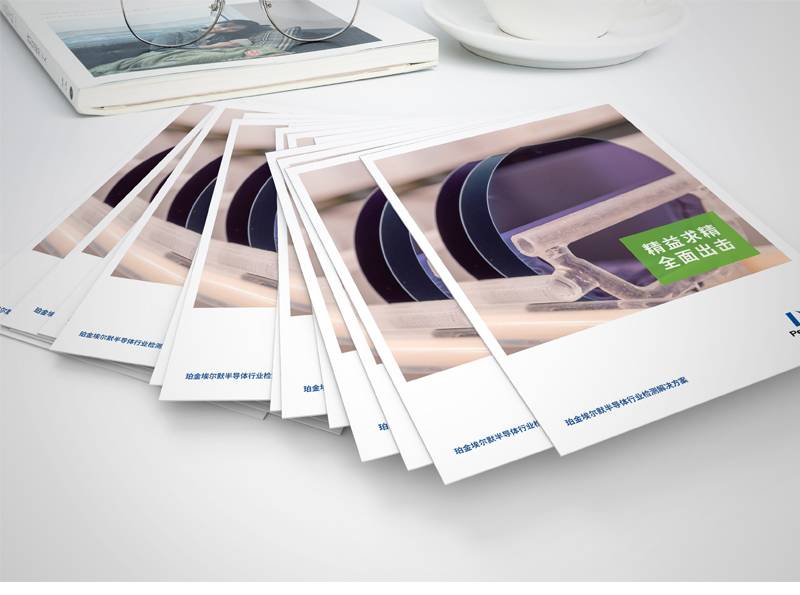
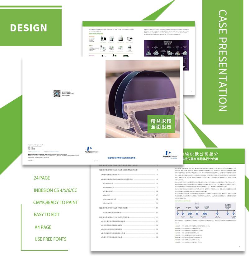
In the era of fragmentation, a high-end picture album with solid touch and excellent design is still a heavy hammer for brands to hit customers' minds. Far from a pile of information, it is a three-dimensional sculpture of brand spirit and a silent declaration of value proposition. When users are looking for high-end album design services, what they really crave is: how to transform the abstract brand soul into a touchable and immersive visual epic? This requires designers to transcend the plane and control the symphony of space and time.
A high-end jewelry brand knows this well. The moment its new album is opened, it does not directly display jewelry, but a dramatic collision between the texture of rough rock layers and bright gems. The user's finger crosses the raised mineral lines, as if experiencing the "birth story" of gemstones. This immersion of touch and vision imprints the product scarcity and ingenuity in the user's memory. This is the "speaking" that high-end picture albums should have.
Pull page design: opening the narrative box of space
Pulling pages is by no means simply extending pages. It is the space-time folding technique in the hands of designers, which expands the reading dimension through precise structure and makes the information progress layer by layer like a movement.
Master of Rhythm Mastering: Imagine Designing Giclee Books for Top Hotel Groups. After the regular page shows the elegant furnishings of the suite, gently pull out the hidden page to the right-outside the panoramic floor-to-ceiling windows, the city skyline suddenly spreads out. This "pull-off" action cleverly reproduces the real moment when guests step into the room and marvel at the scenery outside the window, and their emotional tension is full.
In-depth information layering: How to avoid boring white papers for technology companies? Key data and core patents are "hidden" under the main visual image in the form of pull pages. When users actively explore, it is like lifting the technical veil. Complex information is disassembled into a "discovery" experience, and the threshold for understanding is greatly lowered.
Surprise Making Machine: He once designed the theme album of "Fairy Tale Castle" for luxury children's clothing brands. The cover of the castle is unremarkable, but when it is opened to both sides, the tower actually pops up in three dimensions, and small models "shuttle" through the castle. This interaction beyond expectations has upgraded the album from "flip-through" to "treasure", perfectly conveying the brand's dream gene.
Structure, Function and Beauty: The Iron Triangle of High-end Picture Albums
The highest realm of high-end album design lies in the seamless symbiosis of structure, function and beauty. As a sharp tool of spatial narration, page-pulling design must serve the unity of the three:
The structure is bone: the folding method and unfolding trajectory of the pulling page must be absolutely accurate. One more millimeter of stuck and one less millimeter of looseness will ruin the high-end experience. The fluency of the physical structure directly maps the reliability of the brand.
Function is pulse: Pulling pages is not showing off skills. In the album of a non-genetic inheritance project, we use the pull page to display the genealogy of three generations of craftsmen vertically, and the horizontal expansion is the skill flow chart. Spatial logic and information logic are perfectly integrated, and users can understand it smoothly without thinking.
Beauty is the soul: High-end beauty lies in restraint. The visual transition of pulling pages needs to be as natural as breathing. When designing for the oriental tea ware brand, the color of the page gradually changes from clay brown to glaze green. The unfolding process itself is a visual meditation, which fits the brand tonality.
In the folding space, tell the brand's highlight epic
When the user holds this high-end picture album, every tiny movement of flipping and pulling it open hides your carefully designed spatial narrative code. The page-pulling structure is not only a physical extension, but also a deep release of brand value and a precise trigger of emotional resonance. It allows the heavy history to be stretched, makes complex ideas clearly layered, and makes the soul of products within reach.
High-end album designIn essence, it is a precise arrangement of space, time and perception. When the pull page is elegantly unfolded in the user's hands, and when the hidden story line is lit up layer by layer, what you deliver is not only a picture album, but also a portable brand theater-it tells silently, but reaches people's hearts. In each unfolding sense of ritual, the brand's high-end genes are deeply imprinted. This is the ultimate charm endowed by spatial narrative to high-end picture albums: in a square inch, you can see the vast heaven and earth.

