Advanced album typesetting design: color pre-inspection and overprinting processing solutions for four-color spot color printing of albums
When the customer holds the painstaking album, only to find that the golden color of the corporate logo is dull and green, or the black text reveals dazzling white edges on the color base map, at that moment, the brand image slips at his fingertips. What are we most afraid of when we do album typesetting design? It's not creative exhaustion, but carefully designed pictures, which have changed flavor in the hands of printing houses! Especially when the customer specifies a bright spot color gold, brand-exclusive blue, or you boldly use a complex overprint effect-as a result, the finished product comes out, the color is deviated, the edges are white, and the spot color is dull... No matter how amazing the design draft is, it can't stand it. The printing process falls off the chain.
This is not the unilateral responsibility of the printing factory, but the key link missing in the album typesetting design process: the color pre-inspection and overprinting treatment scheme of four-color spot color printing.
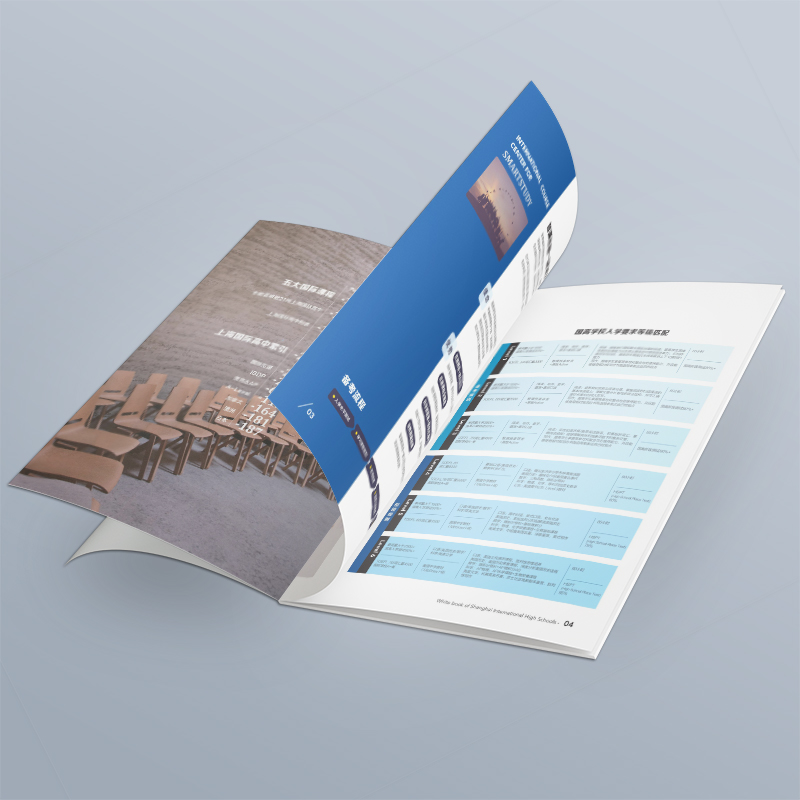
1. Pain point direct hit: when the design draft hits the printing reality
Many designers (especially those who are new to complex printing projects) often encounter these heartbreaking moments:
"Where did the spot color go?": The bright Pantone spot color gold was selected for the design, and the result was printed close to ordinary yellow, without metallic texture and heaviness, and the brand identity color carefully created by the customer disappeared.
"White Edge Fright": Black text or Logo on the deep base map, dazzling white edges appear on the edges of the finished product, which seriously affects the visual refinement and professionalism.
"Color face change": Looking at full and bright pictures on the screen, they are printed gray, or the overall tone is cold/warm, which is quite different from expectations.
"Disaster of inaccurate overprinting": ghosting and blurring appear in multi-color superimposed areas, the details are muddled, and the subtleties of the design are completely concealed.
These problems essentially stem from the huge gap between on-screen display (RGB) and physical printing (CMYK spot color), as well as the insufficient understanding of printing processes (especially overprinting). The design draft stays on the screen, which is only half the success; Ensuring that it is perfectly restored under complex printing conditions is the real closed loop of album typesetting design value.
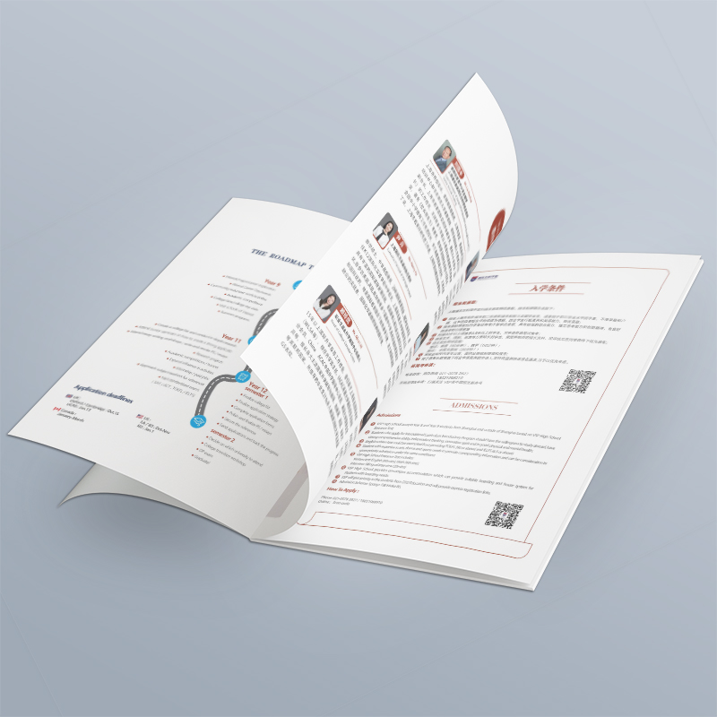
2. Solution: Your color and overprint "anti-rollover" guide
Don't panic! A systematic color pre-inspection and overprinting processing solution is your "reassurance". The key is to put printing thinking in front of the design process.
1. The starting line must be accurate: color space and spot color settings
CMYK is the cornerstone: In design software (such as Adobe Family Bucket), be sure to select CMYK color mode when creating a new document. Simulate the performance range of printed colors from the beginning, avoiding the severe color loss and unpredictability caused by later conversion of RGB to CMYK.
"Real name system" of spot colors: When using spot colors, strictly call the standard PANTONE Solid Coated/Uncoated color library. Clear names in the color swatches (e.g., "PANTONE 871C-Customer Gold") to eliminate random color selection. This is the only basis for printing houses to accurately adjust ink.
Spot Color Preview Simulation: Take advantage of the Overprint Preview mode of design software (such as InDesign, Illustrator) (the shortcut keys are usually Alt Shift Ctrl Y). Although the screen cannot simulate the spot color effect 100%, this mode can display the blending effect of spot color and other CMYK colors more realistically, avoiding serious conflicts.
2. Sharp eyes: deep color pre-inspection
Don't wait for the output to check! Pre-inspection should run through the whole design process.
The software comes with a Preflight tool (mainly InDesign): dig deep into the "Prepress Inspection" panel (Window > Output > Preflight). Custom configuration files, strict inspection:
Color Space: Find out any remaining RGB images or objects in the document.
Spot Color Use: Confirm that the spot color is applied correctly and has not been accidentally converted to CMYK.
Image Resolution: Make sure that all pictures reach 300PPI (color)/600PPI (grayscale line draft) at the output size to avoid printing blurring.
Fonts and links: Guarantee font embedding/transformation, and image links are valid.
PDF output preflight is the gold standard: when exporting PDFs for printing:
Select PDF/X standard (e.g. PDF/X-4: 2010): This is an internationally accepted secure printing format that mandates the inclusion of fonts, embedded images, specified color spaces.
Check "Output Preview": In the export settings, simulate the final printing effect and find spot color conversion errors and RGB content in advance.
Be sure to check "Create overprint preview": this is a key step in finding white leakage issues! It visualizes which objects are set to overprint.
Professional pre-inspection software (advanced): For ultra-complex projects (such as multi-spot colors, high-precision albums), you can consider tools such as Enfocus PitStop. It can perform finer color analysis, overprint rule check, and spot color processing.
3. Overprinting processing: the wisdom of blocking "white leakage"
Overprinting is the core process to solve the white edge caused by inaccurate overprinting. The key lies in understanding "who holds down who".
Core Principle: Deep presses shallow. Usually, dark colors (especially K100 black text, thin lines, small Logo) are overprinted on a light background. Even if the overprint is slightly deviated, the dark colors themselves are exposed, and the white edges are not easy to detect.
Precise control in software:
The Properties panel is key: Select the object in AI, ID and find the Overprint Fill/Overprint Stroke option in the Properties or Effects panel. Check this for elements that need to be overprinted (e.g. K100 black text, dark thin lines).
The "privilege" of black text: Adobe software usually defaults to plain black text (K = 100, CMY = 0) to overprint under certain conditions. But be sure to confirm this setting in Black Options and understand its scope (such as solid black only, text only, etc.). Don't rely on defaults!
Complexity and Processing of Spot Color Overprinting:
Use spot color overprinting with caution: Spot colors overprint other colors with difficult results to predict (spot ink may be opaque). Usually recommended:
Option 1: Hollowing out and embossing: Do "Knockout" in the area under the spot color object, and then let the spot color be 100% overprinted on the paper or underlying ink. This requires communication with the printing factory about the feasibility of the process.
Option 2: Convert to CMYK simulation (select carefully): If the spot color requirements are not high and the budget is limited, the spot color can be converted to the closest CMYK combination in the later stage of design and after clear communication before press. But this will sacrifice the uniqueness and accuracy of spot colors.
In-depth communication with the printing factory: spot color overprinting is the highest risk point! Be sure to provide a PDF containing the spot color overprint settings before exporting, and communicate the process implementation plan and expected results with the printing factory technician in detail. Their experience is crucial.
4. The last line of defense: proofing confirmation
Screen and PDF preview ≠ final effect! Proofing is a necessary link.
Digital proofing: fast and economical, suitable for checking color tendency, content, basic overprint effect. Choose a high-end digital proofer that has been color-calibrated and try to simulate the final paper.
Traditional proofing (on-machine proofing): This is the most reliable way for high-end albums with spot colors or complex overprints. Before the printing press officially starts printing, the actual ink and paper are used for small sample printing. This is the ultimate standard for testing spot color accuracy, overprint effect and color reproduction. Although the cost is high, it can avoid the catastrophic loss of mass printing scrap.
Customer signed sample: The proofing draft needs to be signed and confirmed by the designer and customer (or their brand leader). This is the legal basis for clarifying responsibilities and ensuring that both parties recognize the final color effect.

3. Process integration: Let pre-inspection and overprinting become design DNA
Truly professional album typesetting design is to internalize printing knowledge into the design process:
It is clear at the start of the project: whether spot colors are used in communication with customers? Desired effect? Does the budget support traditional proofing? Reflected in quotes and plans.
"Print" in mind when designing: create new CMYK documents, standardize the use of spot colors, and simultaneously consider overprinting strategies when designing complex elements.
Periodic self-inspection: After completing key pages or chapters, run pre-inspection immediately, and correct problems immediately.
In-depth pre-inspection before output: full document PDF pre-inspection, overprint preview, strict control.
No compromise in proofing confirmation: choose the proofing method according to the importance of the project, carefully compare it, and then print it after confirmation.
Barrier-free communication between printing factory: Provide clear technical descriptions (including spot color information, special process requirements, confirmed proofing draft), and keep in touch with prepress personnel.
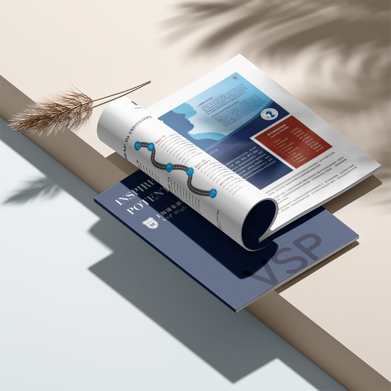
4. Value sublimation: album layout design is not limited to vision
When the colors are accurate and vivid on the paper, when the spot colors shine with the brand light, when the pictures fit perfectly and the details are vivid in my mind-this album goes beyond the scope of information carrier. It becomes a silent declaration of brand texture, a powerful endorsement of professionalism, and an efficient catalyst of trust. Customers use it to impress their customers, deliver value and win opportunities. Every accurate color reproduction and every perfect overprint presentation are silent proof of the professional value of our album typesetting design.

Atlas typesetting design The ultimate goal is to make the design intention most faithfully expressed in the physical world. Four colors dance with spot colors, overprinting and hollowing out are intertwined-master this set of color pre-inspection and overprinting processing solutions, and what you deliver is not only an atlas, but also a brand equity that can stand the test of the market. A visual weapon that makes customers stand out from the competition. From screen to paper, let every design investment gain equivalent market response.


