Single black vs four-color black: Black metaphysics in design and printing, if you choose the wrong thing, you will lose the whole thing?
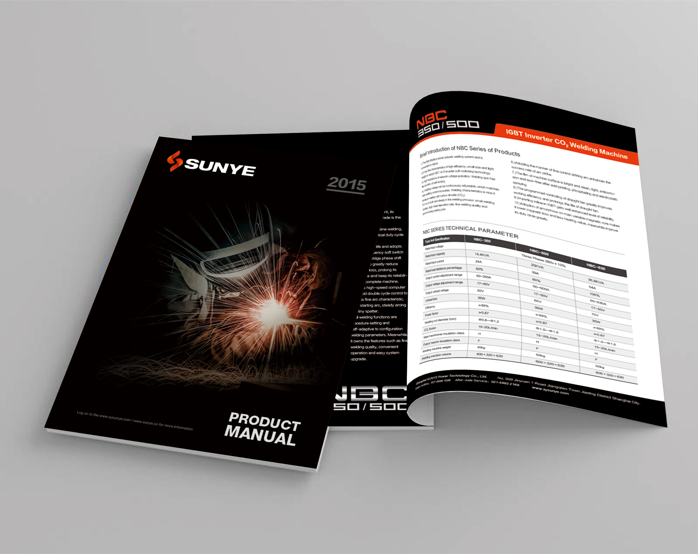
A well-designed corporate brochure with a black title deep and solemn on the computer screen. After delivery for printing, the customer called angrily: the edge of the title was smudged, the ink shades were different, and even the picture next to it was dirty. The designer double-checked the documents and all the black settings were accurate. The problem lies with the printing press-the seemingly simple "black", in the process of transforming the design file into the physical print, buried the huge difference trap between single black and four-color black.
Who who is engaged in design and printing hasn't stumbled on "black"? The computer screen looks perfect and deep black, and the printed picture is gray, smudged, or even dirty? This is mostly due to single black and four-color black! Don't underestimate this choice, it directly affects the first-sight texture of the albums, posters and packaging you paid a lot of money to make. Today, we will break it apart and explain it clearly, help you avoid the most common pitfalls in this design and printing, and make every delivery of customers as stable as Mount Tai.

1. Black and "Black": Screen Illusion and Ink Reality
Designer Xiao Li stared at the cover of the high-end product album on the screen. The title was his carefully selected "Rich Black", and the value was C = 60 M = 40 Y = 40 K = 100. The screen display effect is perfect-rich, full, with a depth that absorbs light. He confidently sent the documents to the printing house.
After a few days, the finished product is delivered to the customer. The phone rang immediately, and the customer's tone was anxious: "Li Gong, what's going on with this cover title? The edges are rough and the color is not so dark. It feels a little black and gray! It's too different from the screen draft we saw before!" Xiao Li's heart tightened and immediately ran to the printing workshop.
Next to the roaring machine, Lao Wang, an experienced printing master, pointed to the printed sheet that just got off the machine and said, "Young man, you'black ', did you fold it with four-color ink? That's the problem." He picked up the magnifying glass and aimed it at the edge of the title. "See? The four-color printing plate is slightly incorrect-which is almost inevitable in high-speed printing-and the black edge is'hairy ', and the color is difficult to maintain uniformity. Moreover, the ink layer is too thick and dries slowly, and when the printed sheets stacked behind are pressed, it is easy to'dirty' the next area."
Xiao Li suddenly realized that the deep and perfect "Rich Black" on the screen had encountered severe challenges in the face of realistic ink, paper and printing press accuracy. He pursued the ultimate depth, but he became a "troublemaker" in the printing process.

2. Dismantling the two heroes: the true face of single black and four-color black
The protagonists of this "dark battle" in design and printing are single black (K100) and four-color black (also called "multi-color black", such as C60 M40 Y40 K100). They are essentially different and have very different application scenarios:
Single Black (K100): Pure Warrior
Essence: Only one ink, black (K), is used, the value is K = 100, and the other three colors (C, M, Y) are all 0. Clean and neat.
Advantages in Design Printing:
Sharp and clear: the first choice for text and thin lines! Only one black block is printed, there is no problem of inaccurate overprinting, and the edge is as sharp as a blade.
Quick drying: The ink layer is thin and dries quickly, which greatly reduces the risk of dirting. Printing factories love this kind of "good student" who saves worry and ink.
Cost-friendly: Only one ink is used, which puts low pressure on the printing press, especially when printing in large quantities, which can effectively control the cost.
Limitations in design and printing: On most ordinary papers, the printed black is often not "deep and full" enough, and may be warm (brown) or cool (blue), lacking heaviness. The main color of the picture that pursues high-end texture is easy to appear "thin" with it.
Four-color black (multi-color black): the charm and risk of mixing
Essence: On the basis of black (K) ink, a certain proportion of cyan (C), magenta (M) and yellow (Y) inks are added. The aim is to simulate a heavier, deeper, more neutral or specific shade of black than a single black.
Advantages in Design Printing:
Extreme depth: It can present rich, thick and light-absorbing visual effects that can't be matched by single black, and instantly enhance the high-end sense and visual impact of albums, posters and packaging. It is the secret weapon to shape brand texture.
Controllable color tone: By adjusting the ratio of CMY, you can call out warmer (add more M and Y), cooler (add more C) or more neutral black to meet the needs of specific brand color or picture atmosphere.
Fatal Risks in Design Printing:
Overprinting Nightmare: Four printing plates are needed to overprint accurately! With a slight deviation (even 0.1 mm), colorful "edging" or "ghosting" appears on the black edges, text and lines instantly become blurred, and the sense of professionalism is gone.
Drying problem: The ink layer is super thick (equivalent to 4 layers of ink superimposed), and the drying speed is as slow as a snail, which can easily cause dirt in the printing process (commonly known as "back printing"), destroy the whole batch of printed products, and cause the blood pressure of the printer to soar.
Cost and efficiency killer: More ink is consumed, the accuracy of the printing press is extremely high, and the printing speed may be forced to be reduced, which will directly push up the printing cost and construction period.

3. Practical Guide: How to Choose the Right "Black" in Design and Printing
Understanding the principle, the key lies in how to make an informed choice in designing printing projects. This requires designers to understand printing, printers to understand design, and close cooperation:
The scene is fixed in black and:
Text, thin lines, barcodes, small icons: unconditionally choose single black (K100)! This is the iron law that guarantees clarity and readability. Imagine the consequences of a blurry contact details on a customer's giclee, or a ghosting product description on a package.
Large area of pure black background, color blocks that pursue heavy feeling, and titles that require extremely high quality: you can consider using four-color black. But be cautious!
Paper is the referee :
Regular Offset/Coated Paper: The single black effect is usually not saturated enough. If a large area of dark color must be used, a proven and stable four-color black formula can be used after full communication between the designer and the printing house (e.g. C = 40 M = 30 Y = 30 K = 100, the specific value needs to be determined according to the printing house equipment and common paper test). Be sure to proof and confirm in advance!
High-quality specialty paper, coated art paper: The expressive force of single black (K100) will be much better, sometimes even close to the heavy feeling of four-color black. For customers who pursue design and printing quality, it is recommended that this kind of paper be matched with single black, which is safe and classy.
Newsprint and other absorbent papers: Strictly avoid four-color black! Too much ink can easily lead to paper through printing and pasting, and the effect is terrible. Honestly and practically use single black.
File settings life and death lines:
It is clearly specified in the design software: When filling colors or setting text colors in PS, AI, ID and other software, you must clearly select whether it is "K = 100" or a specific four-color value. Don't choose colors in the palette that "look black" by feeling.
Black text/graphics must be overprinted: especially if a single black is pressed on a colored background. Make sure that the background color under the black is hollowed out (Knockout), otherwise it is easy to show white edges. This is a critical step in the design file to print process and directly determines whether the edges of the finished product are clean or not.
PDF Output Check: Before outputting a printed PDF, confirm the properties of all black objects (is it single black or four-color black? Is overprinting set?) with a professional prepress check tool such as Acrobat Pro's prepress function.
COMMUNICATE! COMMUNICATE! Or communication!
Designer → Printing House: Before the document is sent out, proactively inform which areas are using four-color black and ask the printing house if there is a recommended recipe for a specific paper or equipment. Proofing documents are provided.
Printing Factory → Designer: After receiving the document, check the black setting as soon as possible, and immediately feed back to the designer for modification if any problems are found (such as four-color black for small text). Provide proofing and clearly state the black treatment method. During the printing process, the registration and ink level control are strictly monitored.

4. Tips to avoid pitfalls: First aid kit for black problems in design and printing
Question: Is the printed large area of four-color black hair empty and ghosted?
Solution: The primary suspicion is that overprinting is inaccurate. Check the press registration status. Prevention: Try to avoid using large areas of four-color black on jobs that require high-precision overprinting (such as small text overprinting); Choose more stable and reliable printing equipment and paper; Use a proven four-color black formula with a low total ink volume.
Question: Is the black area (especially the four-color black) dirty?
Solution: Adjust the amount of powder sprayed by the printing press, reduce the height of paper stacking, appropriately reduce the printing speed, and extend the drying time if possible. Prevention: Strictly control the total ink volume of four-color black (generally it is recommended that it should not exceed 280%-340%, please consult the printing factory for details); Preference is given to paper with better absorption or coating; When designing, avoid placing a large area of high-gloss light colors (easily dirty) adjacent to the four-color black area.
Question: Isn't the single black print black enough, making it gray and warm?
Solution: For customers who pursue texture, this is a flaw. Prevention: On ordinary paper, if the customer is not satisfied with the effect of single black, he can negotiate with the customer and the printing factory to see if the four-color black with a specific formula is acceptable and bear the corresponding risks; A more recommended approach is to upgrade the paper-choose high-quality coated paper or special paper, and the expressive force of single black will be significantly improved.
Question: White borders appear on the edges of black text/graphics?
Resolution: This is a typical case of not setting Overprint (Overprint) resulting in a background hollowing out error. Prevention: Be sure to set the overprint fill/stroke properties correctly in the design software for black (especially single black) objects. Select a PDF/X standard (such as PDF/X-1a or PDF/X-4) that contains the correct overprint settings when exporting a PDF.

5. Winning as a whole: the core value of design and printing integration
The choice between single black and four-color black is not just as simple as the designer choosing a color in the software, nor is it a process that the printing factory can automatically solve by pressing a switch. Like a mirror, it clearly reflects the inseparable essence of "design" and "printing".
Designer's printing thinking: understand the behavior logic of ink on paper, understand the physical limitations of printing presses, and foresee the results of design choices in real production. This makes you no longer an armchair strategist "artist", but an expert who can truly deliver implementable and high-quality visual solutions to customers. You can confidently say to customers, "This black effect is definitely textured when printed."
Design understanding of printing factory: Actively understand the designer's intention and the reasons behind the document setting, have professional prepress inspection ability, and be able to accurately predict problems and provide constructive opinions. This makes you upgrade from a simple "processor" to a technical consultant and quality guarantee trusted by customers and designers. Can you say to the designer, "It's safer to use single black in this place. I guarantee the effect. Try this paper?"
The ultimate benefit of customers: When design and printing are truly integrated and efficiently collaborated, the biggest winner is the customer. They no longer have to juggle between design companies and printing houses that shirk each other. What they get is: WYSIWYG (even exceeding expectations) finished product quality, controllable cost and schedule, and a sense of peace of mind that you don't need to worry about technical details. Their albums, posters and packaging have truly become sharp weapons to convey brand value and impress target users.
The essence of printing is to perfectly transform visual creativity from virtual pixels into physical texture within reach. Every successful delivery is created by the designer's understanding of printing, the printing factory's respect for design, and the common pursuit of quality by both parties. The solution to the "dark war" between single black and four-color black is to deeply understand and respect the objective laws of the whole process of design and printing, and make professional and responsible judgment and collaboration in every link.
Choose a professionalDesign PrintingPartner is to choose a responsibility and guarantee for the final effect of the finished product. Stop letting "black" become an uncertain factor in your project, and let it be a solid foundation for you to show your professional quality.


