

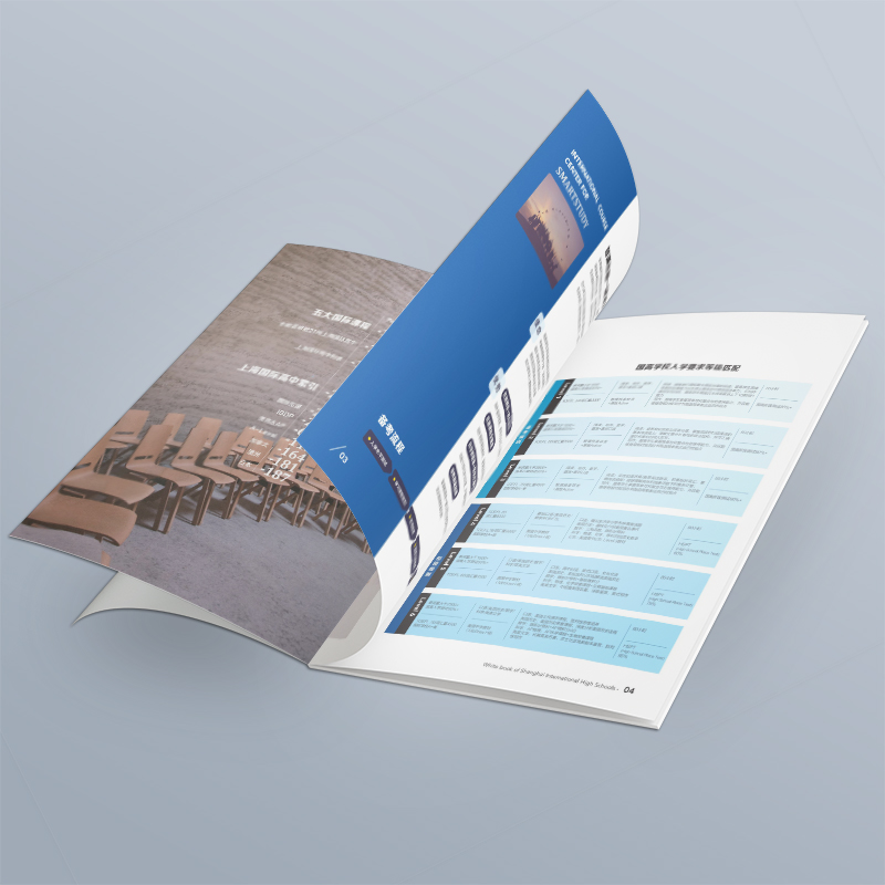
Running out of inspiration for album album design? 5 Entry Points to Find Style Fast!
Recently, I received many private messages from friends in the background, saying that when making company product albums and brand promotional albums, my head was empty and I couldn't find my direction at all. Looking at blank documents and canvases, that's called a big head! Don't panic, it's so common to run out of inspiration. Today, instead of rectifying those vague "design theories", we will actually share five entry points that can be used immediately to help you quickly find your unique "album design" feeling! The album is not a work of art for self-satisfaction, it is a "business card Plus version" you hand to your customers. A truly effective album design allows customers to quickly get who you are, how awesome you are, and why they should choose you. Good design, let the message speak for itself; Good picture album, you can "sell goods" yourself!
Entry point 1: Find out the "temperament DNA" of the enterprise (what is its character?)
Soul torture: If the enterprise is a person, TA is an elite in suits and ties? Is it a vibrant young man? Or a calm and reliable old expert? Is it a geek with a bursting sense of technology? Or a craftsman full of temperature?
How to find a feeling?
Look at the "circle of friends": look through the company's official website and social media accounts (official account, video account, Xiaohongshu, Douyin...). The content posted above, the language style used, and the tone of the pictures are its truest "character". For example, official website is full of dark blue and gray, data charts, and technical terms, which is a proper and rigorous scientific and technological style; If the official account is full of light jokes, bright color schemes, and employee activity photos, it must be a young and energetic school.
Listen to the "mantra": Talk to the boss or market leader! Focus on listening to the high-frequency words they use when describing their enterprises: "innovation", "reliability", "ingenuity", "environmental protection", "fashion", "efficiency"... These words are the core temperament code. For example, if a brand that makes organic food repeatedly emphasizes "nature", "health" and "traceable source", the style of the album will be fresh, natural, simple and vital.
Case understood in seconds :
A boutique cafe focusing on "healing", the owner hopes to convey the feeling of warmth, slow life and stories. We looked through their social platforms and found a lot of warm-tone photos, handwritten fonts, and customer message stories. The final album design uses a lot of warm neutral colors such as off-white, light coffee, oatmeal, etc., with soft illustrations and real scene photography. The text layout on the inner pages is loose and comfortable, just like the feeling of the cafe itself-you want to relax when you come in. This is much more effective than shoehorning a bunch of coffee bean variety introductions!
A "hard-core" industrial equipment manufacturer whose core advantages are "precision", "durability" and "German technology". Their official website is dark blue and silver gray, and the pictures are all high-precision machine tools and rigorous engineers. The design of the album decisively adopts cool colors (dark blue, silver gray), with large white space highlighting the close-up of the exquisite details of the product, and the font selects angular and steady sans serif, which conveys a professional, reliable and trustworthy sense of industrial power as a whole.
Entry point 2: the "dominant gene" of industry attributes (you can know what you do at a glance)
Why is it important? Every industry has some "conventional" visual language or elements. Although it's not for you to copy it, clever integration can make people recognize your "sect" at a glance and build a preliminary sense of trust. The design that is completely divorced from the attributes of the industry can easily make people scratch their heads.
Mining "industry symbols":
Color code: environmentally friendly green, technology blue, financial gold, medical clean white/blue, catering warm yellow/red... these are common industry color senses.
Graphic elements: technological line grid/light effect, financial stable block surface/data chart, natural texture/hand-painted style of cultural tourism, rounded shape/soft color of mother and baby...
Material association: technology (metal, glass), natural and environmentally friendly (wood grain, paper, linen), luxury (leather, bronzing), culture (ink and wash, rice paper texture).
How to play with new ideas? Not copying, but deconstructing and re-creating! On the premise of conforming to the tone of the industry, add the unique personality expression of the enterprise.
Case understood in seconds :
An institution that does children's STEAM education. Books, pencils, etc. are commonly used in the education industry, and cartoons are often used in the children's field. But STEAM emphasizes science, technology, engineering, art, mathematics. Our final design: the main colors are bright blue and orange, which represent creativity, and the graphics cleverly blend simple geometric lines (representing technology/engineering/mathematics) with childlike, hand-painted robot/small animal elements (representing art/children). The inner pages clearly display the curriculum system with modular typesetting, which is as interesting as building blocks, perfectly fits STEAM's interdisciplinary integration concept, and is full of childishness.
A high-end homestay project. Scenic blockbusters are commonly used in the tourism industry, but how to highlight the "high-end" and unique tonality? We extract key visual elements (such as local unique weaving patterns and architectural features) from the local culture where the homestay is located, and carry out modern and simple graphics processing. The material of the album is special paper with natural texture, and the color is mainly earth tone, with a small amount of clay red or indigo (from local traditional handicrafts). Choose a humanistic documentary style with a sense of story and atmosphere, rather than simple beauty. This is not only rooted in the ground, but also stylish.
Entry point 3: Take a look at your opponent's "exercise book" (what are competing products playing with?)
The purpose is not plagiarism! It is to understand the "average line" of the market and find a breakthrough for differentiation. Only by looking at what your peers generally look like can you know what you can do to jump out.
How to do research?
Cast a wide net: Collect brochures, official websites, and product manuals of major competitors in the past 1-2 years. Don't just look at the industry giants, but also those who are similar in size and positioning to yours.
Looking for "commonality": What colors do people commonly use? What typography? (Is it a full-page large image? Or is it information-dense?) What fonts are commonly used? Photography style? (Tall and studio shooting? Or scene-based?) Is the overall feeling conservative? Or is it trendy?
Looking for "loopholes": What are the areas that are generally not done well enough? Where is the visual fatigue point? Is the message communicated clearly? Is there anyone that has done particularly well? Why is it bright?
Differentiated breaking point:
Visual opposite: If everyone uses blue, can you try a premium Morandi green or warm terracotta color?
Form tricks: If all books are square, can you try special-shaped cutting or special binding (such as adding an organ folding to show the timeline)?
More careful information: If opponents are piling up product parameters, can you use story-based scenes to show how the product solves the pain points of users?
Case understood in seconds :
A cutting-edge skincare brand enters the market. The survey found that similar competing albums are common: 1) A large number of close-ups of beautiful models' faces are used; 2) The color is mostly pink and white, fresh green; 3) Emphasize ingredients (various plant extract icons). We decided to differentiate and break through: 1) Significantly reduce standard beauty model photos and use more artistic still life photography (creative combination of products, natural raw materials and laboratory utensils); 2) The main color is a more calm and textured gray-tone purple and off-white, conveying a sense of technology and purity; 3) Instead of piling up ingredient icons, use concise infographics to visualize the mechanism of action of core ingredients. As soon as the album was launched, the unique style of "ingredient science aesthetics" immediately stood out among many "small freshness".
Entry point 4: Take a breath of fresh "trend air" (what is the most eye-catching at the moment?)
Why pay attention? The design trend reflects the aesthetic preference of the current public. Proper integration of popular elements can make your album appear more "current" and "knowledgeable", and it is easier to arouse the goodwill and resonance of target customers (especially young people). But remember: the trend is the dressing, not the entree! Must serve the core of your brand.
Recent Visual Trends to Watch:
BOLD CONTRAST & GRADIATES: Vibrant and eye-catching.
3D elements & surreal sense: add interest and sense of technology.
Retro Resurgence (Y2K/Brutalism, etc): Evoke emotional resonance and create topics.
Hand-drawn graffiti & illustration style: add personalization and affinity.
Minimalism & Large White Space: A timeless classic that highlights the sense of premium and core message.
Dynamic design (extended to electronic version): GIF and micro-interaction enhance experience (especially important when spreading online).
How to "rub" advanced? Choose a point and blend it shallow! Don't mix it up.
Case understood in seconds :
A trendy milk tea brand for Generation Z. We capture the resurgence of Y2K aesthetics (millennial style) among young people. In the design of the album, highly saturated fluorescent color blocks (such as rose red and electro-optic blue) are carefully incorporated as embellishments, combined with small pixel-style icons and slightly retro fonts. However, the overall layout remains modern and concise, and the product photography is clear and attractive. This "light Y2K" embellishment accurately pokes the nostalgia and trend nerves of the target customer group, without appearing cheap or outdated.
An architectural design office. In order to show forward-looking among many competing products, we have introduced minimalist 3D wireframe-style auxiliary graphics. On the cover and inner chapter pages of the album, simple 3D lines are used to outline the architectural outline or spatial structure, with a large area of white space and advanced gray color scheme. This not only reflects the firm's space shaping ability (core business), but also conveys its innovative ideas through cutting-edge visual forms, instantly opening the gap with those traditional design institute albums filled with project photos.
Entry point 5: "Accurate tracing" of user portraits (to whom will it be finally shown?)
The ultimate soul torture: Whose hands will this album eventually fall into? Is it the end consumer? Is it a channel distributor? Is it an investment tycoon? Or an industry expert? Different people have different concerns, aesthetics and reading habits!
User mind-driven design:
Show it to young consumers? The vision should be cool, trendy and fun! Information should be direct, with a sense of network and a resonance point. Typesetting can be bolder and lively, using more pictures and short sentences.
Show it to dealers/partners? Pay more attention to strength, reliability, policies and cooperation prospects. The design should be stable and professional, the information architecture should be clear, and the data and cases should be solid. Vision can be more concise and atmospheric.
Show it to investors or top executives? It is necessary to highlight core values, business models and future potential. The design should be extremely refined, advanced and weighty. Material and craftsmanship can be higher end.
"Speak human language" principle: Communicate in a language (visual language and written language) that your target users can easily understand and like.
Case understood in seconds :
A smart home brand, the album has two core audiences:
Version A (for end-user-family decision-makers): Design warm and life-oriented. A large number of exquisite photos of real family scenes are used to show how products can make life more convenient, comfortable and safe. Copywriting is colloquial, focusing on solving the pain points of life ("No longer have to look for switches in the dark", "You can take care of the elderly and children when you travel on business"). The colors are warm and the typography is clear and easy to read, just like a beautiful guide to life at home.
Version B (for channel providers/engineers): the design is more professional and technical. Highlight the system architecture diagram, technical parameter comparison table, successful case studies, and cooperation support policies. The visual style is simple and rational, with business colors such as blue and gray mostly used, and the font is stable. Information-dense but well-organized, it is convenient for partners to quickly understand product advantages and cooperation value. The same set of products, two completely different album design ideas, accurately hit the needs of different audiences.
A shop that makes high-end custom suits, targeting elite men aged 35-55. Album design: 1) The material is made of special paper with excellent touch, and even the texture of imitation suit fabric is partially used on the inner page; 2) The photography style is low-key and luxurious studio shooting, highlighting the fabric texture and exquisite craftsmanship, and the model's temperament is mature and stable; 3) The typesetting is minimalist, with large white space, and the text is refined and powerful, telling the story of the spirit of craftsmanship and the value of exclusive customization; 4) The colors are mainly classic black, white, gray and navy blue, embellished with a small amount of luxurious gold. The style of "high-end sense" and "understanding you" conveyed by the whole album accurately fits the identity and aesthetic taste of the target customers.
Inspiration never comes by waiting, but is dug by exploring with a "map"! Next time you're worried about a blank canvas, don't think hard. Take out these 5 "treasure maps":
Look through the "family property": look at how the enterprise itself usually "talks" (official website, public account), and listen to what the boss says (high-frequency words).
Recognize the "sect": What is the general appearance of everyone in our industry? What colors and graphics are there that you can tell at a glance that they are for this?
Look at the "neighbors": What have the competitors done? Is there anywhere where everyone has done the same thing and is a little tired of watching it?
Look at "popular": What style looks fresh and pleasing to the eye on the street and online recently? (But remember, it's important to wear fashionable clothes that suit you!)
Think about the "object": Who is this precious booklet ultimately for? What do they like? What information do you care about?
Think, collect and collide according to these points, and your unique inspiration will naturally emerge. When it comes to designing, I am most afraid of building a car behind closed doors. Go out, see more, and think more about "who are you", "where are you", "how are others", "what is popular now" and "who do you want to show"-the answer is in it.
Truly talking beautyAlbum Album Design, never just "good-looking", but accurately delivering value to customers for you, becoming a silent sales that incites the market. When inspiration has a direction, design can become your most powerful weapon on the marketing battlefield.

