

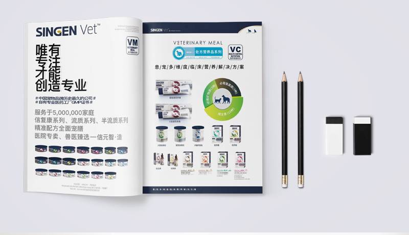
Corporate brochure design and production: Can you put the boss's photo? How to put it without being embarrassed?
When you open a brand-new corporate brochure, the boss's carefully shot photo that always shows some "excessive force", does it make you feel inexplicably drumming at the moment of handing it out? The new customer, General Manager Zhang, poured out bitter water for the first time: "We made great efforts to make a new brochure, but I always felt that something was wrong when I sent it out. Later, I realized that it was the boss's' standard business photo 'that was too stealing the show! The customer is holding the brochure and focusing on thinking about the boss's suit and tie. Who still looks at the product?" Does this scene also seem familiar to you? Carefully designed corporate brochures carry the brand image and core values, but they are often stuck in the seemingly simple link of the boss's photo, which is actually easy to "step on the thunder".
Can you put the boss photo? There is no standard answer, but there is a golden rule: Your brochure is for customers, not your boss's personal photo album. There is only one core logic for putting photos-can this photo create value for your target customers?
1. When will it be released? Look at the scene, but also at the value transmission
Start-up or founder-driven brand: When the boss himself is the brightest IP of the brand, his story and professional background themselves are the cornerstones of customer trust. A real, warm photo can quickly narrow the distance.
Professional service organizations: law firms, design companies, consulting agencies, etc. What customers buy is essentially the professional capabilities of your team. Clear, professional image of the core team (including the boss) that delivers a sense of reliability.
Industries that need to build deep trust: high-end customization, health care, family businesses, etc. A sincere and friendly photo of the boss can effectively eliminate the strangeness.
When should I be cautious?
Large mature enterprises: The brand itself is strong enough, and customers pay more attention to the product, solution and overall strength of the company. Forcibly putting the boss's headshot is easy to appear abrupt or even "drop in price".
The boss's image is inconsistent with the brand tonality: the brand positioning is young and fashionable, but the boss is a serious old-school image? This sense of fragmentation will directly weaken the transmission of brand information.
The boss strongly resisted: the twisted melon is not sweet, and the embarrassing expression will be written on the face and printed on the booklet.
2. How to put it? Practical ways to say goodbye to embarrassment
Putting the boss's photo is not the end. How to make it naturally integrate into the overall narrative of the brochure through design and production, and become a bonus item rather than an interference item is the key.
1. Photography: Realism is the highest level of sophistication
Throw away the "studio style" posing: avoid stiff postures, smirks, and excessive dermabrasion. What the customer wants to see is an authentic and authentic "person".
Capture dynamics and situations: the boss guides technology in the workshop, focuses on discussions in the office, and communicates with customers at the exhibition... The boss in the situation is more convincing than the boss in the studio. Let the photos tell how he works and how he leads.
Eye contact: A good business portrait should make the reader feel that the person in the photo is sincerely looking at him. Photographer guidance is crucial.
Light vs. Atmosphere: Natural light tends to work better than stiff flash. Create an atmosphere in line with the brand tonality (professional, innovative, affinity).
2. Design: clever integration, not stiff insertion
Refuse the "ID photo" typesetting: Don't leave the photo on the cover or the corner of the inner page at will, just add your name and position. This is a taboo in design and production.
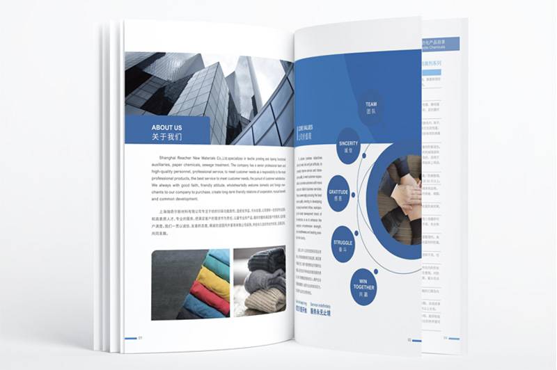
Deeply bound to the copywriting content: photos are placed next to sections such as "Founder's Message", "Leadership Team" and "Our Story". Pictures and texts complement each other, photos provide concrete support for words, and words give connotation to photos.
Exquisite size and location: It is necessary to be extremely cautious to put the boss's photo on the cover, and usually the inner page is more secure. The size should not be too big to dominate the host, nor should it be too small to see clearly. Take advantage of typography white space and let the photos "breathe".
Unified style: The tone and texture of photos must be highly coordinated with the overall design style of brochure (color, font, layout and picture style). Abrupt photo styles can instantly destroy the sense of design.
Weaken the "individual" and emphasize the "role": if the team is photographed, the boss is one of them, rather than the absolute C position (unless specific cultural requirements are required), which reflects teamwork.
3. Copywriting: Inject soul into photos
Beyond name position: The accompanying text is not a resume retelling. The focus should be on: How does he/she lead the company to create unique value for customers? What philosophy does he/she adhere to to solve customer problems?
Short and powerful, straight to the heart: avoid long speeches. One or two finishing touches tell the connection point between the boss and the company's mission and customer value.
The tone matches the brand: is it professional and rigorous, or innovative and lively? Copywriting language should be consistent with photo temperament and brand tonality.
3. The ultimate mentality: the protagonist of the brochure is always the customer
What is our core goal of corporate brochure design and production? It is to clearly deliver to the target customers: "Why choose us?" All the significance of this booklet lies in the decision-making of serving customers.
Customer Perspective Check: Pick up your brochure and imagine yourself as a prospect. Does this boss photo make you feel more trusting and knowing the company better, or is it confused or even a little "narcissistic"? Does it distract you from your core value (product/service/solution)?
Value matching: Does the message conveyed by this photo (professional, innovative, reliable, friendly …) accurately match the core values of the brand that you most want to convey to customers? Does it reinforce your key message?
Overall consistency: Is the style and feeling of the photos harmonious with other parts of the brochure (copywriting tone, design style, case presentation)? The fragmentation of any element weakens the overall professional image.
4. The essence of design and production is value transmission
The design and production of corporate brochures is far more than a simple collage of pictures and words. It is a systematic project, which requires accurate strategic positioning, professional visual expression and rigorous content carving. Every element-including the boss's photo-is an important component of this system. Its existence or absence and how it is presented must serve an ultimate goal: to deliver value to the target customer clearly, forcefully and convincingly, and promote trust and choice.
Struggling whether to put the boss photo? Let's go back to the source and ask: Can this photo really help my client understand who we are and what problems we can solve for him faster?
When Corporate brochure design and productionWhen every detail of the customer accurately serves the transmission of customer value, embarrassment naturally disappears and strength naturally appears. At this time, no matter whether or not the boss's photo appears and how it appears, it will become a harmonious and powerful stroke in the brand narrative. After all, a truly excellent brochure will ultimately make customers remember your value, not the boss's face.

