

Brochure looking "cheap"? Company brochure design and production 5 detailed designs to enhance the texture
Recently, I received a lot of bosses' complaints: "Obviously, I spent a lot of money on brochures, but when customers get them, they always feel like small street advertisements, and the price drops!" This feeling is like dressing up carefully and going out but being said that "clothes are like stalls", which is humbled and embarrassing. The texture of the brochure is the first impression of the enterprise's face. Today, let's put aside those dumb theories and talk about five key details that can "double the value" of your company brochure, specializing in "cheapness"!
1. Paper: the "first impression" you can touch, don't lose at the starting line!
Cheap minefield: Ordinary coated paper as thin as cicada wings, light and weightless, and even transparent. It feels creamy and cheap, like a fast food restaurant flyer.
Texture upgrading technique:
Choose the "weighty" one: don't be stingy with the weight! The inner pages should be at least 157g, and the cover should be more than 200g. The thick feel conveys the weight of "important information".
Pick the "Character": Try Special Paper! Highly recommend when designing and producing company brochures for customers:
Touch paper: With a little frosted or fine texture, it feels warm and comfortable, low-key and expensive.
Soft cotton paper: slightly matte, soft and natural feel, suitable for literary and high-end brands.
Contains cotton paper: slightly yellowed, with its own retro bookish atmosphere, the favorite of cultural and handmade brands.
Play "careful" on the cover: cover it with a matte film (advanced matte feel) or partial UV (key information/Logo lights up), the cost is not high, and the grade is immediately obvious. We once had a customer who made organic food. After switching to the local UV process containing tissue paper, the customer reported that "the brochure feels as comfortable as a natural product", and the sense of trust doubled!
2. Color: If the color is right, the nobility will come naturally!
Cheap minefield: the saturated "scrambled eggs with tomatoes" color scheme, the colorful "palette", and the large printing color difference lead to the "discoloration" of the Logo.
Texture upgrading technique:
Do subtraction, more advanced: don't have more than 3 main colors! Learn from big names, one main color base, and add 1-2 embellishment colors is enough. Professional company brochure design and production, color planning is the soul.
Low-key luxury has connotation: try Morandi colors with low saturation and gray tones, or classic black-and-white gold/silver combinations with advanced filters.
Spot color blessing shows strength: brand color requirements are extremely high? Consider printing with spot color (Pantone color), the color is accurate and eye-catching, which is a symbol of strength.
Proofing! Proofing! Proofing! Say important things three times! Design draft and printed matter are two different things. Design and production must be closely coordinated. Before formal printing, be sure to look at the physical proofing to confirm that the color is correct. Only by seeing it with your own eyes can you avoid the tragedy of "buyer show".
3. Typesetting and font: the sense of breathing is the oxygen of high-level sense!
Cheap minefield: words are squeezed into canned sardines, pictures are piled up at every opportunity, fonts are fancy like "non-mainstream signatures", and the line spacing is so small that people fear attacks.
Texture upgrading technique:
White Space Is Gold: Be Bold White Space! Give words and pictures enough "breathing space". The page is not as full as possible, but the blank space highlights the key points and creates a sense of calmness. Imagine the display of luxury stores, isn't it ethereal and high-end?
The fonts are expensive but not expensive: don't have more than 3 types of fonts in the whole book! Choose classic and attractive fonts (such as Siyuan Song/bold, Helvetica, etc.), and strong legibility is the basis. The title can be changed slightly, but excessive design is refused.
Line spacing should be stretched: the line spacing is recommended to be about 1.5 times, and the kerning should not be too crowded. Imagine the spacious seating in an upscale restaurant, and read with this comfort.
The grid system is the skeleton: align all elements (words, pictures, icons) with invisible grid lines to form the beauty of order. Clutter is a hotbed of cheapness.
4. Picture: Slag picture quality, ruin everything!
Cheap minefield: a "hodgepodge" of blurred mobile phone shots, watermarked pictures picked up from the Internet, dummies and false scenes with excessive PS distortion, and chaotic styles.
Texture upgrading technique:
High definition is the bottom line: all pictures must be HD! Printing resolution at least 300dpi. Fuzzy = cheap.
Create the texture scene yourself: product/environment/team picture, shoot when the budget allows! Professional photographers can capture light, angle, atmosphere and present a real texture. Don't save money on pictures, it's the most intuitive!
Unity of style is king: picture selection should have a unified tone! Is it bright and fresh? Or dark luxury? Is it a realistic capture? Or exquisite studio shooting? Only by keeping consistency can the brochure have an overall temperament.
Make good use of galleries to be smart: if you really want to buy pictures, choose high-end galleries, and avoid tacky pictures of "smirking and posing". Add keywords such as "authentic", "minimal", and "luxury" when searching.
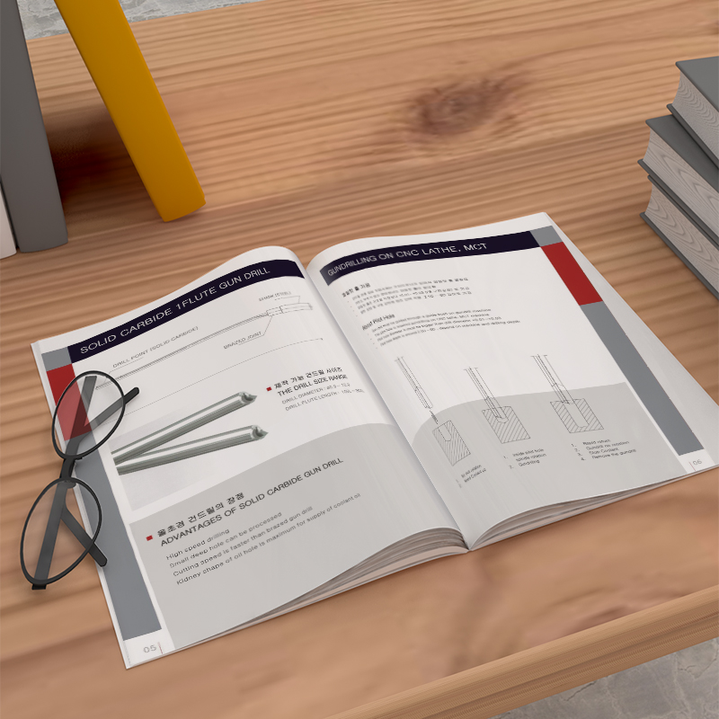
5. Detailed craftsmanship: The devil is in the details, and the finishing touch shows the truth!
Cheap minefield: rough edges, skewed cutting, simple binding and easy loose pages, and no craft highlights.
Texture upgrading technique:
Accurate cutting is dignity: the edges must be smooth and straight, which is the basic requirement. Crooked and direct negative points.
The binding method shows care:
Saddle Stud: Suitable for small pages (usually within 32P), concise and neat.
Glue binding: thicker and flatter, flipping feel good, suitable for booklets with many pages. Choose PUR glue for more durability.
Hardcover (hard shell): The highest specification, with a hard cover, suitable for extremely important booklets that need to be kept for a long time, and the cost is also the highest.
Don't abuse the finishing touch: use it in a small area in key positions (Logo, title, main visual):
Bronzing/Silver/Black: Classic and luxurious, instantly upgrade the class.
Convex/embossing: Make the pattern text three-dimensional, and the touch is surprising.
Local UV: Make specific areas brighten up (varnish) or matte down (matte oil) to create texture contrast.
The landing of the process depends on communication: the feasibility of production must be considered when designing! A reliable company brochure design and production supplier will communicate with you in advance about process selection, cost and realization effect. Close cooperation between designers and printing factories can ensure that the design drawings are perfectly implemented into real things.
OKCompany Brochure Design and Production, is the "silent salesman" of the enterprise. It lies quietly on the customer's desk, but tells your brand style, professional attitude and pursuit of quality with every detail. Stop letting the "cheap feeling" brochure drag down your image! Starting with these five details that can be touched, seen and felt, and polishing them carefully, your carefully prepared products and services are worthy of a "high-level business card" that can truly touch people's hearts. When users successfully win their customers through your carefully polished brochure, the value of this texture investment is far beyond imagination. The next time users consider finding a supplier, a brochure with perfect quality is the best endorsement of your professional strength.

