Corporate album brochure design: How to make the company history timeline so as not to be a "running account"?
Xiaobian said: Does it feel like writing a "chronicle" every time you sort out the company's history and make a picture album? The hard-worked timeline is like a "running account" when put in, and the customer skips it after turning two pages? Don't worry! Today, let's talk about how to make the company timeline both story-telling and impactful in the design of corporate album brochures, so that people will remember you at a glance!
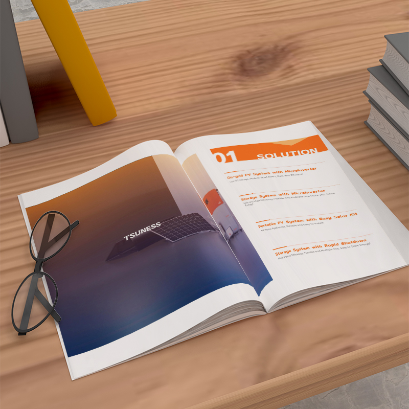
1. Abandon the "list body" and embrace the "story line"
Don't simply list "we did something on a certain day of a certain year"! Users aren't here to check files. Think about it:
The "moment of breaking the cocoon" is more touching than the "date of establishment": instead of writing "the company was established in 2010", it is better to focus on "in 2010, three people crowded into a 20-square-meter rental house and stayed up all night on the day the first customer was signed". This is the living starting point!
"Key leap" is better than "product iteration": instead of a dull record of "launching product A in 2015", it is better to highlight "in 2015, in the face of the encirclement and suppression of giants, we put all our eggs in one basket to develop product A, and finally opened up the market gap". Show courage and wisdom!
"User Echo" is more credible than "Honor List": Next to "Won the XX Award in 2020", an early user said: "There was no solution on the market at that time, but your product saved us!" Instantly close the distance.
Design Finishing Touch: Strengthen the Story with Visuals! Design a strong symbol icon for each key node (for example, the broken egg represents the start-up, the upward arrow represents the breakthrough, and the handshake represents the milestone of cooperation), with selected historical photos or hand-painted scenes, and the words are refined into golden sentences. Let the timeline become a visual micro "corporate biography".
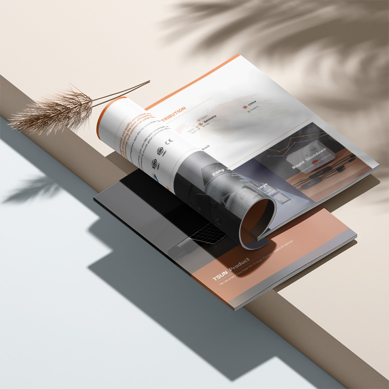
2. The theme runs through, rejecting "bulk history"
The timeline is not a hodgepodge and needs a soul theme! Ask yourself:
Is the core driving force of the company's growth "technology surge" or "customer first"?
Is the spirit throughout "subversion and innovation" or "ingenuity and persistence"?
Design finishing touch: The entire timeline page adopts a unified visual atmosphere (technological blue-purple tone/warm and rustic wood color system). In terms of layout, let the theme keywords or core graphics (such as code symbols/close-ups of craftsmen's hands) skillfully run through each node to form a visual bond.
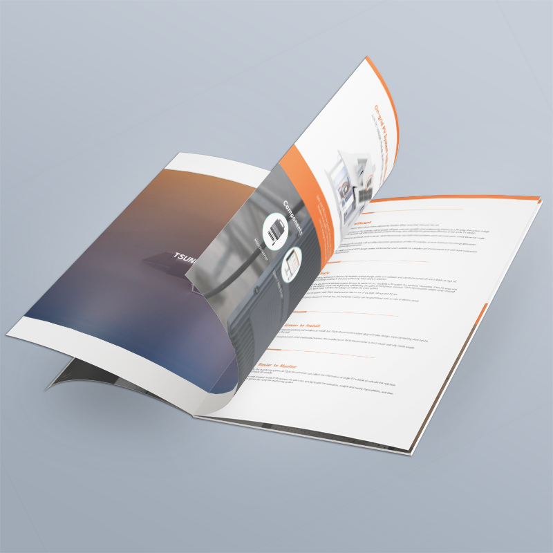
3. Interactive design to make history "alive"
Paper albums can also have a "sense of interaction"! Breaking the boredom of linear reading:
"Folding time and space" mechanism: design a "small window" that can be opened. The outer layer is a concise time point and title, and the inner page is a richer graphic story, old photos or scanned copies of precious documents of that year, creating a sense of surprise.
"Time Tunnel" tour: Using the spread design, the timeline is designed as a winding "road" or "river" running through the picture. Readers' eyes naturally follow the "flow", and important nodes are prominently displayed on the side of the "road" or the "river bank".
Ingenuity of "index anchor point": Set keyword indexes at the beginning or end of the timeline (such as: "first breakthrough", "major cooperation", "social responsibility"). Or click on the corresponding logo to quickly locate the relevant event group, which is convenient for readers to explore according to their interests.
Design finishing touch: bold use of special craftsmanship! Bronzing, UV, convex and other processes are used at key milestones, and the key points can be distinguished by touch. Combine arrows, dotted lines, gradient lines, etc. to guide the visual flow direction, making the reading process full of dynamic interest.
4. Integrate the present and point to the future
The timeline is not a nostalgia pavilion, but the end point should be the present and the future!
The blank space of "To be continued...": At the end of the timeline, design an open visual element (such as: arrows pointing to the outside of the album, unfinished path lines, question mark graphics) with the caption: "Our story, It's happening, invite you to write the next chapter together..."
The echo of "gene inheritance": in the section that introduces the current business or future vision, the core spirit or classic products in the timeline are cleverly rebated (such as: "The fighting spirit in that rental house in those days has now been integrated into every product line"; "The core design concept of the first generation product is still driving our innovation").
The power of "data witness": Next to the key nodes of the timeline, integrate core data in a very small but eye-catching way (such as: the number of start-up teams vs the number of current employees; first-year revenue vs the revenue of the latest fiscal year), forming a silent but shocking contrast.
Design finishing touch: The visual style of the timeline should be connected with the overall modernity of the album. At the end, gradient color (transition from historical yellowing/black-and-white to bright colors representing the present), combination of virtual and real (past events are slightly faded, and the current state is highlighted in high definition) and other techniques can be used to symbolize development and inheritance.
5. Vision is king, and words are "green leaves"
Time is abstract, vision is king!
"A picture is worth a thousand words" is the iron law: rack your brains to find or create the core pictures/illustrations that best represent that era and that event. A scene photo full of tension is better than a long paragraph of descriptive text.
"Infographics" simplify complexity: For milestones involving complex processes or data (such as product iteration paths, market expansion maps), use a concise and clear Timeline Infographic (Timeline Infographic) to present them, which is clear and professional.
"Font emotion" can speak: choose different font styles according to the nature of the event. Heavy and powerful fonts are used for major breakthroughs, handwritten fonts are used for warm stories, and modern sans serif fonts are used for technological innovations. The contrast of font size and word weight creates a sense of rhythm.
"Color coding" is divided into chapters: setting the main color for different development stages (such as start-up stage, growth stage and transition stage). Even if readers don't read the text, they can quickly perceive the different stages of the company's development through color blocks.
Design finishing touch: pursue magazine-level layout composition! Leave blank space boldly and let important graphic information breathe. Using grid system to ensure the organization of complex time axis. Picture processing must be fine (uniform tone and exquisite cutting), which is the hard power embodiment of professional enterprise album brochure design.

Let your corporate story become the secret weapon to impress customers!
Look, doing a good company timeline is far more than just piling up dates! It is a journey to sort out the soul of an enterprise, and it is an excellent opportunity to turn the cold journey into brand assets with temperature and memory. A timeline with distinctive theme, visual shock and ingenious interaction can instantly catch the attention of customers when they quickly flip through the album, and clearly convey your core values and unique genes-isn't this exactly what you expect when you invest in the design of corporate album brochures?

Don't let the precious company history become a "running account" that no one cares about in the picture album. It's time to use carefully designed visual language and narrative structure to turn your history of struggle, growth and innovation into the most trustworthy endorsement and the most touching brand story in the eyes of customers! A truly outstandingCorporate album brochure designThat's it, let the journey speak, and let time be your most powerful spokesperson.


