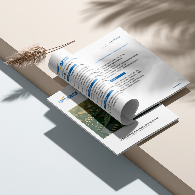
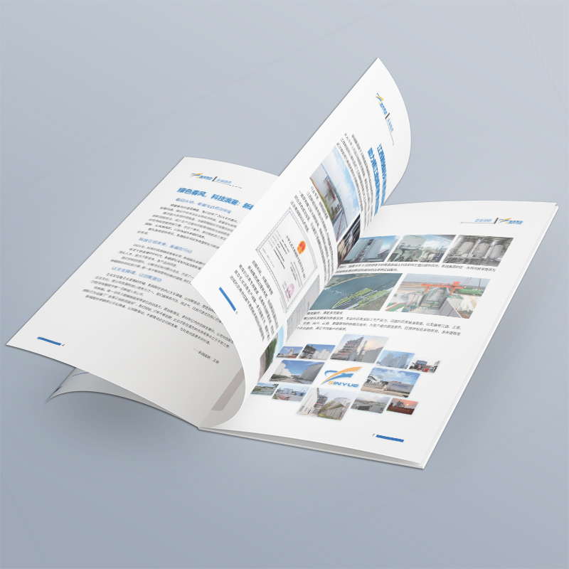
Design company corporate brochure: contact information, it's better to put it smart than to put it conspicuously!
Xiaobian said: Last week, a customer sighed with a newly printed brochure: "The design is quite advanced, but after making three calls left on it, one was empty, one was always busy, and the last one was finally passed. The person who answered the phone said, 'You have found the wrong department'... It's really humbled to spend this money!" This is like a thorn, and it makes me feel uncomfortable. Yes, we have worked so hard to polish every page of the corporate brochure of the design company just to help customers connect their business? If the contact information becomes a decoration, even the beautiful booklet will lose its soul. Today, let's not talk about emptiness, just talk about how to make the seemingly simple thing of "contact information" really smart.

Silly, big, rough and conspicuous? Customers may "turn a blind eye"!
When many companies design corporate brochures, their understanding of contact information is still stuck at the level of "bigger is better, more is better, and more conspicuous is better":
"Door God"-style stacking: the back cover of the cover and the corner of the inner page, I can't wait to stuff all the telephone numbers, email addresses, and QR codes into them, which are densely packed like small advertisements.
"Island" existence: the contact information is concentrated on the back cover or a fixed page, and the customer turns to the highlight of the product and is excited to get in touch, only to find that he has to cross the mountains to find the phone.
"Antique" Level Information: Phone Changed? The mailbox is not used? Address relocated? When the brochure is printed, it is a "historical relic", and the information on it may have long been invalid.
And the result? Customers are either so dazzled with information that they simply can't remember which call to make; Either at the moment when I want to contact you most, I can't find the entrance, and my enthusiasm cools down instantly; Either call and find that it is wrong, and the sense of trust will collapse directly. Conspicuous ≠ effective, stacking ≠ convenient. The core value of a design company's corporate brochure is to facilitate connection, not to show the design itself. The contact information is clumsy, and even the best design is in vain.

Where do you hide smart? Let customers "find it when they want it"!
The truly intelligent design of contact information is a silent guide to moisten things, and it just appears at the moment when it is most needed. It understands the customer's browsing path and mental rhythm:
Key contact points "immediate response": Don't treat contact information as "supernumerary personnel".
After the core business segment: When the customer is excited after reading the service introduction you are most proud of (such as "brand design" or "explosive product creation"), a clear contact number or QR code is attached immediately afterwards, which says "Consult your exclusive plan immediately". It's like handing a glass of water when you're thirsty, natural and thoughtful.
Next to the successful case display: When the customer is impressed by your wonderful case (such as "a well-known brand renewal case"), lightly mark next to or below: "Want to get the same effect? Contact us for a chat!" And attach the contact entrance. Instantly turn customers' "heartbeat" into "action" opportunities.
Near Client Testimony: Harnessing the Power of Social Identity. Under the customer's praise such as "The cooperation is very smooth and efficient!", take advantage of the trend and guide: "Looking forward to starting efficient cooperation with you! Contact Manager XX". Trust is directly translated into action.
Information layered "on-demand access": giving it all at once is equivalent to letting customers "find a needle in a haystack" by themselves.
Clear primary and secondary: determine 1-2 core and smoothest contact channels (such as a business consultation telephone and a WeChat QR code) as the "main push", which will appear repeatedly in multiple strategic locations (but the design should be unified and not messy).
Auxiliary information return: Put the detailed address, extension number, non-emergency email address, etc. in a fixed but clearly designed area (such as information bar) on the back cover or inner page. The main push channel is responsible for "drainage" and the auxiliary information is responsible for "verification".
Scenario design: Are the target customers overseas companies? Give priority to WhatsApp or international calls. Primary customers are locally? Highlight local fixed line and WeChat. Make the information tailored to each person.
Visual guidance "The heart moves with the eyes": using design to guide the eyes silently.
Use white space and arrows skillfully: Appropriately increase white space around the phone or QR code that you want customers to pay attention to to form a visual focus area. Or suggestive guidance using arrows or lines that are extremely minimalist and don't ruin the overall beauty.
Micro-Motion QR Code: In a static page, a subtly designed, slightly stereoscopic or slightly dynamic QR code (make sure it can be scanned!), can effectively attract attention. But don't be so fancy as "psoriasis".
Color and contrast: The background color or key text color of the contact information area forms a soft but discernable contrast with the surroundings, allowing it to be easily located when flipping through.
QR code is "more than just code": QR code is a super entrance to modern brochures, but don't just be a "black and white square".
Value guidance: The QR code must be accompanied by a short and powerful call to action! Don't just write "scan code attention". Try: "Scan the QR code to receive the White Paper on Industry Design Trends" or "Scan the QR code to make an appointment with a senior consultant for one-to-one communication". Give clients a "must sweep" reason.
Dynamic Update: Utilizing Live Code Technology. Even if the brochure has been printed and distributed, the content pointed to by the back-office links (such as case updates, promotions, electronic brochures) can be adjusted at any time, making the paper brochure "never out of style".
Tracking source: Configure different QR code parameters for different channels (such as brochures of different exhibitions, business cards of different account managers), accurately track which brochure brought consultation, and optimize subsequent delivery strategies. A technology company designed QR codes with exclusive parameters for exhibitions in different regions, and found that the conversion rate of code scanning in South China exhibitions far exceeded expectations. The following year, it immediately increased investment in the region.

Don't let customers "find the north": smart design, connection is valuable
A really effective timeDesign Company Brochure, is more than just a visual feast. It is a warm and strategic business communication tool. The core mission of the company's brochure is to let the target customers know you, trust you, and ultimately be willing to contact you. To "hide" contact information smartly is not to let it disappear, but to let it appear where it should most appear, in the friendliest way, and with the clearest promise of value. The success of designing a company's corporate brochure is ultimately reflected in the moment the customer picks up the phone, scans the code to add it, and sends out an email. Let the end of every reading become the starting point of a business dialogue. The "cleverness" of designing a company's corporate brochure lies in this quiet but crucial guiding force.


