Experiment of brochure design company: monochrome printing of kraft paper, which actually makes a retro high-end feeling!
Hey, guess what? Recently, our studio did something quite "rebellious"-we didn't use the glamorous special paper, but chose the most inconspicuous kraft paper; Obviously, there is a colorful tool for four-color printing, but stubbornly only uses one color! To tell the truth, even we are muttering in our hearts: Can this work? Customers can't turn around and leave when they see them? But the result … hehe, look down, it will definitely surprise you!
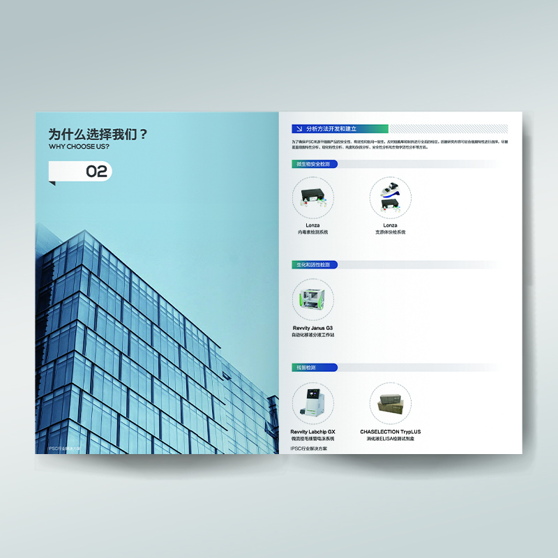
Breaking the "Impossible": When Kraft Paper Meets Monochrome Printing
In most people's perception, a good corporate brochure, especially if you want to convey the brand texture, must be:
Paper should be "expensive": the weight of the gram is high, so it's best to have some lines, and it has to be classy when touched.
The color should be "dazzling": starting with four colors, it's best to add a few more spot colors, and gold foil and silver foil can't be less. In short, how rich it is.
There should be "many" processes: bronzing, UV, embossing, hollowing out... I can't wait to use all the processes that can be stacked to prove that they are "worth the price".
This "formula" has almost become the "safety card" of the brochure design company. But what about the cost? Go up and up! Many small and medium-sized owners with limited budgets and a desire for quality are often dissuaded by this "high threshold" or bite the bullet, but the effect may not be as "advanced" as expected.
Our "rebellious" experiment is aimed at breaking this "impossible"! The core idea is incredibly simple: use the most basic material (kraft paper), do the boldest subtraction (monochrome printing), and challenge the limits of visual texture.
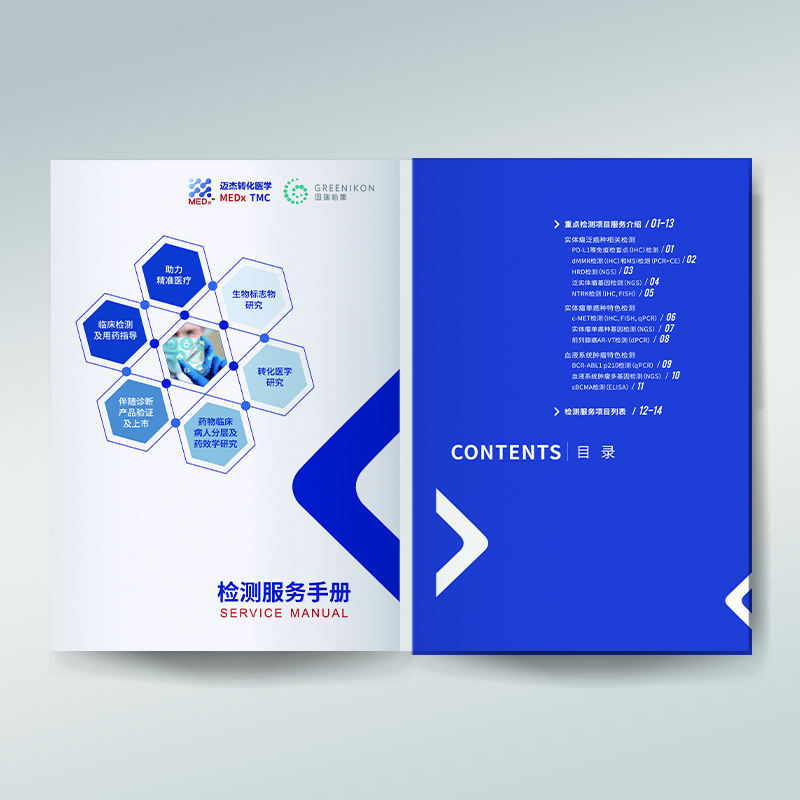
A design adventure that goes the opposite way
The experimental process is more like an exploration full of unknowns:
Embrace "rough" kraft paper: Give up smooth and delicate, and choose kraft paper with natural texture and rustic tones. It is imperfect and even has subtle impurities and chromatic differences, but this is precisely where the sense of time and craftsmanship comes from. We were pleasantly surprised to find that under the right gram weight, the crisp feel of kraft paper is no less than that of expensive special paper.
The "magic" focus of monochrome printing: abandon the colorful and focus on only one color (we chose dark brown, which blends perfectly with the kraft background color). This seems to be a restriction, but it is actually a liberation! The design team was forced to rack their brains on graphics, typography, and the use of negative space. The high degree of unity and strong sense of visual symbols brought by monochrome make information transmission clearer and more impactful. Imagine a well-designed brand symbol or a core Slogan, calmly printed on warm yellow paper in dark brown. The low-key and determined sense of strength is beyond the reach of complex colors.
Craftsmanship does subtraction, texture does addition: without bronzing and flashing silver, we explored other "light" crafts that can coexist harmoniously with kraft paper monochrome:
Elegant embossing/convex: On the cover or important graphics, the concave or convex texture is formed by physical pressure, and the hierarchy is presented by the change of light and shadow, with warm touch and subtle vision.
Local matte/bright UV: Used with extreme restraint on small elements that need to be emphasized (e.g. Logo, key icons) to form a subtle textural contrast.
Hand-binding traces: Try hand-threaded binding and raw edge effects to transform "imperfection" into unique humanistic temperature.
The whole process is full of "serendipity" and "self-doubt". When the first experimental sample was released, the team was silent-there was no expected sense of cheapness, but a quiet, story-telling and highly recognizable sense of retro high-end. It is unobtrusive, but people can't help but want to touch, read and explore.
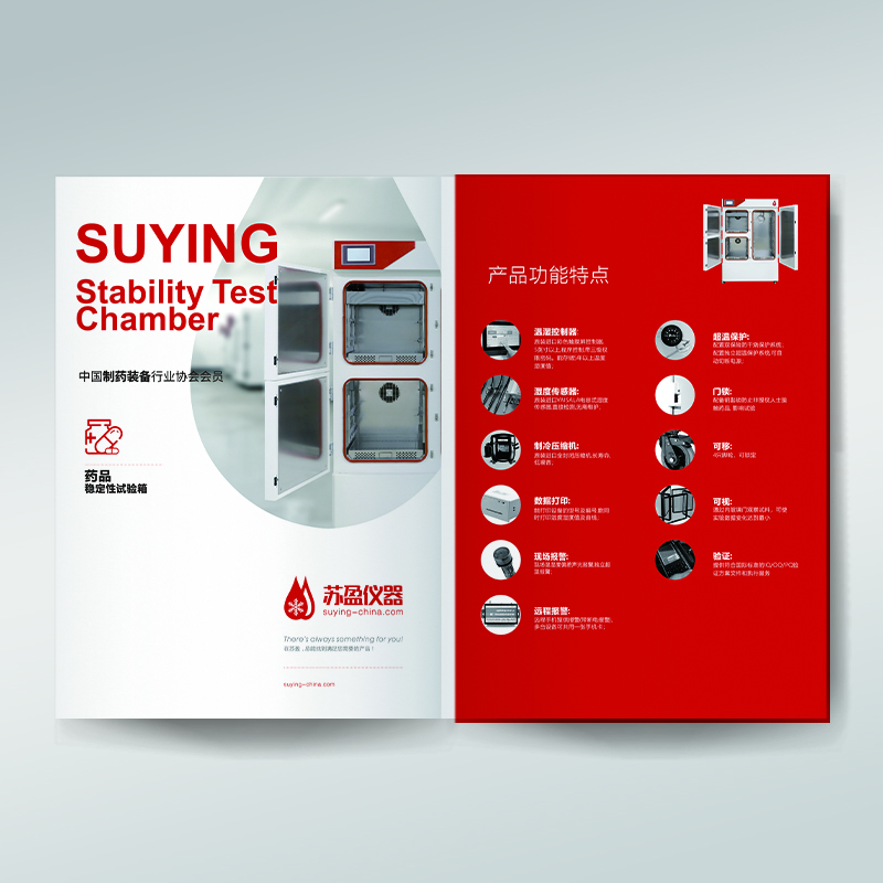
Customer Feedback: From "This Can Work?" To "That's It!"
No matter how good the experimental results are, the customer and the market have the final say in the end. We uneasily recommended several kraft paper monochrome schemes to several customers who have requirements for cost and texture. The response was surprisingly consistent:
Customer A (owner of a boutique cafe): "When I first saw the sample, I was stunned for a moment. It's completely different from those'glittering'albums I received before! But the more I look at it, the more it tastes, especially like the retro and industrial feeling in my store. The key is that the budget is saved a lot! My old customers all praise my style and ask me where I did it."
Customer B (independent handmade brand manager): "I've always wanted to find a way to express our brand's'handmade'and'natural'concepts. Your monochrome scheme of kraft paper simply pokes my heart! That simple and undeliberately carved feeling is so right! After the album was sent out, many cooperative buyers said they were deeply impressed and asked us about the brand story."
Customer C (CEO of start-up technology company): "To tell the truth, I refused to hear 'kraft paper' and 'monochrome' at first, and it felt too 'plain'. But I was really amazed to see the real thing! Dark blue monochrome printing on kraft paper has a special sense of retro technology, which is very unique and professional, and completely breaks away from the same 'technology blue' tone of peers. Investors spoke highly of it after getting it, saying that we'have ideas'. "
Real feedback from customers, gives us great confidence. What they need is not the stacking of materials and the dazzling skills of craftsmanship, but a solution that can accurately convey the core of the brand, be remembered at a glance among many promotional materials, and is really worth the money. Kraft monochrome printing, in an unexpected way, hits this pain point.
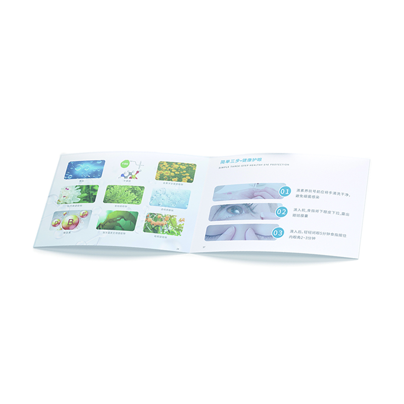
Why does it succeed? Not just saving money!
Strong recognition, unforgettable at first glance: in the ocean of four-color coated paper, a kraft paper monochrome album is a unique existence. It comes with a strong visual memory point, which makes the brand stand out instantly.
Tell a good brand story: the natural and nostalgic feeling of kraft paper and the pure and focused feeling of monochrome are themselves a silent narrative. It is naturally suitable for conveying brand tonality such as ingenuity, environmental protection, retro, minimalism, and humanism, making the brand temperament "touchable".
Tactile experience upgrade: the texture of the paper, the uneven printing, and the rustling sound when flipping through together constitute a multi-sensory immersive experience, which cold and smooth coated paper cannot provide, greatly deepening users' goodwill and memory for the brand.
Controllable cost and high sense of value: Under the premise of controlling the budget, it has achieved a texture presentation that far exceeds expectations, and the cost performance is extremely high. It is especially suitable for small and medium-sized enterprises with limited budget but pursuit of quality.
Return to essence, content is king: Subtractive design forces both teams and customers to focus more on the refinement and visual expression of core information, so that the album can truly return to the essence of "effective communication" instead of being overwhelmed by fancy forms.
Your brand, dare to have a "texture revolution"?
This experiment completely subverts ourselves, and I hope it can challenge your inherent cognition of "the sense of high-grade promotional brochures". The sense of high-grade is never a pile of expensive materials, nor a carnival of colors. It comes from accurate brand insight, bold design creativity, and chemical reactions after in-depth excavation of material characteristics.
If you are looking for aBrochure Design Company, a partner who is not satisfied with routines, dares to use innovative solutions to help you really solve problems, and speak for the brand with unique texture-then, it's time to jump out of the "safe zone"! Don't be trapped by the thinking that "it must be high cost to be advanced". A simple kraft paper, a touch of pure monochrome, after professional design hands, can also generate shocking brand power.


