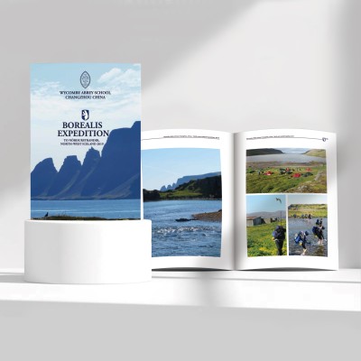
This brochure is mainly based on fresh and natural visual style, and makes a lot of use of blue color and vast natural landscape pictures to create a quiet and exploratory overall feeling. This design method fully captures the core spirit of this adventure, that is, experiencing the beauty of nature and having in-depth communication with foreign cultures. In order to fully display the rich content of this adventure, the brochure adopts a multi-page layout, and through the presentation of pictures and texts, readers can have an overall understanding of various activities organized by the school. Detailed itinerary arrangements, in-depth introductions to scenic spots, and real records of students outdoors, none
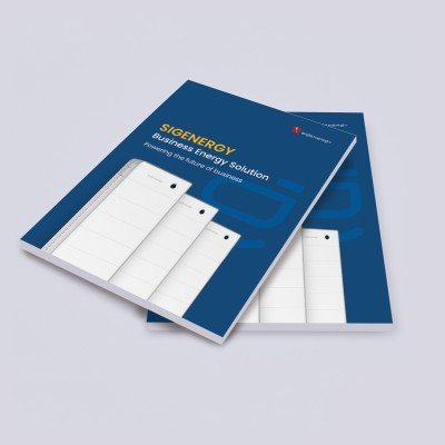
Turquoise tones create a vibrant visual feel, globe and other icons convey the concept of environmental protection. The simple and generous layout highlights the professional image. Comprehensively expound the advantages of enterprises in the field of green energy, concise text, rich graphics, clear layers to improve readability. To meet China's green development needs, highlight the technological leadership of enterprises, and help to build up the brand image. The combination of visual creativity and professional craftsmanship, fully interprets the concept of green energy, helping enterprises to break out in the Chinese market. The collection conveys not only the professionalism and reliability of solar power technology, but also the designer's attention to detail and visual presentation. None
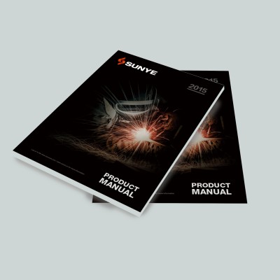
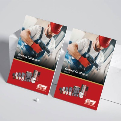
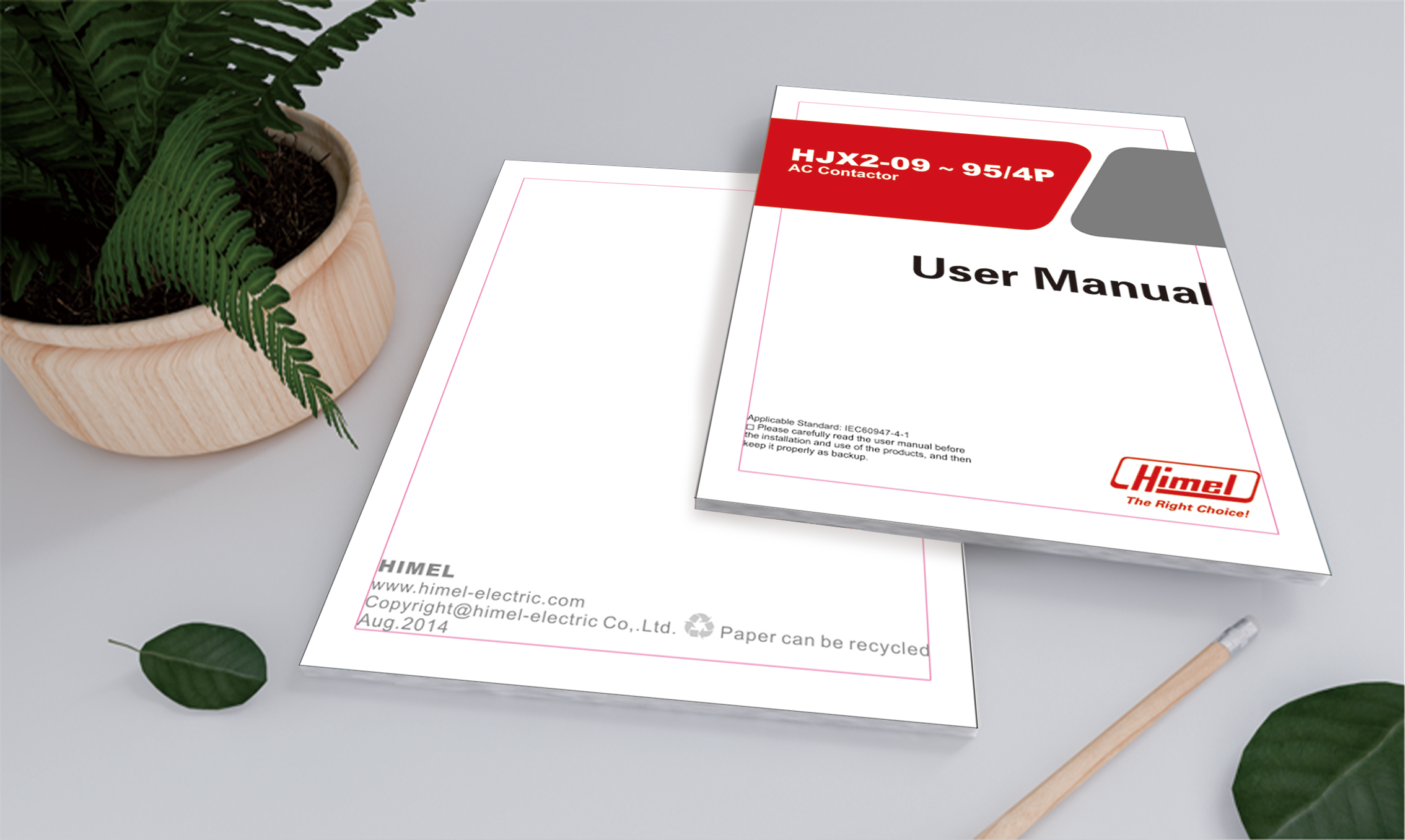
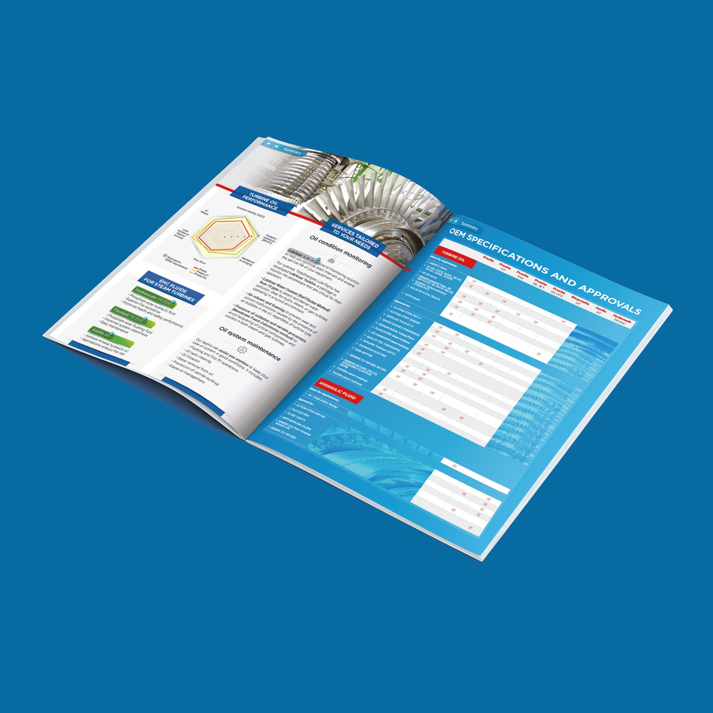
Black and red tones are used to create a strong industrial sense, and large product images convey the characteristics of the product itself. The simple and regular layout design enhances the overall professional image. The product manual provides a comprehensive and systematic introduction from the perspectives of product specifications, technical parameters, etc., and is combined with a large number of data tables and illustrations, allowing readers to have a clear and intuitive understanding of the product. With the continuous upgrading of China's industrial manufacturing industry, customers' demand for high-quality industrial products is getting stronger and stronger. Such a professional and neat product manual will surely become a strong support for this multinational enterprise to establish its brand image in the Chinese market. This product manual design case fully demonstrates the role of visual communication in
Light grey keynotes with fluorescent orange identifiers, with arrows and module layers, make the manual "page-turning-teaching". In the introduction part, the manual clearly states its purpose and scope of application, and provides the reader with a clear direction of use. The operating instructions section details the operation steps of the device to ensure that the user can easily get started. The safety information part emphasizes the safety precautions during use to ensure the safety of users. The installation guide provides detailed installation methods to help you install the device correctly. Finally, the wiring diagram shows the electrical connection of the equipment intuitively, which provides convenience for the user.
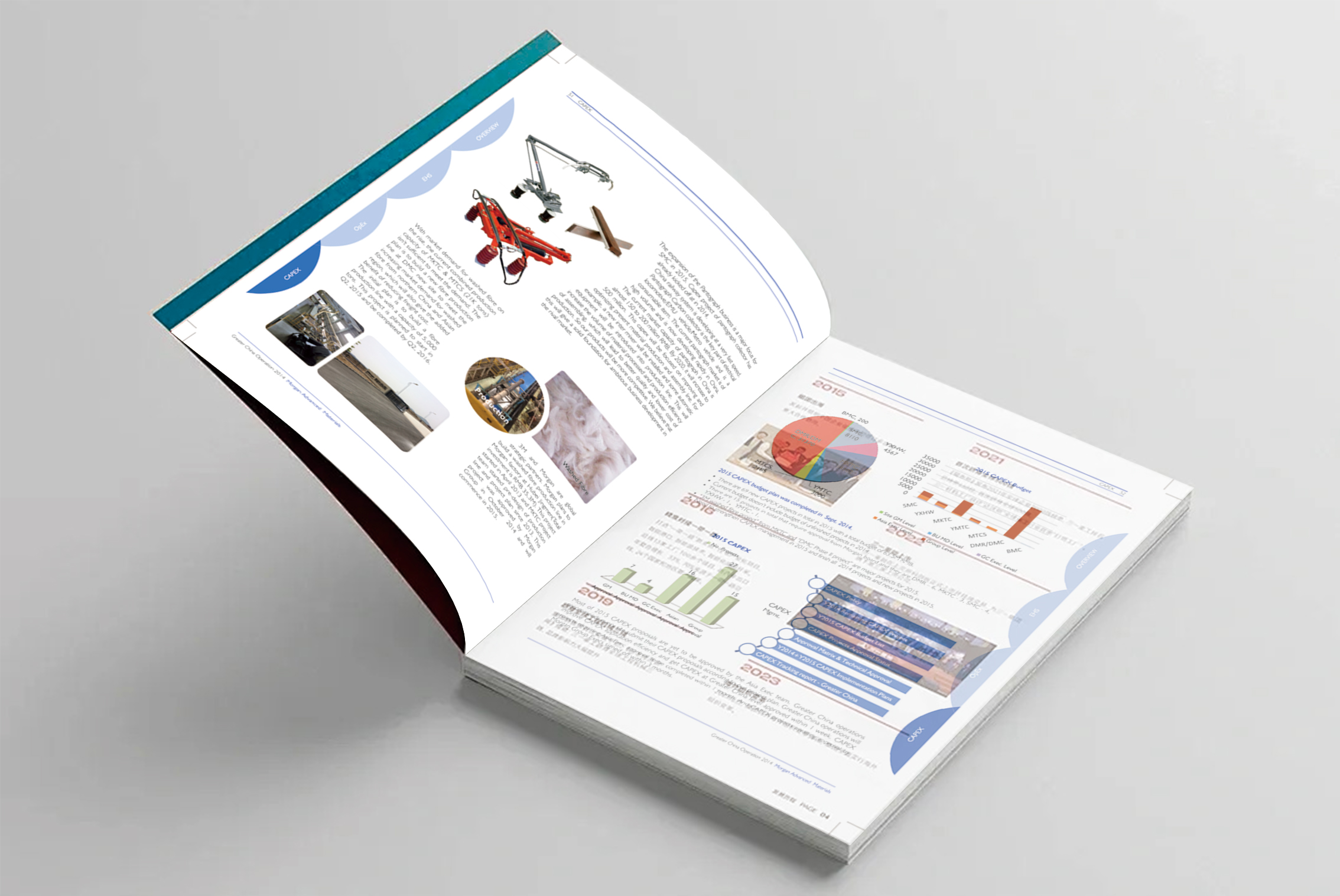
From the visual design point of view, this album uses blue as the main color, supplemented by text and graphic elements, the overall style is simple and atmospheric, in line with the corporate image recognition. Visual elements such as pictures, charts, and infographics are used in a variety of ways to make the entire report more vivid and intuitive. This design not only conveys the company's business, but also highlights Morgan's professional image as a leader in the industry. In addition, the report makes full use of both Chinese and English to facilitate communication between the company's multinational teams and partners operating in China. This kind of design on the international vision, also highlights the Morgan company in the globalization background.
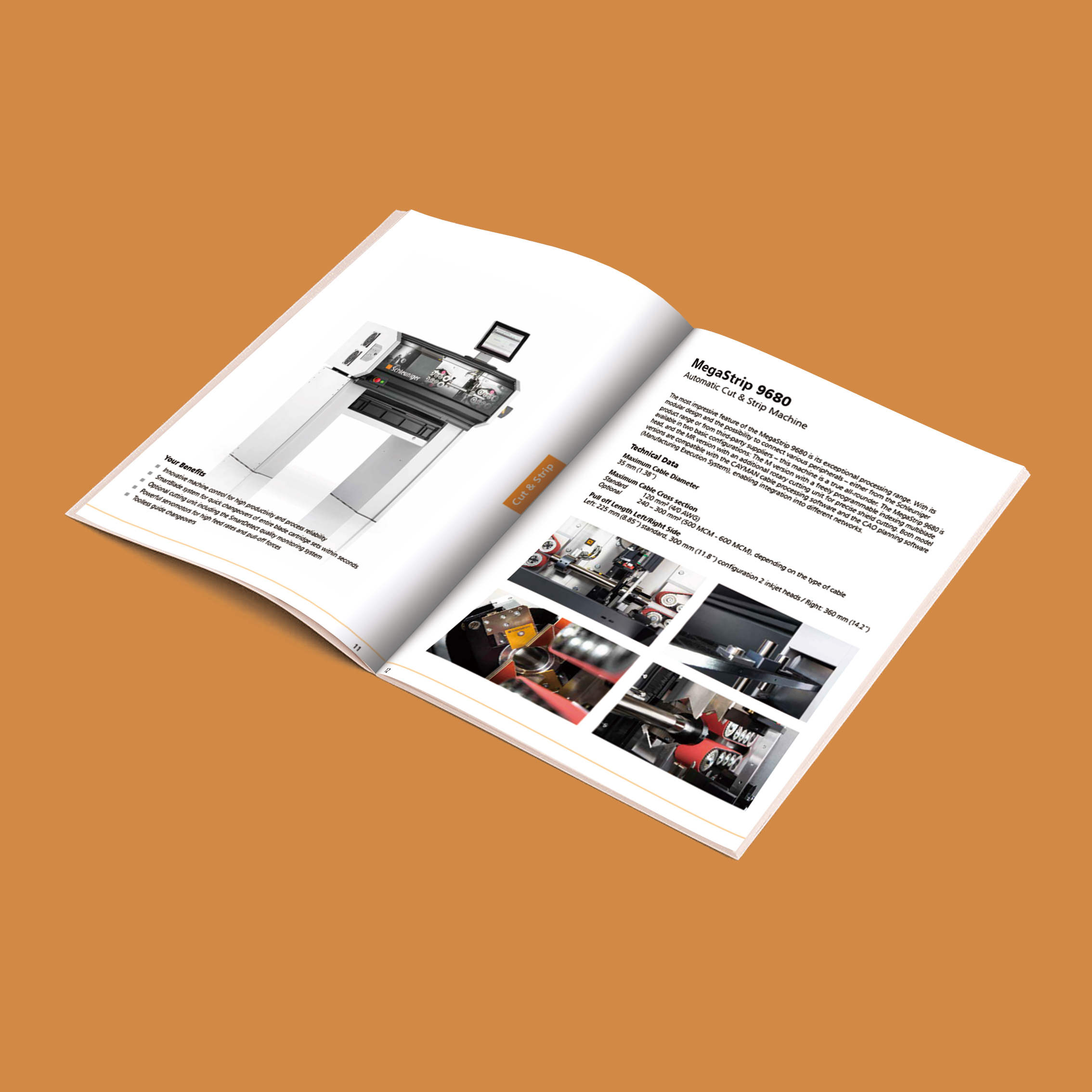
This product giclee adopts a modern, concise visual style with extensive use of negative space to create a high-quality and technically sophisticated brand image, which fits well with the professional image of this industrial equipment manufacturer. By cleverly arranging product pictures and detailed technical parameter information, the company's professional advantages in functionality and performance are further highlighted. In order to fully display the company's rich product line, the design team adopted a modular layout, so that each product can stand out independently, while maintaining a consistent visual style with the overall album. Detailed technical drawings and concise product descriptions enable customers to fully understand the characteristics of the equipment
After fifteen years of album design, I found that brochures in the testing instrument industry are evolving from "parameter instructions" to "data experience cabins". Today, I dismantled the new picture album of a German company's subsidiary in China to see how hard-core technology uses design to tell the story of trust. Open the album, and the internal pages are divided into four parts, each of which is carefully planned. From "precise analysis" to "improving the accuracy of your research", to "cooperating with us" and "exploring together", we demonstrate the technical advantages, service support and contact information of our products one by one. The English text is not only easy for international customers to understand, but also reflects users' understanding of the global market
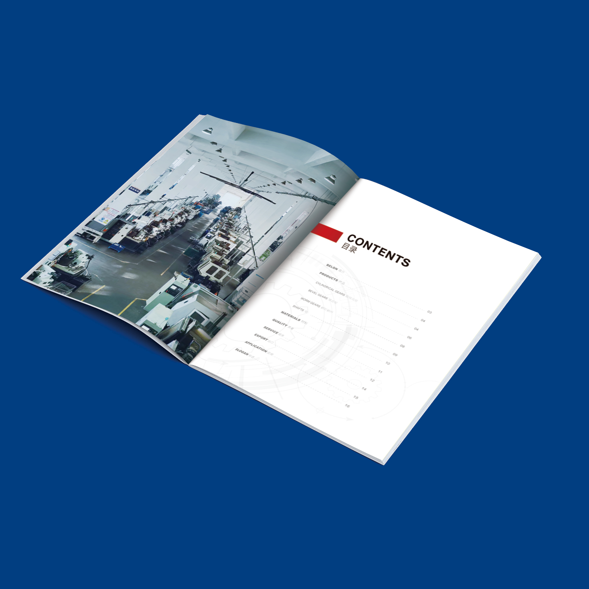
This product album adopts a simple and elegant visual style, making full use of negative space to create a precise and professional brand image, which perfectly fits the engineering and technical strength of the bearing metal manufacturer. Through ingenious product picture arrangement and detailed technical parameter information, the company's advantages in product performance and functions are fully demonstrated. In order to fully display the company's rich product line, the design team adopted a modular layout, so that each product can be highlighted independently while maintaining a unified brand visual style. Detailed technical drawings with concise and clear product descriptions enable customers to fully understand the key indicators of equipment. In China
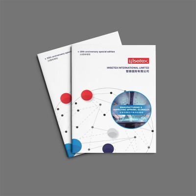
After more than ten years of album design, I found that the brochures of textile foreign trade enterprises are undergoing a transformation from "product manual" to "brand chronicle". The anniversary album of a company that has been deeply involved in the industry for 20 years uses metal cold ironing technology and modular narrative structure to effectively improve the retention rate of overseas buyers. Today, Xiaobian will analyze this booklet and see how traditional industries use design to tell the story of time. DESIGN STYLE: Loom aesthetic cover is made of 210g wire blended paper, the surface texture simulates the warp and weft interweaving of cloth, with Pantone 18-4052 classic navy hot stamping. The hidden mystery of interior page design: global supply
The editor, who has been engaged in album design for many years, found that the brochures of new energy companies are experiencing a "green revolution". The German company Schaltbau, which I recently came into contact with, is a typical example-as the leader of wind power contactors, their new album actually uses degradable materials and AR dynamic technology. Today we will open this booklet and see how foreign-funded companies use design to leverage China's green electricity market. Design style: Industrial aesthetics meets oriental Zen. Veteran German enterprises have always preferred the cold industrial style, but this album has played a "combination of Chinese and Western". The cover is made of FSC-certified sugarcane fiber paper, and the rough texture coincides with China's "Taoism"
This red-toned brochure is modern and professionally designed with a clever blend of white and grey backgrounds to create an elegant yet vibrant atmosphere. When you open the cover, the first thing you see is the headline "CASE PRESENTATION" at the top, which immediately conveys that this is a detailed introduction to the product case. The catalog section is carefully divided into sections, each organized around different topics, such as Case Presentation, Product Catalogue, and Brochure. In the
With the steady development of China's economy and the continuous improvement of its scientific and technological strength, the promotion of foreign-funded enterprises in the local market is also undergoing a transformation from technology to specialization. This product brochure design case of a foreign-funded energy company fully reflects this trend. From the perspective of the overall visual style, this brochure abandons the common technological design in the past, but adopts a more concise and atmospheric blue tone, combined with off-white tones to create a professional and stable brand image. At the same time, the designer also skillfully used traditional Chinese pattern elements, such as "fishbone" texture, to integrate
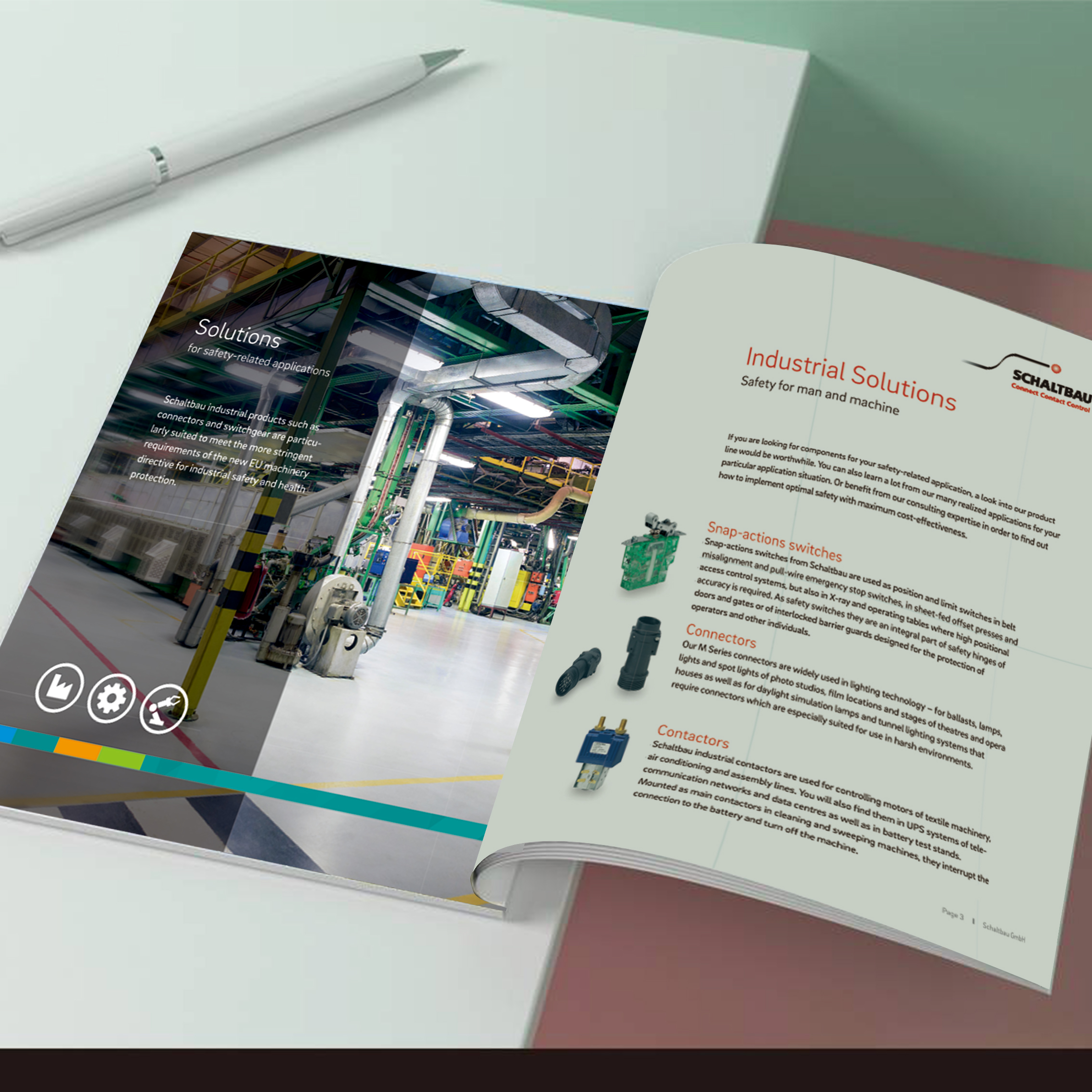
With the rapid development of China's industrial manufacturing industry, the brand promotion of enterprises in the local market is undergoing a deep transformation from emphasis on technical attributes to prominent professional image. This trend is fully reflected in the design of this brand handbook by Schaltbau, a German industrial company. In terms of overall visual style, the manual takes away from the mechanical design common in traditional industrial brochures and uses a clean, clean color scheme with a blue-green hue. This not only creates a more professional and stable brand image for enterprises, but also echoes the trend of consumers' increasing concern about environmental awareness in the Chinese market. at the same time
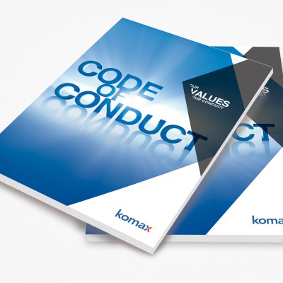
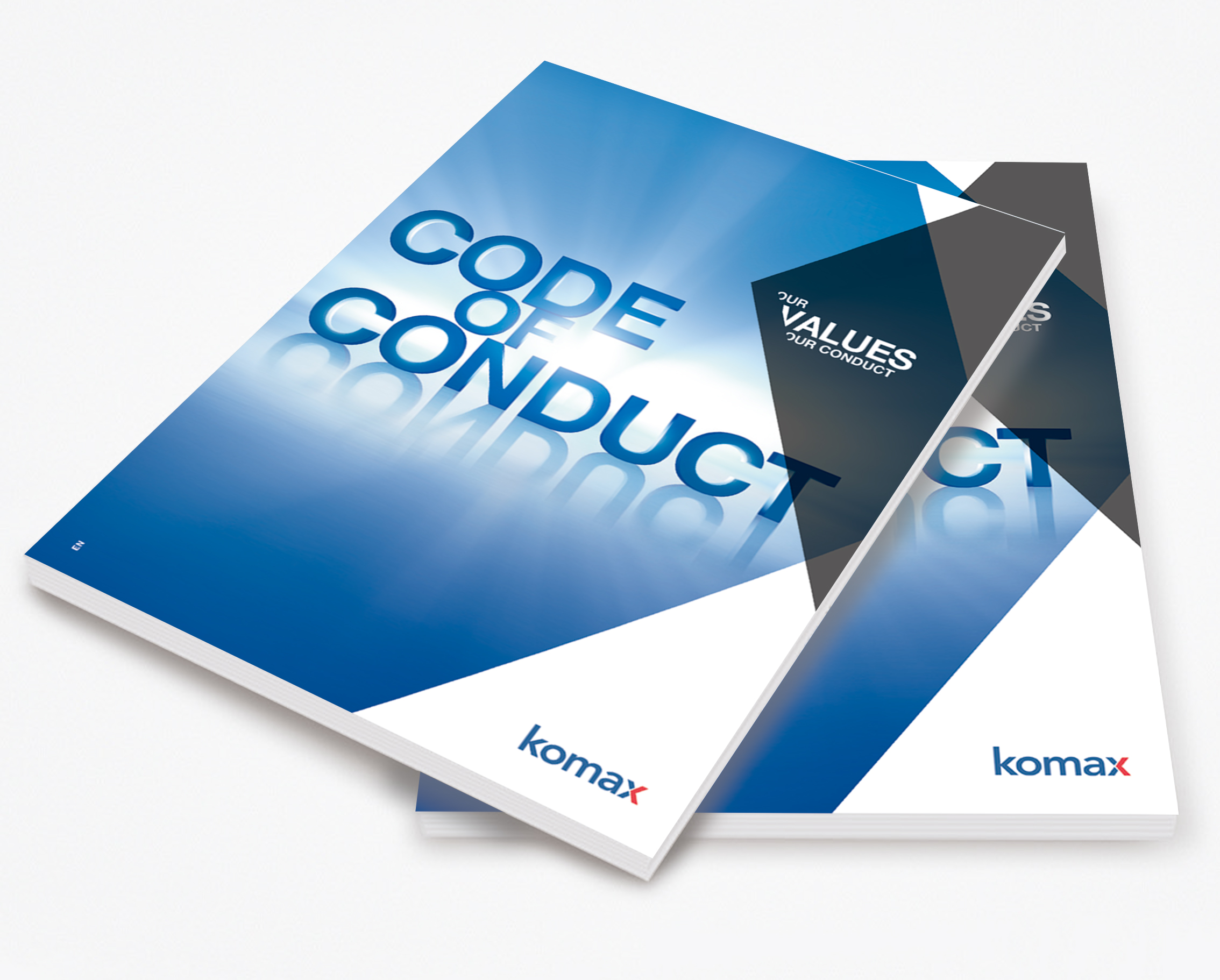
After more than ten years of album design, I found that the manual of corporate code of conduct is changing from a "slogan on the wall" to a "guide in the palm". The case of a subsidiary of a European industrial giant in China is very typical-after the new manual uses bumping technology and metal cold ironing, the circulation rate of employees has increased by nearly half. Today, analyze this booklet to see how foreign-funded enterprises use design to solve cultural differences. Design style: Cold industrial style collides with ink and wash artistic conception. The code manual of foreign-funded enterprises is often criticized as "cold and difficult to understand", but this time the design plays with temperature. The cover is made of 320g rigid grain paper, rough touch simulated metal panel, and paired with Pantone 432C cold gray ironing
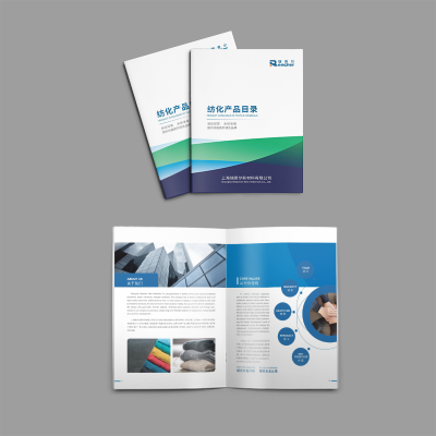
This set of images shows a textile company dedicated to innovation and fashion. The company mainly produces fabrics composed of a variety of colors and textures, these fabrics have unique appearance and texture, can be widely used in clothing, home decor and outdoor products. In the picture, we can see the inside pages of the brochure showing different combinations of colors, textures and textures, as well as the detailed features of the material. These beautiful images not only highlight the unique appeal of the blue fabric, but also highlight its wide range of applications. In addition, the text section describes Blue Fiber as an innovative and stylish textile company dedicated to providing global customers with


