

The four core elements of the group's monthly magazine typesetting design: a solution to create a high-looking corporate internal magazine
Recently, I was rushing to typesetting a monthly magazine, and my eyes were dazzled at the screen! It took me a long time to choose the cover picture, the number of pages suddenly increased and suddenly decreased, and it was almost meaningful to adjust the color tones... Only then did I deeply realize that the typesetting design of a group monthly magazine that can be sold is really not a simple "pile of content". How to make the monthly magazine both beautiful and easy to read, and also convey the spirit of the enterprise? Today, Xiaobian will talk to you about the four key plans behind this!
1. Cover theme: Attraction and connotation at first sight
The cover is the "face" of the monthly magazine, and the choice of theme pictures is very important, which directly determines readers' first impression and desire to read.
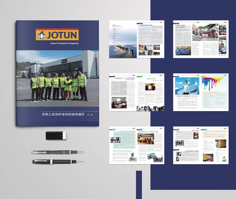
Combined with the seasonal characteristics of beginning of spring, summer solstice, autumn equinox, heavy snow and other seasons, high-definition large pictures are selected for the scene. For example, the spring magazine uses new shoots to symbolize the vitality of the group, and the winter magazine uses warm lights to convey care. The advantages are that it can reflect cordial nature, keep pace with the times and have cultural charm.
We can also consider using the city flowers, characteristic plants, or landmark architectural landscapes where the group headquarters or representative branches are located. It can strengthen the sense of regional belonging and highlight the diversified composition of the group or the connection of core industries (such as trees used by forestry groups, modern buildings used by science and technology parks, etc.).
There is also the branch style round show: in each issue, a branch provides high-quality pictures that can represent its business highlights, team spirit or landmark features. This can promote internal recognition, demonstrate the huge branch and vitality of the group, and is a good window for internal publicity.
In addition, it is the focus of core events and achievements, such as the completion of major projects, the winning of important awards, the silhouette of large-scale events, etc. It can directly demonstrate the strength and achievements of the group, and the timeliness is also strong.
Closely following the core content of the publication of the month or the focus of the group's phases, the pictures should be high-definition, tense, and able to arouse emotional resonance, leaving enough space in the design to highlight the publication title and issue number. Avoid random patchwork or disconnect from content.
2. Page number planning: stabilize the rhythm and improve reading expectations
The number of pages in a monthly magazine is like the "heartbeat" of a journal. Fast and slow (20P and 40P) will make readers at a loss, and the editing process is easily confused.
The editor suggests setting the benchmark page number: according to the content output capacity, budget and readers' reading habits, determine a relatively fixed core page number range (such as 32P or 36P), which becomes a normalized "skeleton".
A small amount of floating (e.g. ± 4 P) is allowed on the base page count. Major topic months (such as annual reports and major project topics) can be appropriately expanded; Regular information months remain benchmarked.
In addition, it is recommended to divide the monthly content into relatively fixed columns (such as "Group News", "Team Style", "Industry Insights", "Employee World", etc.). Each column is allocated a roughly stable interval of pages. In this way, even if the content of a certain column in a certain issue is particularly rich, the balance can be achieved within the controllable range of the total number of pages by fine-tuning the number of pages in other columns.
No matter how fine-tuned the page count is, a clear and accurate table of contents is key to guiding readers and allowing them to quickly locate content of interest.
The advantage of stable page count is that it facilitates printing cost control, improves readers' reading habits (knowing how long it will take to finish reading), reduces the pressure of editorial department to re-plan the layout of each issue, and allows energy to focus more on content quality and typesetting design itself. Don't let readers flip through it and be confused: "Hey, why is this issue so thick/thin?"
3. Visual center of gravity: people-oriented, transmitting temperature and height
Monthly magazine is not only an information carrier, but also a cultural carrier. What is highlighted visually and directly conveys the value orientation of the group.
If you need to highlight employees, you can do this: Make a lot of real, vivid employee work, activities, and award-winning photos (not stiff posing). Set up columns with pictures and texts such as "Star Employees", "Team Stories" and "First-line Style". In terms of design, the character pictures should be large and prominent, and the words and stories should be sincere. This can enhance employees' sense of belonging, pride and recognition, reflect that "people" are the most precious wealth of the group, and make journals more warm. Strong internal cohesion.
If we highlight the corporate culture, we can highlight activities, cases and slogans that embody the corporate spirit (such as innovation, collaboration, integrity and hard work). Presented through carefully designed charts, infographics, serial cultural stories, etc. In visual design, graphic elements symbolizing enterprise spirit can be used. The advantage is that it can continuously strengthen internal common values and codes of conduct, shape a unique corporate character, and is an effective tool for cultural implementation.
If you need brands and products, we can focus on new product launches, technological breakthroughs, successful cases, marketing activities, honorary certifications obtained, etc. Use high-quality product/service images, customer testimonies, data visualization, etc. The design style is more inclined to the refinement and professionalism of commercial albums. This has a very good auxiliary role in displaying the group's strength and professional image to the outside world, being suitable for external readers such as customers and partners, and helping brand building and marketing.
Taking into account both internal and external considerations, dynamic balance. Purely internal monthly magazines can focus on "employees" and "culture"; It is hoped that internal and external communication can increase the proportion of "brand/product". The key is to avoid "four dissimilarities"-each issue should have a clear visual narrative thread, supplemented by other elements. Excellent monthly layout design can make this emphasis naturally revealed through layout language (such as image size, position and color guidance).
4. Color melody: a smart movement under a unified tone
Color is one of the strongest elements of visual memory, which directly affects the overall temperament and brand recognition of publications.
Under the condition that the main color of the group Logo is prioritized, 1-2 core colors (usually brand standard colors) in the Logo can be used as the dominant color system of the monthly magazine. It is applied to key elements throughout the whole journal, such as masthead, headline, important decorative lines, column color blocks, page numbers, etc. It can strengthen the visual identity of the group brand most powerfully, and ensure that the internal magazine is highly consistent with the external image of the group, professional and authoritative.
In the case of extending the theme color system, on the premise of using the Logo color as the keynote, it is allowed to introduce a small number (1-2 kinds) of coordinated auxiliary colors or shade changes of the same color system according to the cover theme or the key content of the current period. For example, for groups with green as the main color of their Logo, bright green and grass green can be used for spring magazines; Autumn issues can be embellished with olive green and golden brown. This layout design not only maintains the overall sense of brand unity, but also increases the freshness and uniqueness of each issue, so that color serves the content expression. Avoid cookie-cutter monotony all year round.
In addition, no matter which mode is adopted, it is necessary to formulate a simple internal color usage specification: clarify the color numbers of the main color and auxiliary color, and specify their usage scenarios and proportions (for example, the main color accounts for 70%, and the auxiliary color/embellishment color accounts for 30%). Ensure consistency in design execution.
The essence of the whole application of color lies in "there is change in unity, and the foundation is kept in change". The main color of Logo is the "root" and "soul" of monthly design, which must be stable; The theme color is a smart "note", which makes the visual "movement" of each issue unique. Don't randomly match colors away from the brand foundation, or be too rigid and lifeless.
Designed carefully, make the monthly magazine the "expectation" of the group. The group monthly magazine is far from a simple stack of information. A carefully planned cover theme, like a unique invitation for each issue; A stable and reasonable number of pages brings readers a comfortable reading rhythm; Clear visual center of gravity selection can accurately transmit the temperature and height of the enterprise; The unified and smart main color has shaped a deep brand imprint. Monthly typesetting design These four elements, like four solid pillars, jointly support an excellent corporate publication with beauty, readability and cultural communication power.

