

Solving the problem of homogenization of enterprise album design: Four steps of brand differentiation expression
I wonder if everyone feels this way? Now, when I open the brochures of many enterprises, I feel like they are carved out of the same mold-similar product pictures, similar typesetting, and even the copywriting styles used are surprisingly consistent. The brochure that the enterprise has made great efforts to print, and customers lose interest after turning a few pages, and they can't even tell who is who. Is it money well spent? Homogenization is quietly making corporate albums lose their due value! Today, let's talk about how to make the album truly a unique "spokesperson" of the enterprise.
To jump out of the quagmire of homogenization, the key is to regard the album as the visual carrier of brand strategy, rather than a simple product manual or photo collection. Here are the key four steps to brand differentiation :
Step 1: Dig deep into the brand genes and find your "uniqueness"
Aside from the product itself, why does your business exist? What are the core values? Compared with your peers, where is your unique charm? Editor's suggestion: Re-examine the brand positioning report, interview core team members and loyal customers, and dig out those stories, ideas or emotional connections that really touch people's hearts and make you different. This will become the "anchor" of the content and vision of the album. A company that focuses on environmentally friendly materials, its album does not pile up technical parameters, but focuses on the core concept of "originating from nature and belonging to nature", using a large number of natural texture paper and hand-painted illustrations to tell how materials come from the forest, and finally the story of friendly return to nature has strong emotional resonance and obvious differentiation.
Step 2: Create a visual language to make the brand "recognizable at a glance"
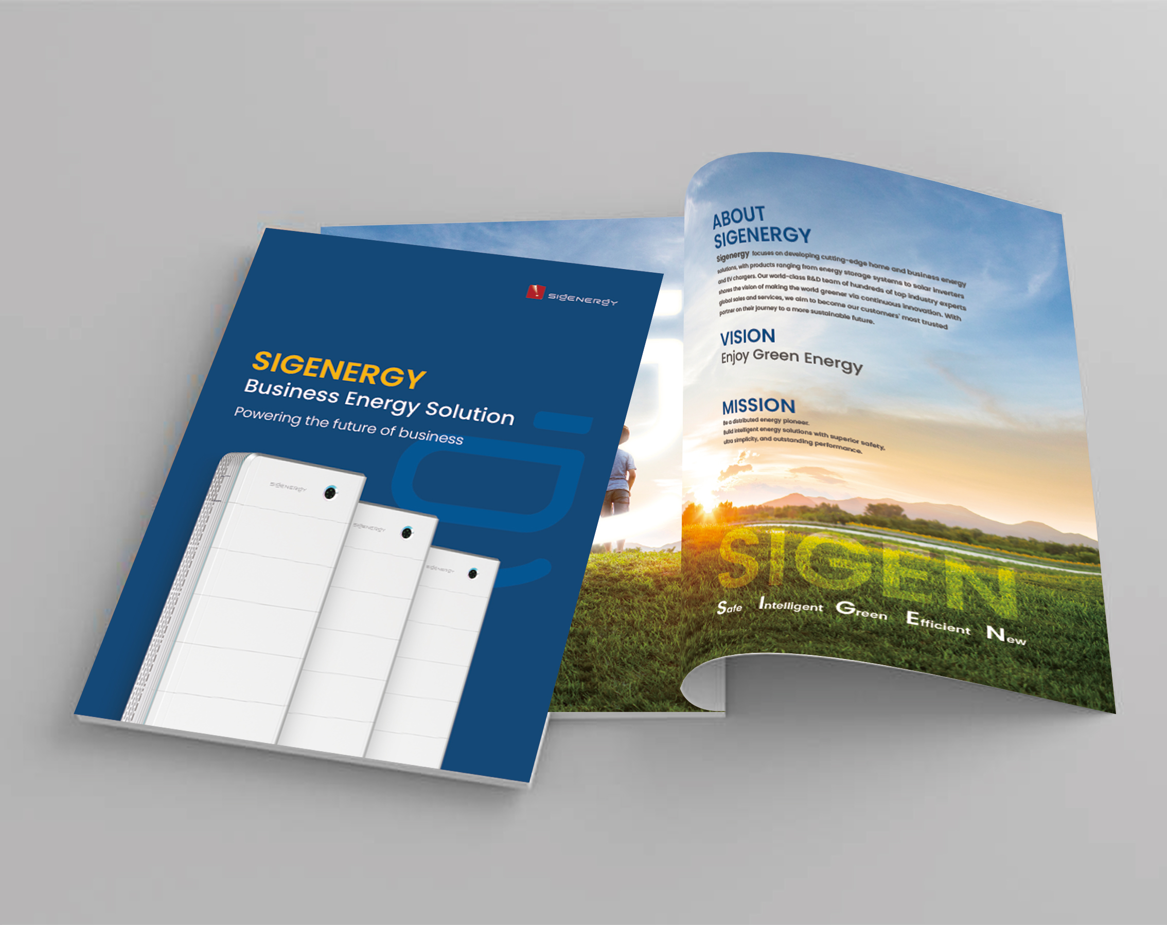
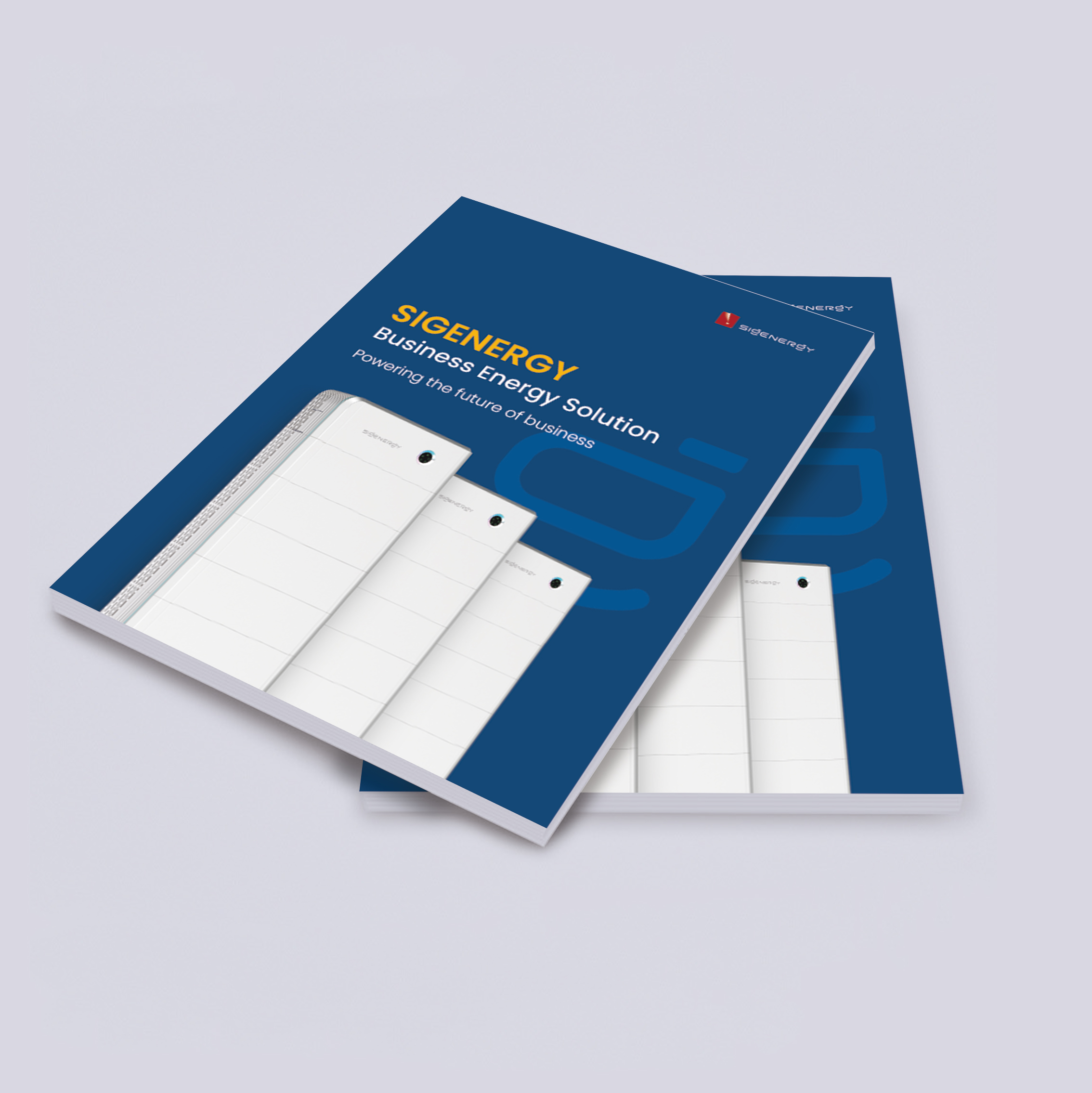
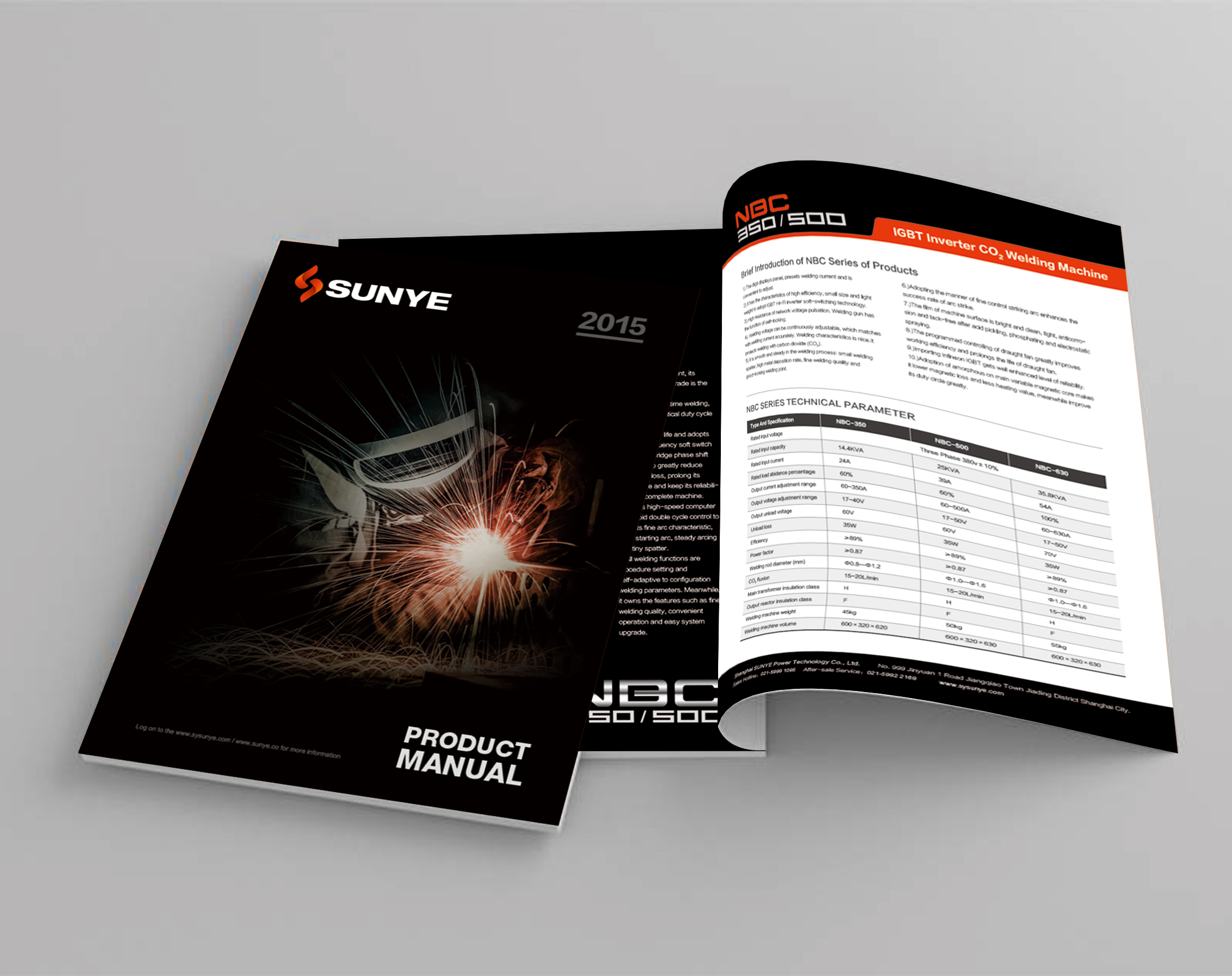
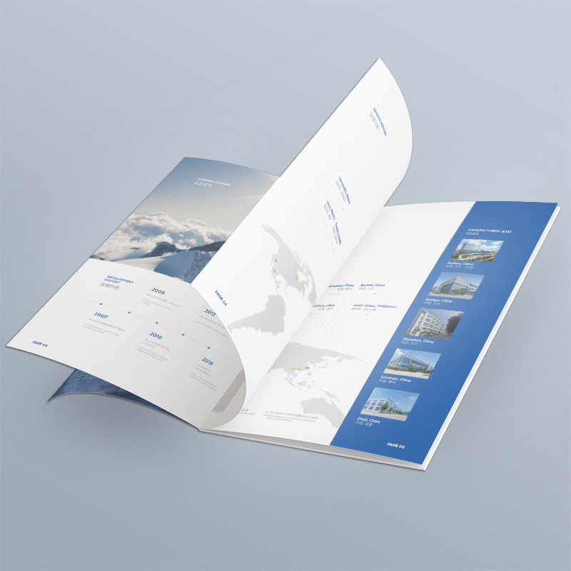
Based on brand genes, build a unique and exclusive visual identity system. Create a graphic, image style or photographic technique that highly encapsulates the brand ethos. Choose an exclusive color combination that can accurately convey the brand's personality (is it a sense of technology, warmth, or vitality?) and strictly run through. Go bold and break the regular grid! Design unique white space ratios, graphic rhythms and visual movement lines according to the brand tonality (is it minimalist, luxurious or creative?). A high-end handmade leather goods brand, the main vision of its album adopts close-up shots of craftsmen's hands throughout, supplemented by calm sepia and a large number of handmade texture backgrounds. The typesetting is sparse and the text is refined. Each page is like displaying a work of art. The temperature of luxury, concentration and handwork comes to your face, which is in sharp contrast to the fast-moving consumer goods album.
Step 3: Tell stories with content and "capture people's hearts" with emotions
A giclee is not a product catalog! Talk less about "what we have" and more about "why we do it", "what pain points we can solve for you" and "what value we have created with users". With customers' success stories, usage scenarios, and real experiences as the core, show how products/services can change their work or life. Avoid blunt technical jargon and slogans. Talk to readers in language with temperature, attitude and even a little personality. Organize content around core brand philosophy or core user needs, rather than simply dividing it by product line. A SaaS software company, its album does not list the functions, but uses the slogan "Let the world have no difficult projects" as it is divided into chapters to tell the story of customers in different industries (such as anxious project managers and start-up CEOs) before and after using its products. The dramatic changes in working status and team efficiency are full of storytelling and sense of substitution.

Step 4: Craft tactile experience, let the impression "stay at your fingertips"
The touch of paper, the texture of ink, and the details of binding are all silent expressions of the brand, and the direct transmission of high-end sense, environmental protection concept or innovative spirit. Material speaks: Choose paper that fits the brand personality (such as recycled paper reflects environmental protection, tactile paper delivers high-end, and special paper shows innovation). On the key information (such as brand slogan and core graphics), skillfully use bronzing/silver, UV, convex, hollowing out and other processes to enhance the texture and memory points. Depending on the content and brand tonality, consider unique format sizes (such as extra-long pull pages to show the timeline, special-shaped cutting to attract attention) or binding methods (such as naked ridges to reflect a handmade feel). A home furnishing brand that advocates "slow life", its album is made of unbleached natural recycled paper, which is warm and simple to the touch; There is a lot of blank space on the inner pages, and the text layout is soothing; The cover brand Logo uses matt blackening process, which is low-key and exquisite. The reading process of the whole album itself conveys the quiet, natural and far-away life philosophy advocated by the brand, which is impressive.
Let Giclee be your brand fingerprint! To solve the homogenization dilemma of corporate album design is essentially to refuse to blindly follow the trend and return to the brand itself. Starting from the mining of brand genes that go deep into the bone marrow, building cognition with unique visual symbols, moving people's hearts with emotional resonant story content, and finally making the experience reach your fingertips with the help of exquisite material technology-these four steps are closely linked to create a unique expression that is difficult to replicate for the brand.
When your album can be recognized, felt and touched at a glance, it is no longer a pile of information, but a vivid carrier of brand charm and value, and becomes a unique "brand fingerprint" in customers' hearts. In the era of information overload, this unique touch and resonance is the winning way for enterprises to break through the homogenization encirclement and win lasting attention. Do a good job album design, the album speaks, tells a story that only you can tell, and you can leave your name in this homogeneous competition.

