Stop messing up the design of corporate brochures! An experienced driver personally teaches 4 tricks, accurate positioning is fast and accurate
After so many years of corporate brochure design, I have handled at least thousands of corporate brochures. To tell the truth, every time I see customers coming to us with a bunch of scattered ideas and vague demands, and the final brochure is either a "complete collection of corporate resumes" or a "collection of product instructions", I am anxious for them! Money is spent and energy is invested, but the effect is like a stone thrown into the sea-it's gone when you hear it. Where is the core problem? Positioning is unclear! If the direction goes astray, no matter how exquisite the design and planning are, it is useless. Today, Xiaobian shares four "fast and accurate positioning methods" summarized in actual combat, helping you sort out your ideas from the source, and making the brochure truly a marketing weapon, rather than a "work of art" at the bottom of the box.
Pain point direct hit: What does the "mess" with unclear positioning look like?
"Big and complete" syndrome: I can't wait to stuff all the glorious deeds and product parameters of the company since its establishment. After reading it, readers are confused and can't grasp the key points at all.
"Self-satisfaction" copywriting: full of "We are awesome", "leading technology" and "first-class service", but it doesn't make it clear "What does this have to do with you (customers)?", "What specific problems can I help you solve?"? "
"Imitate the east" design: look at the competitor's brochure, whether it is suitable or not, just copy the style directly, and the result is neither fish nor fowl, with no brand tonality at all.
Operation "Objective Ambiguity": After finishing the brochure, is it done after distributing it? Or do you want customers to call, scan QR codes and place orders? The action guidelines are not clear, and the conversion rate is naturally low.
"Scene mismatch" is embarrassing: hardcover brochures as thick as bricks are brought to the exhibition, but customers are too heavy to take them; The light single page is used for in-depth negotiation, but it doesn't seem weighty enough.
Xiaobian's way to break the game: 4 quick and accurate positioning methods
The first trick: in-depth communication, not "you say and I listen", but "getting to the bottom" to dig real gold!
What you do: The designer team communicates with the user docking person.
Xiaobian upgrades and patches (pain point refinement method deepens) :
Clarify "true docking people": it is very important to find the right person! Is the marketing manager? Director of Sales? Or the boss himself? Different levels of concern vary greatly. The boss may look at the strategic height, and what he wants in sales is to "sell some ammunition".
List of interview questions (don't talk in general terms) :
Soul Torture 1: Who does this booklet want to impress most? (Accurate to position, industry, pain point, for example: purchasing managers in manufacturing industry, who are suffering from supply chain instability)
Soul Torture 2: What is their biggest annoyance/goal they most desire to achieve at present? (pain points/needs)
Soul Torture 3: After reading this booklet, what do you most want them to remember about us? (Core Values)
Soul Torture 4: After watching it, what do you want them to do next? (Specific action: scan the code? Make a phone call? Visit the web page?)
Soul Torture 5: What occasions is this booklet mainly used for? (Exhibition? For sales visits? Download from official website? Mail?)
Soul Torture 6: What is the biggest difference between you and your peers? (differentiation anchor point)
Be wary of "pseudo-demand": Customers may say "be tall", but if they dig deeper, they may need more "professionalism and reliability" or "innovative vitality". Ask a few more "why" questions.
Case instrumentalization: Prepare some excellent and failed album cases, so that customers can intuitively feel the differences in effects brought about by different positioning. "Look, this kind of information-intensive is suitable for technical customers to read in depth; And this kind of visual impact is more suitable for the exhibition to catch eyeballs quickly. What kind of feeling do you want?"
Output: A clear "User Core Portrait and Core Appeal Briefing".
The second trick: insight into competing products is not "just looking at it", but "my skill solves the cow" to find flaws!
What you do: Learn more about the promotional materials and information of competitors in the same industry.
Xiaobian upgrades and patches (pain point refinement method deepens) :
Lock in "real competing products": not all peers are competing products! Find those who grab the same group of customers and solve the same kind of problems as you.
"Disassemble" instead of "browse" :
Visual layer: dominant color? Design style (simplicity, technology, luxury)? Layout features? Picture style (real shots, illustrations)? What is the overall feeling?
Copywriting Layer: What is the main title slogan? How to express the core selling point? (Technical parameters? Service commitment? Successful cases?) Language style (professional rigorous? Cordial and lively?)? Do they focus on saying "what do we have" or "what do you get"?
Structure layer: How is the directory arranged? (Talk about the company or the product first? How important is the case?) Where is the call to action (CTA)? How was it designed?
Value layer: After reading it, what is the core value they want to convey most? (Reliable? Innovative? Cost-performance? Speed?)
Looking for "blank spots" and "difference points" :
Blank spot: Customer pain points that competing products ignore? Didn't emphasize your own advantages?
Point of difference: What aspects are we really better than them? (Don't be self-satisfied, be objective) Is this "strong point" what the target customers care about most?
Punctuation: how can we express the value points that are common in the industry and recognized by customers better and more convincingly? (For example, if we all use "24-hour service", can we add the data of "average response time < 30 minutes"?)
Output: A "Analysis and Comparison Table of Core Competitive Product Picture Albums", which clarifies the key differences between our "I have what others don't have, and I have what others have".
The third trick: focus on the goal, not "a slogan", but an action order of "hitting wherever you point"!
What you do: Use the most concise sentence to state the goal to achieve of the corporate brochure.
Xiaobian upgrades and patches (pain point refinement method deepens) :
"One sentence" template: "Through this album, under the [core scenario], let [target users] realize that we can solve their [core pain points/meet core needs] and guide them to complete [specific actions]."
Practical examples:
Error (vague): "Promote brand awareness."
Correct (precise): "At the 2024 XX International Industrial Exhibition, let the visiting automation equipment purchasing manager realize that our precision bearings can effectively solve the problem of insufficient long-term operation stability of their equipment, and guide them to scan the QR code to make an appointment. Technical exchange meeting after the booth."
Another example: "When used for sales visits to high-end medical customers, let the director of the hospital equipment department clearly understand that our one-stop medical purification engineering solution can ensure that the construction of its new campus is delivered on time and in compliance, and guide them to leave contact information. Obtain detailed project planning."
Why must there be a "single core goal"? Resources are limited and information overloaded. A booklet wants to achieve "attracting investment, recruiting, selling products, and building brands" at the same time, but the result is often none of them well. Only by concentrating firepower can we penetrate cognition!
"Call to Action" is the soul of the target: the target must contain clear, specific and actionable action instructions! Scan code, make phone calls, leave messages, visit specific pages, download white papers... The design should be eye-catching and easy to operate.
Output: An undisputed statement sentence of the core goal and call to action of the album that has been confirmed by the team.
The fourth trick: The plan is closely linked, not "around positioning", but "a steel nail" to the end!
What you do: Make sure that the design and planning plan revolves around positioning.
Xiaobian upgrades and patches (pain point refinement method deepens): This is the easiest link to deviate! The previous effort was in vain, and he often died at this step.
The "tightening curse" of content planning :
Do subtraction cruelly: Any content (text, pictures, cases, data) should be asked: Is this related to our core target users? Can it support our core differentiated value? Can it push users to complete targeted actions? If you can't answer one of the three questions, delete them decisively! Don't feel distressed.
Structure serves the goal: If the goal is to build trust quickly, success stories/customer testimonies may be pre-empted; If the goal is to show technical depth, product analysis/technical parameters should be highlighted; If the goal is to stimulate interest (such as an exhibition), the visual impact and core proposition of the cover and opening must be extremely prominent.
Copywriting speaks "human words": avoid self-satisfying industry slang and empty adjectives. Speak clearly "what benefits can you get" and "why choose me" in a language that the target customer can understand. Use "you" more than "we".
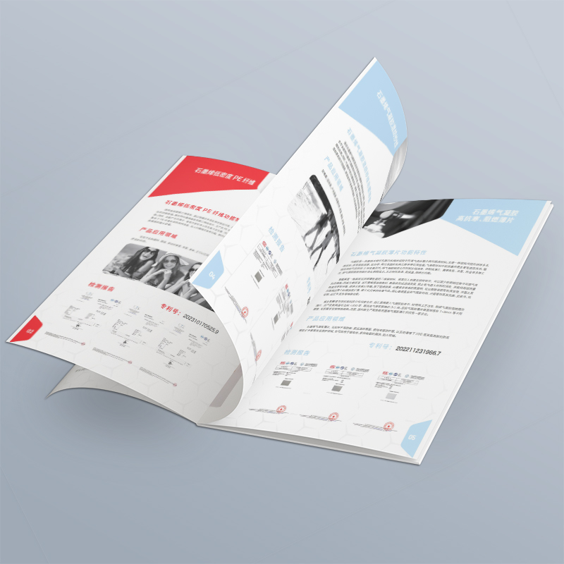
The "Location Translator" of Visual Design :
Style matching value: "Professional and reliable" may use steady dark blue, rigorous typesetting and high-quality real shots; "Innovative vitality" may use bright colors, dynamic graphics and illustration styles; "Environmental protection and nature" may use green, organic texture and hand-painted elements. Design style is a visual expression of core values!
Clear information hierarchy: Under preset usage scenarios (such as noisy exhibitions), the headlines, subheadings, text, data, and CTA must be clearly hierarchical, allowing readers to grasp key information within seconds. Make good use of white space, contrast and font size.
Pictures Tell Stories: Pictures Are Not Decorations! Choose images that reflect core values and resonate with your target customers. Showing the "results" (smiling faces of satisfied customers, equipment that operates efficiently) is often more convincing than showing the "product itself".
Form matching scenario :
Exhibition tools: moderate size (easy to take and carry), visual explosion of the cover, concise and powerful information on the inner page, prominent key points, and super eye-catching action guidance (QR code). Consider hard-wearing paper.
Sales Assist: It can be slightly thicker to reflect the texture. The content is more in-depth and logically clear, making it easy for sales to explain page by page. The blank space is convenient for sales records. The online version should be easy to display on the flat panel.
Mailing/official website download: The cover design should be attractive to open in a pile of emails/files. Online PDF should optimize the loading speed, have clear bookmark navigation, and facilitate search.
Core penetration points: The core value proposition (refined by the second move) and the core call to action (clearly defined by the third move) must appear and be repeatedly strengthened in the key positions of the album (cover, back cover, inner chapter pages, end)! Visually, it should also be focused.
Output: A "Album Content Outline and Visual Style Guide" based on precise positioning, and strictly review whether it deviates from positioning throughout the design process.
Guide to avoiding pitfalls: Those thunders the editor has stepped on
Boss opinion ≠ customer needs: The boss's preferences are very important, but it is the customer who ultimately pays the bill. Use the data mined in the first trick and the clear goal in the third trick to convince the boss to put customer needs first.
Good-looking ≠ effective design: Aesthetics is the foundation, but the core is to serve marketing goals. A brochure with cool design but confusing information and no contact information is a failure.
The pursuit of "perfection" leads to delay: after the positioning is clear, the first draft is quickly published, small-scale test feedback, and iterative optimization is carried out. It is a hundred times better than holding back the big move to pursue "perfection" but missing the market opportunity.
Ignore the "landing" details: Is the QR code link valid? Is the contact number up to date? Is the online version suitable for mobile phones? These missteps in detail will directly ruin all efforts.
Positioning the country, Corporate Brochure Design, is by no means simple graphic typesetting and printing. It is a strategic investment in deep communication with target customers. Precise positioning is the "Beidou navigation" of this communication. Make good use of these four tricks of Xiaobian-in-depth communication to dig out demand, insight into competing products to find differences, focus on goals and determine actions, and closely follow the plan without deviating. You can quickly sort out the clues from the mess, spend your money on the cutting edge, and make a good picture album that can really "talk", "sell goods" and "circle powder"! Don't let ambiguity of positioning become a stumbling block on your marketing road, take action!

