

6 key points of corporate internal magazine typesetting design, typesetting tips with pictures and texts [Shanghai Shen Youmei] Dry information
Dear colleagues in charge of corporate culture, hello! As an "old editor" who has been deeply involved in album design services for many years, I understand the "internal magazine complex" of our group enterprises too well. Monthly, Bimonthly, Quarterly... No matter what the frequency is, a handy and illustrated corporate magazine is definitely a heavyweight weapon to display the corporate image, unite the hearts of employees, and convey brand value! The group has many subsidiaries, miscellaneous departments and massive news materials. How to turn them into a pleasing publication with refined content? This layout design effort is too crucial!
Today, the editor will combine the practical experience of serving many group companies over the years to chat with you about the layout design of corporate internal magazines, especially the six core points of how to be illustrated and professional and eye-catching. This is not a general talk, it's all real dry goods, helping you avoid pitfalls and make lottery!
Point 1: The information level should be "bright", and it is king to grasp the key points at a glance!
Imagine, when readers get the internal magazine, are they blinded or bright at first glance? It depends on whether the information hierarchy is clear or not. We can't expect readers to dig key points in the sea of words like archaeology.
The "main title" should be a "C star": the font size, font, color and even special typesetting (such as superimposed on a shocking big picture) must be made eye-catching enough to instantly convey the core theme. Subtitles and subtitles should form a clear echelon with distinct levels.
The "grid system" is an invisible skeleton: don't underestimate those invisible grid lines! They ensure that layout elements (text blocks, pictures, icons) are orderly aligned and properly spaced. Left alignment, right alignment or centering must be regular, not a hammer in the east and a stick in the west. Clutter is the natural enemy of beauty.
"Visual flow" design guides reading: The reader's eyes are "path-dependent", usually "Z" or "F" shaped. We should skillfully use the position of the picture (important pictures are placed on the upper left or visual center), the direction of the character's line of sight, arrows, color block extension lines and even blank space to guide the natural flow of sight to the key content like a director. The eyes of a good picture are worth a thousand words.
"Blank space" is a high-end luxury: don't fill the page! Margins, paragraph spacing, gaps between pictures and texts, these "negative spaces" are not waste, but the key to let the layout "breathe" and the key points "jump out". Appropriate blank space is the secret to improving readability and professionalism.
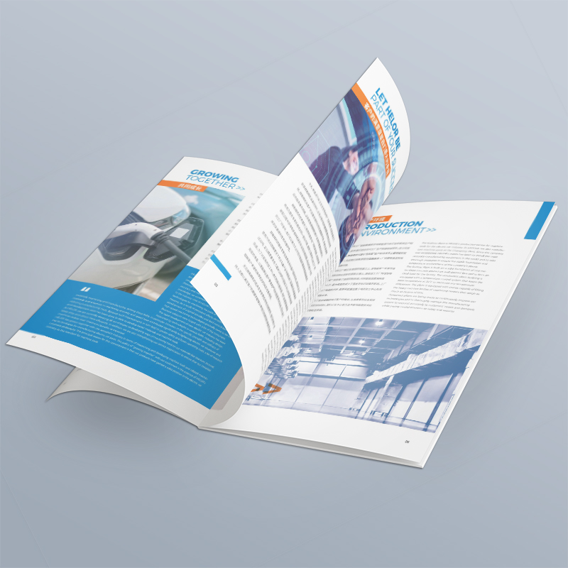
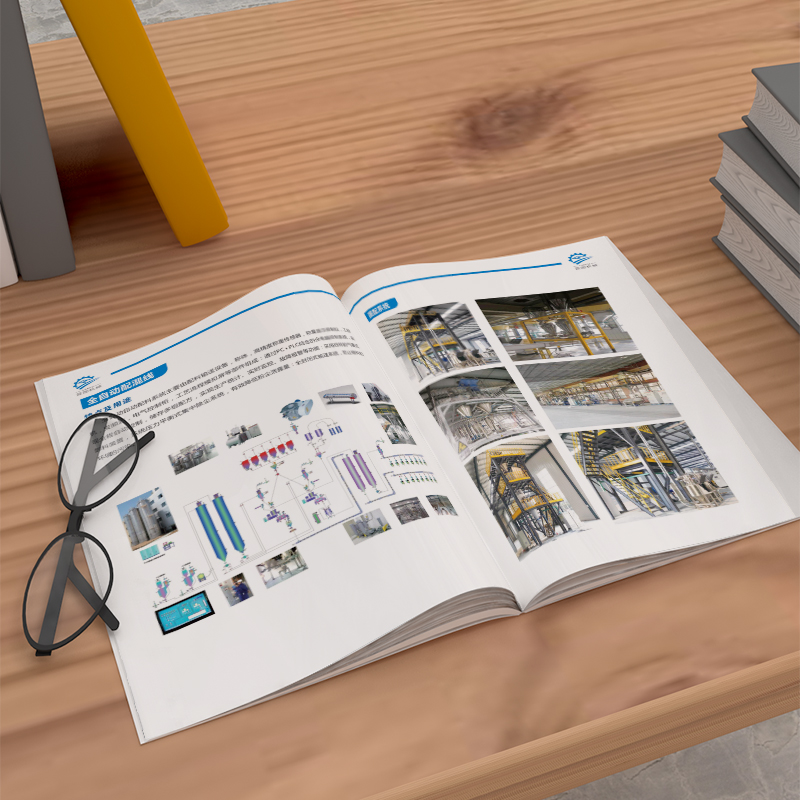
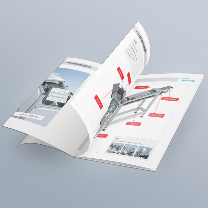
Point 2: Pictures are not only embellishments, but also "talking" hard power!
"Illustrated and illustrated", the picture is half the sky! However, if the picture is not used well, the grade of the whole publication will be lowered in minutes.
"High image quality" is the bottom line, but also dignity: pictures with blurred, noisy, skewed composition and distorted colors must not be used! Prints in particular require sharp large images with high resolution (300dpi). Activity photos taken by mobile phones must be professionally screened and post-processed.
"Strong correlation" is the soul: the picture must fit perfectly with the text next to it! Report the innovation of the workshop, with a picture of the office meeting? Then it's a joke. Pictures should truly reflect corporate activities, character spirit, product details or cultural atmosphere, and avoid using blunt and irrelevant "universal material library" pictures.
"Diversity" is charm: don't just use one type of picture!
News documentary photography: capture the wonderful moments of meetings, events and project sites, which are true and powerful.
Portraits: Exclusive interviews, excellent employee displays, pay attention to natural light, vivid expressions, and show the character's elegance.
Product/scene diagram: Clearly display the company's products, modern office environment or grand project site.
Infographic: This is high-order gameplay! Present complex data, processes, and organizational structures with visual charts, which are intuitive and easy to understand, and the amount of information is bursting.
Illustrations/Icons: Add interest and a sense of design, explain abstract concepts or as embellishments (style must be unified!).
The "relationship between pictures and texts" should be close: the position of pictures should be as close as possible to its explanatory text. Illustrations (picture descriptions) should be concise and accurate, supplementing key information that the pictures cannot express (such as characters' names, positions, specific scene descriptions).
"Size cropping" shows skill: important pictures should be boldly enlarged to create visual impact; The diagram of the auxiliary explanation can be smaller. Learn to crop reasonably, remove background interference, highlight the subject, and make the picture more focused.
Point 3: The visual style should be "unified" and the brand brand should not be lost!
The internal magazine is an important extension of the corporate image, not a show of the designer's personal style! Unity, professionalism and brand tonality are the core requirements.
The "color system" strictly adheres to VI: the main color and auxiliary color in the enterprise VI manual are the imperial edict! The main color is used for titles, key information, important decorations; Auxiliary colors are used to enrich layers and embellishments. Colors should be restrained to avoid colorful "local style". The emotion conveyed by color should also conform to the corporate temperament (the calmness of technology blue, the enthusiasm of vitality orange, etc.).
"Font specification" is the source of sense of order: it is best to limit the use of 2-3 fonts in the whole journal. Usually, a highly readable serif (such as Song type) is used for the main text, and a concise and modern sans serif (such as bold type) is used for titles and subheadings. The font size level (text, subtitle, headline, introduction, etc.) must be unified throughout the journal.
"Layout template" is the guarantee of efficiency and unity: design fixed layout templates for different columns (preface, company news, in-depth topics, employee stories, cultural life, etc.). Including title position style, color scheme, graphic and text matching ratio, decorative elements, etc. This can not only ensure that the style of the whole publication is highly consistent, but also greatly improve the later typesetting efficiency.
"Brand elements" are cleverly integrated: corporate Logo, core Slogan, brand auxiliary graphics, etc. are naturally integrated into headers, footers, chapter separators, column pages, etc. Instead of stuck it bluntly, it becomes a part of the design and constantly strengthens brand recognition.
Point 4: The proportion and rhythm of pictures and texts should be "relaxed" to make the reading experience comfortable!
Good typesetting is like a piece of music, with ups and downs and rhythm. Avoid suffocating text throughout, and prevent full-page pictures from lacking depth.
"Proportional coordination" looks at the content: in-depth analysis of the article, the text is the main body, the pictures are more refined than more, and high-quality charts are bonus points. Event reports and product promotions need more pictures to support them, and the text outline is concise. Find the golden balance between pictures and text.
"Layout rhythm" creates experience: flexibly use different layouts to create a sense of reading rhythm :
Banner typesetting: It appears formal and stable, suitable for important statements or in-depth articles.
Column typesetting (double/three columns): increases flexibility, is more suitable for longer text content, and reduces reading fatigue.
Big picture spread: When you open the publication, the shocking big picture will come to your face, which is suitable for the frontispiece or the opening of a heavy topic, and instantly catches the eye.
Mixed layout of pictures and texts: Text surrounds pictures and pictures are embedded in text blocks to increase the vividness and interaction of the layout.
Blank Pages: Dare to Leave Blank! It is used for prefaces, chapter transitions or quoting important quotations to give readers' eyes and thinking a "breathing point" to rest, but it is more advanced.
"Breaking the routine" needs to be cautious: on the premise of ensuring the overall unity, you can occasionally try a small breakthrough on a certain page, such as special arrangement of text, special-shaped cropping of pictures, superposition of transparent color blocks, etc., to create a little surprise. But remember that restraint is a virtue, too much is too late, and the loss outweighs the gain if you destroy the sense of integrity.
Point 5: Details are the devil, and only by "striving for excellence" can you show your professional qualities!
The professionalism and credibility of an internal magazine are often hidden in the details that are most easily overlooked. A small mistake may greatly reduce the previous efforts.
"Proofread! Proofread! Proofread again!": This is a lifeline! The text content (including all captions!) must ensure zero typos, zero syntax errors, zero data errors. After the design is completed, be sure to arrange multiple people and multiple rounds of cross-proofreading, and it is best to print it out.
"Alignment OCD" is beneficial: all page elements (text block edges, picture borders, mouldings) must be strictly aligned with the grid or with each other. Jagged is a typography taboo.
"Spacing consistency" is the basic skill: line spacing, paragraph spacing, word spacing, gaps between pictures and text, page margins... The whole journal must maintain a uniform standard (or change according to preset rules). Inconsistencies can feel rough.
"Picture processing" should be flat: for pictures of the same type (such as portraits of all people), the color tone, light and shade, and contrast style should be as uniform as possible. Avoid random mixing and matching of this cool tone, that warm tone, this one with a border and that one without (unless there is a clear creative purpose).
"Page numbers and headers and footers" should be clear and accurate: the page numbers should be easy to find and the design should be clear. The information in the header and footer (publication name, issue number, current column name) must be accurate, and the typesetting format must be consistent throughout the journal.
"Output adaptation" should be considered in advance: at the beginning of the design, it is necessary to make it clear whether it will be paper printing, electronic PDF or web browsing? This directly affects picture resolution requirements (print 300dpi, screen 72-150dpi), color mode (print CMYK, screen RGB), and whether print bleed bits need to be reserved. Don't wait until it's done to find out that it doesn't meet the output requirements.
Point 6: Content refinement is the foundation, and only by "overall control" can we get rid of the ruins and preserve the essence!
This is so important! Especially for group enterprises, there are many subsidiaries and departments, and the enthusiasm for submission is high. The press releases collected in the initial stage are often huge in number or even overlapping in contents. At this time, content screening and overall planning before typesetting design are very important!
"Editor-in-chief thinking" first: Typesetting designers (or colleagues in charge of content) need to have a certain "editor-in-chief" perspective. Not all contributions are suitable for putting, nor is it the more you put, the better. It is necessary to carry out strict press release screening and content integration around the current theme, key tasks of enterprises and communication goals.
"Remove redundancy and focus on key points": merge manuscripts that repeatedly report the same event; Abandon content with weak timeliness, low information value or deviation from the theme; Refine the core information of the manuscript and avoid long speeches. Remember, the internal magazine is a boutique display, not an information trash can.
Guidance content of "Layout Planning": In the early stage of design, preliminary layout planning and allocation are carried out according to the general content volume and importance. For example, what to put on the front page headline? How many P do important topics account for? How to balance space in department/subsidiary coverage? This can effectively guide the selection of content, and avoid finding that the content can't be stuffed or empty in later typesetting.
"Communication and coordination" is the key: maintain close communication with the submitting department and the person in charge of corporate culture, explain the screening principles and layout planning, and strive for understanding. Provide clear submission requirements and content direction guidance to improve manuscript quality from the source.
"Whole" is greater than part: always remember that the internal journal is an organic whole. The selection and layout of every article and every picture should serve the information transmission efficiency, reading fluency and visual beauty of the whole publication. Just because a certain department has too many manuscripts, it can't be forced to destroy the overall harmony and rhythm.
Well, regarding how to do a good job in the typesetting design of enterprise magazines with illustrations and texts, the six key points summarized by Xiaobian-clear information level, high-quality picture application, unified brand visual style, careful picture ratio and rhythm control, extreme detail processing, and crucial global content control and screening-hope to bring tangible help to all colleagues.
An excellent bookEnterprise Internal Journal Design, is not just a technical activity, it is also a systematic project that integrates brand communication, corporate culture cohesion, content planning and visual aesthetics. When we integrate these six key points and carve every page with our heart, what we gain will not only be a publication that employees love to read and customers praise, but also a powerful improvement of the corporate brand image and a vivid interpretation of the corporate culture. Remember, a good internal magazine can speak by itself. It can cross the department wall, connect the hearts of employees, and become an intangible valuable asset of the enterprise! Come on, fellow insiders!

