

The appearance of the group's internal magazine has overturned? Don't step on these five typesetting design "minefields"!
Do you all the designers who are fighting in the front line of the group's internal magazine often have such grievances: the content is carefully crafted, the pictures are one in a hundred, and the finished product comes out-no matter how you look at it, something is wrong! Either like a pot of information "hodgepodge", people are dazzled and can't find the north; Either the fancy and whistles are like small street advertisements, which lower the tall temperament of our group; Otherwise, it is dense and breathless, or empty as if "cutting corners"... Not to mention those typos that appear suddenly, which simply make people want to disappear in place! Don't panic, nine times out of ten, these "face value rollover" scenes are planted in the key link of design and typesetting. Today, let's talk about the reality and find out the five most common "minefields" in the design and layout of internal magazines. Today, Xiaobian will share with you how to avoid pitfalls elegantly, so that our internal magazines can instantly "branch up" and become a beautiful business card that conveys the spirit of the enterprise!
Minefield 1: No distinction between primary and secondary? Readers are confused, focusing on "invisibility"!
As soon as I opened the internal magazine, hoo! Leadership speeches, department happy news, employee stories, industry dynamics... Everything was covered in his face! The titles are all about the same size, the position of the pictures is so capricious that readers don't know where to put them. Carefully prepared core content? I was already drowned in the ocean of information, and I couldn't find it!
Why not? It feels like entering a giant supermarket without a shopping guide, and you have to be dizzy if you want to buy a bottle of soy sauce. Readers are impatient and important information is not conveyed. Isn't our internal magazine busy in vain?
Usually we can handle it this way: play with the visual "C-bit"! Want readers to grasp the point at a glance? When designing typesetting, you have to learn to "arrange troops". In terms of design, first set the "pillar" (core theme or heavy article) of each issue and give it the brightest "C position"! How to shine? The main title is enlarged for me, the font is distinctive, the color is the most eye-catching one in Enterprise VI, and enough "breathing space" (blank space) is left around it to make it stand out from the crowd. The secondary title is responsible for plate partitioning, and the font size, thickness and color should be clearly distinguished from the main title. The title of the text is kept uniform and fresh. Remember, blank space is not a waste, it is a sense of high class and a secret weapon to guide your sight! (Case: A certain issue focuses on "technological breakthroughs", and directly makes the large picture of the core product into a cross-page visual center, with the main title "Intelligence · Creating the Future" in oversized, technological font, leaving blank areas around it. Other related report titles are uniformly used with slightly smaller and stable secondary titles, and the primary and secondary titles are instantly clear, so it is difficult not to pay attention!)
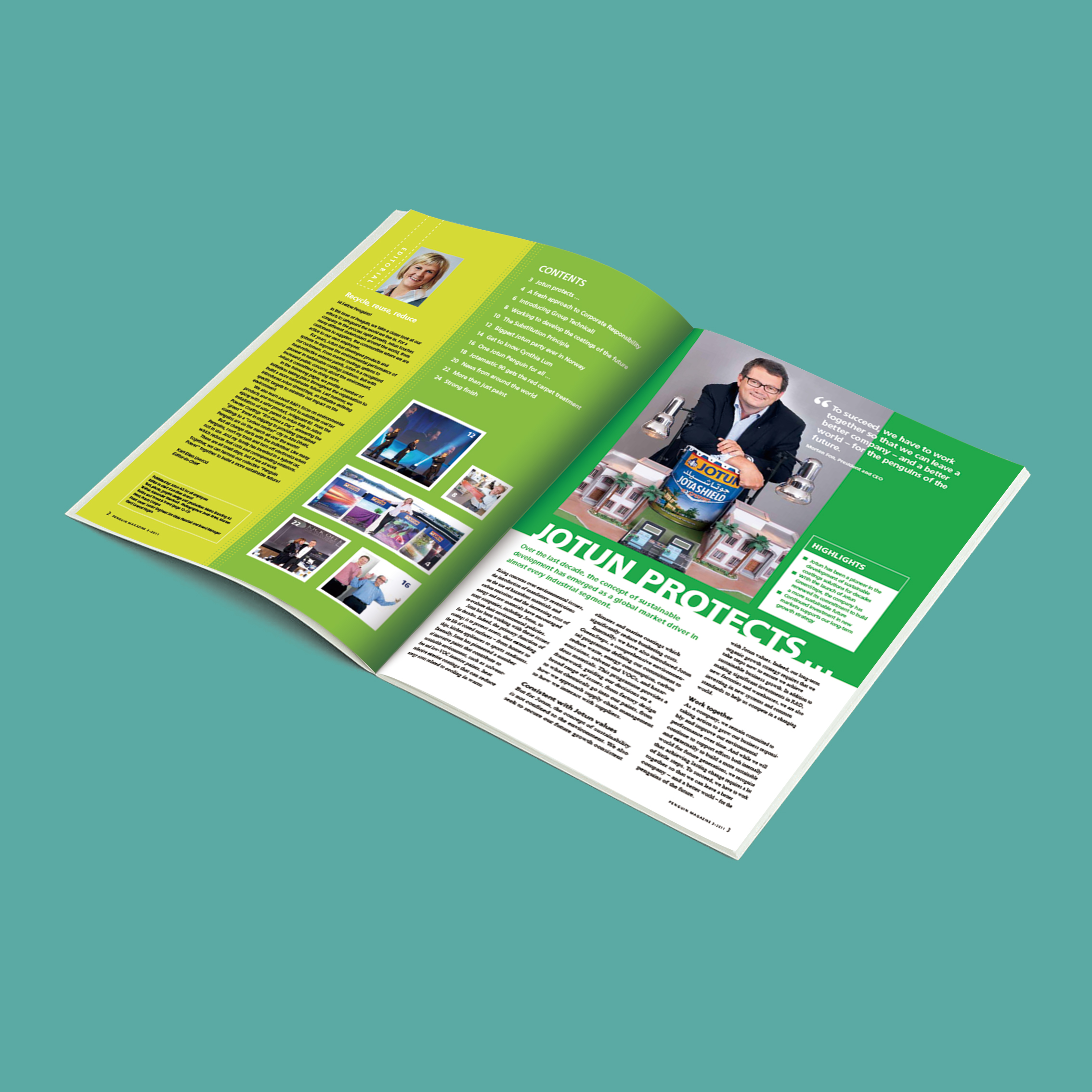
Minefield 2: Mountains of elements? Dazzling, aesthetic feeling "offline"!
Oh my God, is this page the scene of the "Designer Skills Contest"? Fonts can't wait to collect stamps (song style, italic style, art style big fight), colors are colorful like knocking over the palette, borders, shading, small icons see every opportunity... The whole page is noisy, and my eyes don't know where to look. Not only is it devoid of beauty, but it also has a sense of cheapness.
Too "lively" has become visual pollution, and it is a trivial matter to interfere with reading. The key is that our group is unprofessional and tasteless. Do you want this corporate image?
We learn to do subtraction, and the sense of advancement comes naturally! The essence of good design and typesetting lies in "restraint". In terms of design, the font should be "broken away" first! It's best to choose two types for the whole magazine: one is responsible for "reading comfortably" (text fonts, such as Microsoft Yahei and Siyuan Song style, font size 9.5-10.5), and the other is responsible for "catching people's eyes" (title font, optional one with a little personality, but don't exaggerate). More than 3 kinds? Da meh! The color must be more disciplined and firmly grasp the main color of the enterprise VI. Set a main color with 1-2 harmonious auxiliary colors (it is best to derive from the main color). Those dazzling fluorescent colors and saturated off the charts colors, all pass! Color blocks are used to distinguish content or emphasize key points, not to be used as wallpaper. Decorative elements (lines, small icons, shading)? Order so far! Their purpose is to help readers sort out the content structure and guide their eyes (such as dividing areas with thin lines and marking prompts with small icons), rather than simply "looking fancy". Remember, in design and typesetting, blank space itself is the highest decoration! (Case: In a group's internal magazine, the main color is corporate dark blue, and the auxiliary colors are light gray and off-white. The text is Microsoft Yahei No.10, and the title is Founder Lanting Special Black. When the whole magazine only quotes the golden sentence of corporate culture, it is lightly set off with a very light blue thin wire frame and a very light gray shading. The overall effect is called a refreshing atmosphere!)
Minefield 3: Layout "roller coaster"? Too crowded space, experience "crash"!
Some cultural internal journals are either "impenetrable": the characters are as small as ants, the line spacing is narrow enough to catch mosquitoes, the pictures are next to each other, and the margins can't wait without them, which makes people's brains painful; Either it's a "vast land and sparsely populated" type: there is nothing in a large blank space, and the content is pitifully shrunk in the corner. I feel that this layout is really unjust!
Too crowded? After reading for ten minutes, eye drops have to be dropped three times! Space? It seems that the content is empty and the design is not careful. No matter how you look at it, it makes people feel unprofessional and waste resources.
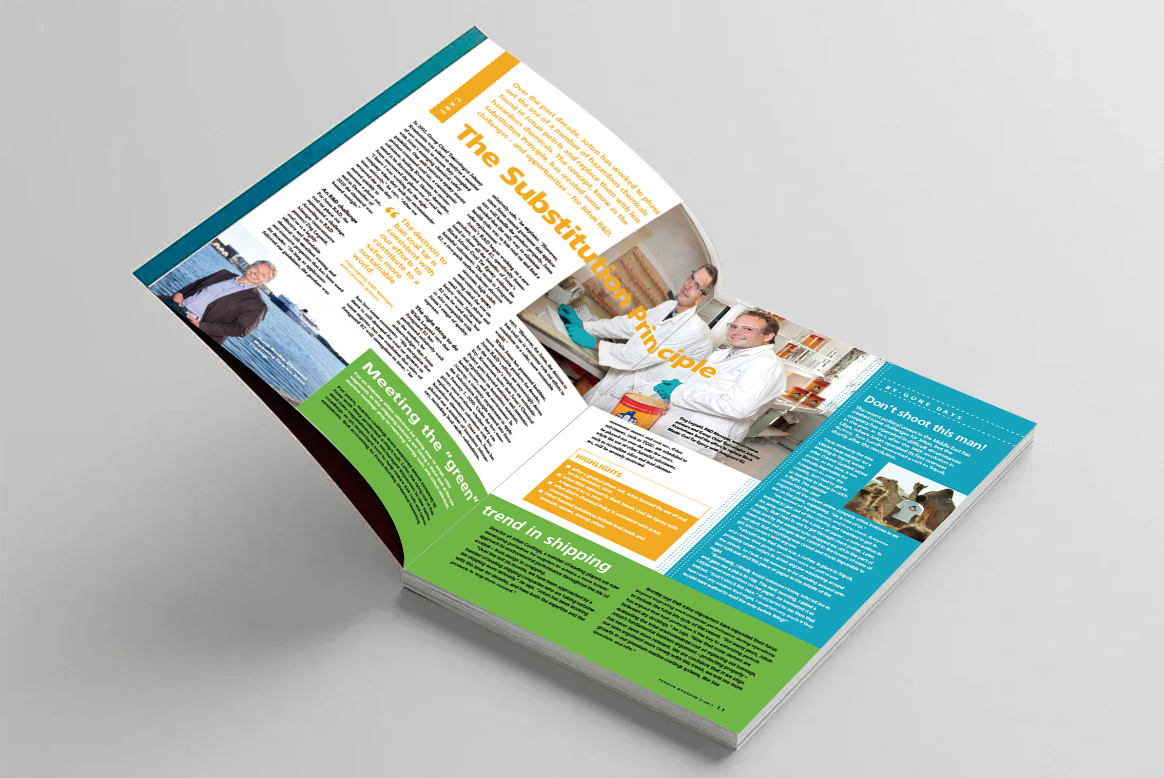
Pay attention to finding a good rhythm here, breathing is king! Comfortable design and typesetting require tension and relaxation. Before typesetting, lay the "foundation"-with a grid system (imagine some invisible reference lines). Let the words and pictures align with these lines obediently, and the layout will naturally be regular. The margin is the "picture frame" of the content. Don't be too stingy (usually 1.5-2.5 cm, depending on the form for adjustment). Line spacing and word spacing determine the "breathing feeling" of words. The text line spacing is usually 1.5 to 1.8 times the font size (for example, the 10-size word, the line spacing is set to 15-18 points), and the kerning is defaulted or slightly widened. Between paragraphs, also remember to leave some blank space (0.5-1 line height). Around the picture, above and below the title, and between the plates, these "blank spaces" should be consciously planned when designing. Leaving blank space is not lazy, but the key to making the layout breathable and upgrading the grade!

Minefield 4: "Finding fault" with mistakes and omissions? Professional design, "house collapse" in one second!
"President"? "Company"? Wrong date? Does the data not match before and after? Statements read stuttering?... These inconspicuous small "mines" were blown up in the internal magazine, and the effect was quite "shocking".
Why not? Lethality MAX! Let the authority and professionalism of the internal journal instantly shatter. Readers will wonder: Can the content be reliable if such obvious mistakes can't be found? From making jokes, to causing misunderstanding, where are the faces of enterprises and editorial teams? The hard-built professional image may be destroyed by a few typos.
Careful proofreading process is the lifeline! No matter how good the content is, no matter how beautiful the design and typesetting are, it can't stand the "bottom-of-the-pot" of mistakes and omissions. There is no shortcut to this matter, it must rely on the process of iron. Responsibility to people is the key! Strictly implement the "three schools and one reading": the junior school (the editor reads it first), the second school (someone else cross-reads it), the third school (experienced old editors or supervisors check the gate), and read through (finally scan the whole quickly before press or publishing). Expect to get it done in one go? Absolutely not! You must also have skills: print out the proof (the screen is easy to leak) and pass it word for word. After a part of the school, come back after a break ("cold treatment"), and you often make new discoveries. Make good use of software spelling grammar check, but don't be superstitious about it. It can't handle homophones, professional words and logical errors! Names, positions, numbers, dates, and technical terms are the key targets. For particularly important manuscripts (leadership speeches, policies), read them aloud, and ears are easier to catch language errors than eyes!
Minefield 5: Banner "building walls"? Desire to read, directly "return to zero"!
No matter how long or important the article is, typesetting is just one word-banner to the end! Especially the long speech, the full screen of dense text walls, you can't see the end at a glance, which instantly makes people lose the courage to open it.
It feels like hiking across the Gobi Desert, it's so exhausting! It greatly increases reading fatigue, has low efficiency, and the layout is monotonous like an old antique, which is completely inconsistent with modern people's reading habits.
Xiaobian suggests that it can be flexibly divided into columns, and "breaking the wall" has skills! Want to improve your reading comfort? Column division is a required course in designing typesetting! For common A4-sized internal journals, typesetting the main text in 2 or 3 columns is a golden choice. The column width is narrow, and the distance between eyes moving left and right is short, so it is natural and easy to read. But just dividing columns is not enough, you have to learn to "break the wall"! In long articles, consciously insert elements to break the monotonous column line: put a high-quality core image (the size can span 1-2 columns); Refine a core quotation that catches people (enlarge the font size, highlight it with a special font or background color, and you can cross hurdles); Use subheadings well; Insert concise data charts. These elements are like an oasis in the desert, giving the reader a point of rest and focus. Conditionally (for example, with InDesign), pictures and text can be "wrapped" more flexibly (text is wrapped around), instead of stacking them up and down rigidly.
Design and typesetting is the "face" and "lining" of internal magazine. A real group that can take the hand internal journal of enterprise, far more than just a pile of information. It is the frontier post of corporate image, the transmitter of cultural temperature, and the bridge of internal and external communication. And design typesetting, is precisely the core code that shapes the beauty and strength of this bridge. Only by saying goodbye to the chaos that does not distinguish between primary and secondary, the exaggeration of elements, the embarrassment of layout imbalance, the flaws full of mistakes and omissions, and the suffocation of the dense columns can we truly activate the vitality of the internal magazine and make it a "corporate golden business card" that employees are happy to read and partners admire.

