Five major misunderstandings and ways to break the situation in high-end color matching in technology album design
Looking through the product albums of many technology companies, the color scheme is either as cold as an operating room or as fancy as neon lights-obviously the strength is top, but the vision is always short? If you want your science and technology album to truly convey high-end and innovation, avoiding the misunderstanding of color matching is the key first step! Today, let's tear open those color matching traps that seem "advanced" but actually lower the grade.
Misunderstanding 1: Technology blue dependence-everything can be a "blue ocean"
At this stage, regardless of products, services or concepts, the main colors are all dark blue, lake blue, and electro-optical blue, as if the "sense of science and technology" cannot be reflected without blue. The consequence of this is serious homogenization and submerged in the ocean of competing products; Excessive coldness and lack of temperature make it difficult to convey humanistic care or unique brand personality. Want to embrace the visual emotions of diverse sense of technology? You must carefully analyze your core technology core and brand soul. For cutting-edge exploration/futuristic sense, you can try deep space purple (deep and mysterious) silver gray (precision) aurora green (vitality). For example, the album of a quantum computing company uses gradient deep space purple as the main tone, which instantly widens the gap with ordinary IT companies. Life science/care can try soft gray green (life) warm white (purity) light gold (hope). The album of a genetic testing institution uses this combination, which reveals temperature in the profession. In the field of artificial intelligence/wisdom, you can consider charcoal ash (steady), dark red (energy and breakthrough) and light amber (light of wisdom) to break the shackles of all cool colors.

Misunderstanding 2: High saturation of dazzling skills-the screen is dazzling, and the real thing "overturns"
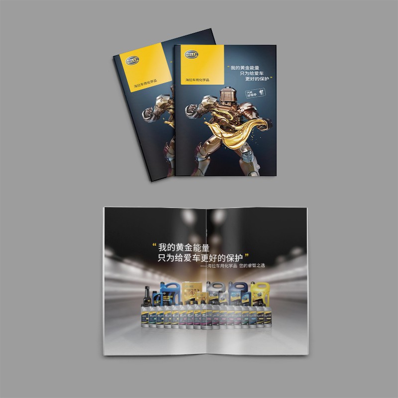
Some designers or corporate marketing personnel rely too much on screen display effects, and like to use fluorescent colors and solid colors with extremely high saturation to collide in large areas, pursuing instantaneous visual stimulation. It is conceivable that the color overflow and cheapness of the finished printed products in the later stage are strong; Reading for a long time is extremely tired; Overwhelming the host and interfering with the transmission of the core information. Therefore, Xiaobian suggests refining color and texture is king! Bow down to the "sense of high class". We need to restrain ourselves in color. 1-2 main colors are enough, supplemented by neutral colors (different levels of gray, off-white and sand). In addition, by reducing saturation and increasing levels, the favorite bright colors can be reduced in saturation, or grayscale can be added to become more attractive "Morandi" technology colors. Replace stiff contrast colors with shade changes of the same color system. In the material and technology of the album, the high-end color matching needs to match the high-end carrier. You can consider special paper (such as environmentally friendly paper with texture, tactile paper), local UV, hot stamping and other processes. Matte texture is often more classy than high gloss. A high-end chip album, only hot stamped with dark gray and matte gold, has double advanced touch and vision.

Misunderstanding 3: Ignoring brand genes-"separation" of color matching and positioning
Nowadays, many designs pursue "fashion" or designers' personal preferences, and the color scheme is seriously out of touch with the brand's core values, industry attributes and target user groups. This will make the album beautiful but fail to strengthen brand awareness, and even cause confusion; Difficulty resonating with the target audience. We can let color matching tell the brand story. When we need to trace the origin of the brand color, we don't just copy the Logo color mechanically, but refine the emotion and concept behind the brand color (is it reliable, innovative or environmentally friendly?), and use it in the album as the "finishing touch" or the harmonious extension of the main color. At the same time, we should also make it clear whether the target users are rigorous engineers or fashion technology enthusiasts? The former prefers stable and precise color matching (such as dark blue precision gray), while the latter accepts more experimental combinations (such as gray pink electronic blue). When facing different industries, we can also consider, for example, medical technology needs to convey trust and cleanliness (white, blue, green/gray); Environmental protection technology can be integrated into natural elements (earth color ecological green); Fintech emphasizes robustness and innovation (navy blue gold/gray).

Misunderstanding 4: No levels of "flat painting"-the picture is dull and focuseless
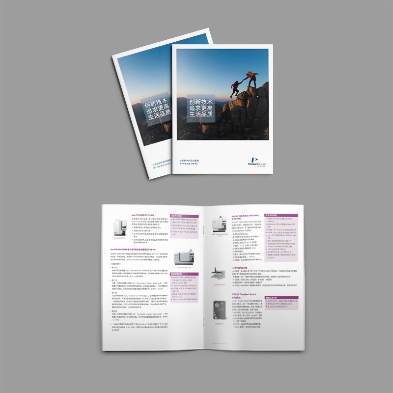
Layerless color flat painting brings about the lack of primary and secondary colors, light and dark changes, and rhythm changes. The page is "flat" and straightforward, and all information seems to be equally important. The reading guidance of such a science and technology album will become very poor, and readers will not be able to find the key points; The layout lacks tension and breathing, and it seems dull. At this time, we designers need to consider creating visual rhythm and breathing! For core products or information points, use colors with slightly higher or more unique contrast ratios (shade/lightness differentiation is required even in the same color system). At the same time, we should also learn to make good use of neutral color "blank space": a large area of neutral color (non-pure white) is the cornerstone of "high-end sense", giving the picture breathing space and contrasting key colors. Imagine a piece of paper filled with colors VS a large piece of high-grade gray set off a touch of exquisite technological blue. By establishing the color rhythm, the color application of the whole album fluctuates, and the chapters can be distinguished by auxiliary color systems, but the whole album remains harmonious and unified.

Misunderstanding 5: Ignoring practical application-the screen is gorgeous and the printing is "dusty"
Don't just stare at the high-resolution display when designing, but fully consider the actual printing process, paper characteristics, ambient light and other factors. Xiaobian often encounters some cases of design failure, that is, there is a huge gap between the screen effect and the printed finished product, the color is dim, the color is cast, the details are lost, and the sense of high-end is gone. Therefore, an excellent designer also needs to master rich skills in printing technology and design for "landing"! Effect of different paper types (coated paper, uncoated paper, specialty paper) on color presentation. The ink absorption of different papers varies greatly. Just like the same colorful design work, the performance on coated paper will be very delicate, but when printed on double-adhesive paper, the same document, the same machine, and at the same time, the color on double-adhesive paper will suddenly dim. Why? Because the double-adhesive paper has no coating, the ink acts on the paper and sinks into the paper fibers. Proofing! Proofing! Proofing! Say important things three times. Review the proofing draft under different light sources (natural light, warm white light, cool white light) to confirm whether the colors meet expectations. Fine-tuning is a necessary process.

The high-end sense of science and technology albums does not depend on piling up popular colors or dazzling special effects. It stems from a deep understanding of the brand soul, a precise control of color emotions, and an almost demanding pursuit of details. Avoid the five misunderstandings of "technology blue dependence", "high saturation showing off skills", "breaking away from brand genes", "flat picture painting" and "ignoring printing reality", and master the core logic of high-end color matching-restraint, precision, harmony, There is a story, yours Science and Technology Album DesignOnly after completion can it truly become a work with both professional depth and artistic beauty.


