Guide to avoiding pitfalls in home textile and clothing fabric album design: Analysis of five core dimensions from vision to craft
Have the bosses and designers of home textiles and clothing ever encountered such a heart-wrenching moment? The carefully shot fabric album, but the customer said that "the color difference is too big" and "the texture is completely wrong" when he got it, or the exhibition was sent around, but there were very few repeat customers? Don't panic! Xiaobian has been deeply involved in the industry for many years, and has seen too many "rollover" scenes of picture albums. Today, from five key dimensions, I will teach you step by step how to avoid the "deep pit" of the design and production of home textile clothing fabric picture albums, so that your product album can truly become a signing tool!
First of all: Visual presentation: Seeing is believing, details determine success or failure!
Pit avoidance points: blurred pictures, outrageous color aberration, lack of texture details, confusing style, excessive PS distortion, and neglect of application scenarios.
Xiaobian's tips :
You should also take good pictures when you spend money: find a professional still life/fabric photographer, and the lighting and scenery should be in place. The principle of retouching is to "restore the truth", so don't even know your own mother.
Follow the color difference to the end: the standard color card is used for shooting, the designer uses the color calibration screen, and proofing must be made before printing! Different papers have different colors, so be sure to confirm the actual effect. This is the lifeline of home textile album design!
Look at the details at the microscope level: front and back, texture, thickness, gloss, special process (jacquard, embroidery, etc.), all for close-ups! Use the macro lens.
Unity of style is king: set the color, light and shadow, and typesetting template, and the temperament of the whole booklet should be consistent.
Scene is a bonus: don't just shoot cloth, shoot ready-made clothes, bedding and the effect of hanging curtains! Let customers feel immersed.
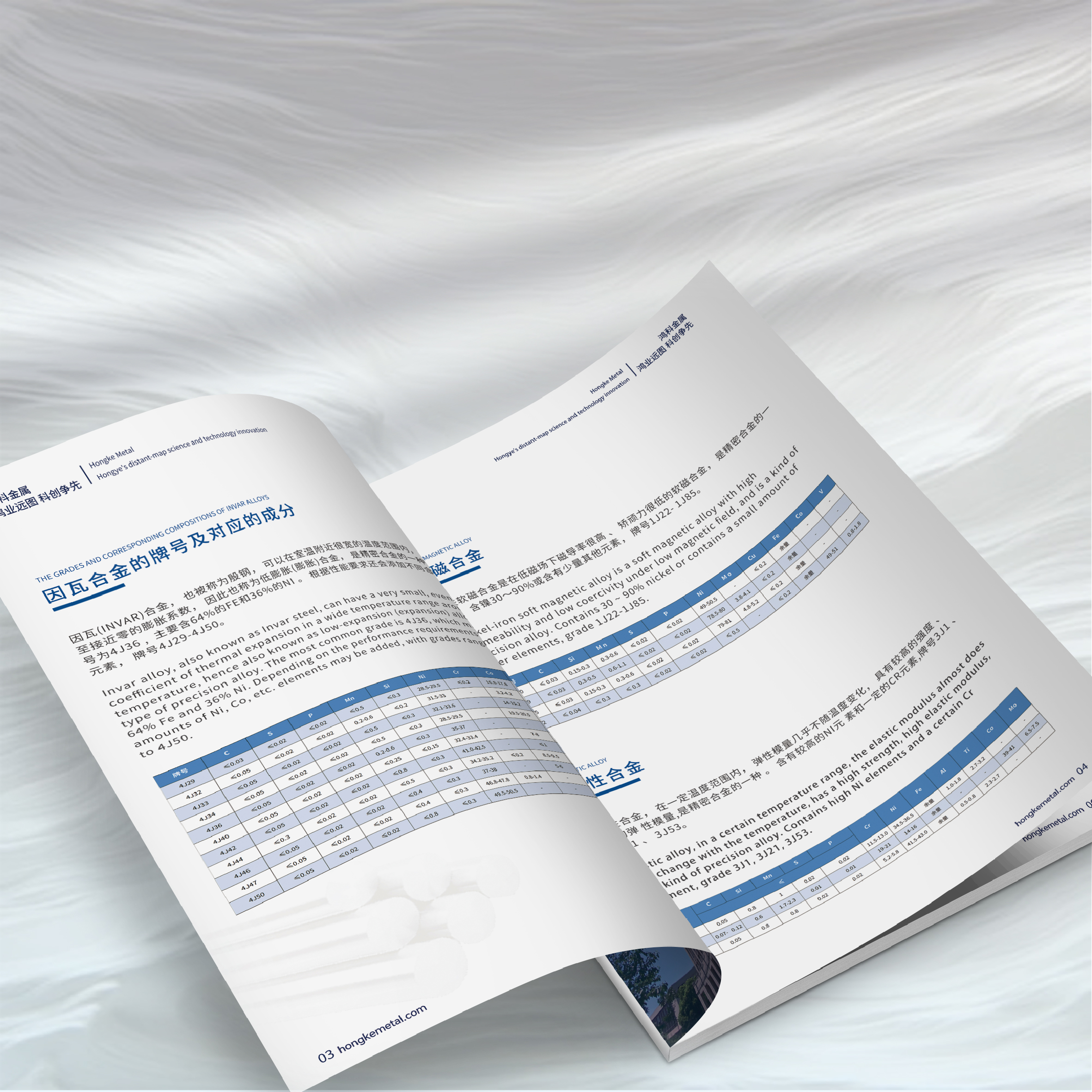
Secondly: Information architecture: the logic is clear, and you can find it and understand it!
Points to avoid pitfalls: the directory is confused, the classification is unclear, the information is not divided between primary and secondary, the parameters are wrong/missing, the selling points are vague, and there is no clue when turning it over.
Xiaobian's tips :
The catalog index is indispensable: it allows people to locate it quickly, and it is convenient to check by category, material and color number.
Is scientific classification the foundation: by season, function, collection or material? The logic should be clear and the chapters should be clear.
Typesetting should have a sense of hierarchy: title, selling point, parameters and explanatory text, which are distinguished by font size, color and white space, so that they can be seen at a glance.
The parameters are ID card: composition, gram weight, width, color number, washing method, environmental certification... none of them can be wrong! Must be strictly proofread. The core of fabric atlas production is accurate information!
The selling point should be "bright": don't just pile up parameters! "Organic cotton is skin-friendly and breathable", "graphene is intelligent to keep warm" and "three proofs and easy to take care of", one sentence pokes the pain point!
Design flip-through moving lines: Like telling a story, guide customers to read page by page, and the cross-page design should be coherent.
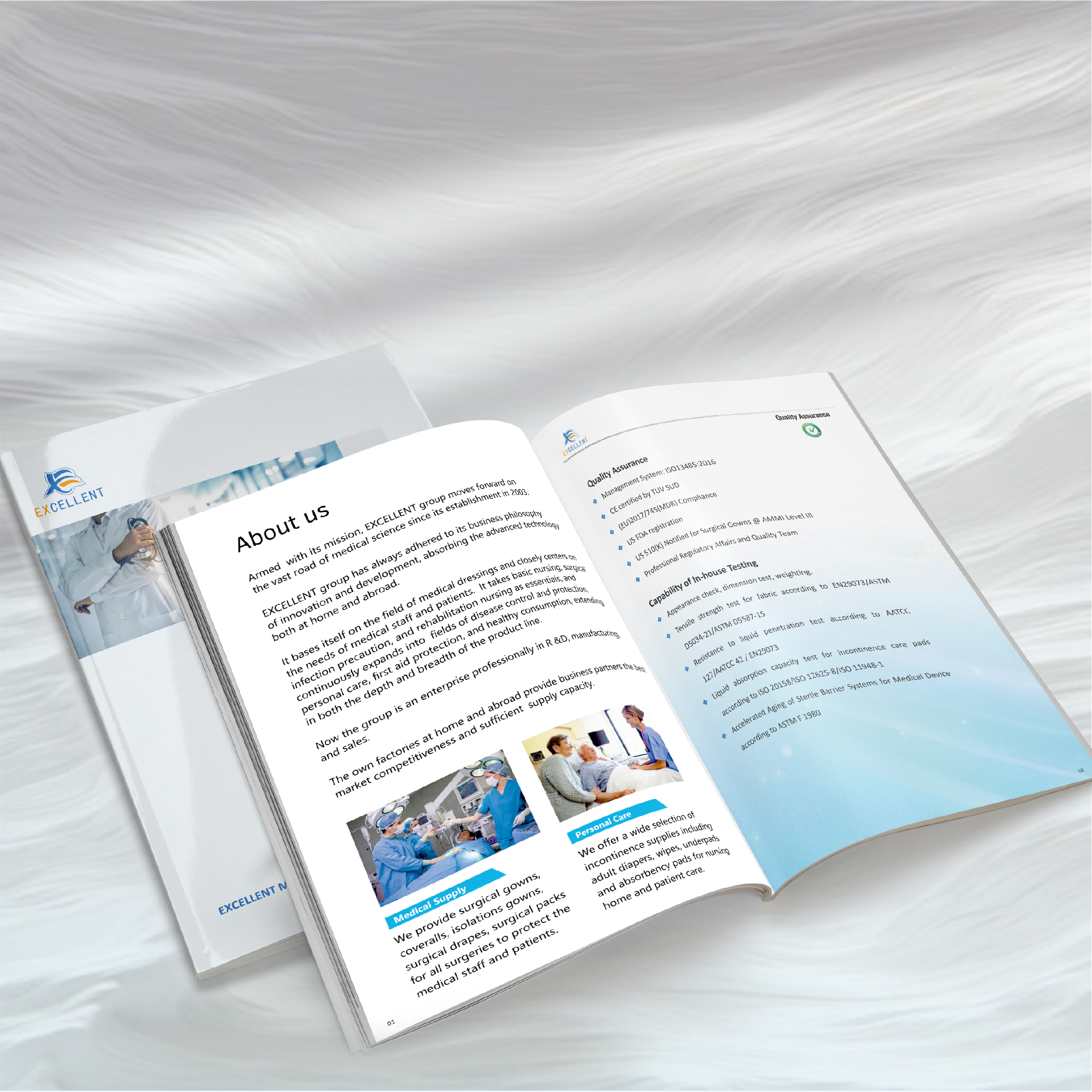
Third: The content is professional: authentic and credible, and can stand up to scrutiny!
Points to avoid pitfalls: terminology errors, false propaganda, content too deep or too shallow, outdated information, translation rollover, copyright risk.
Xiaobian's tips :
Be precise in terms: ask technical experts to review the manuscript, and don't make jokes. Add a small dictionary of terms if necessary.
Bragging must be moderate: functional descriptions such as "antibacterial" and "UV protection" must be produced with test reports or certification (such as Oeko-Tex, GRS). Home textile brand marketing relies on honesty!
Looking at people ordering dishes: for designers? Talk more about technical parameters. For consumers? Talk more about comfort and beauty. Language depth should be corresponding.
The edition should be managed well: print the date/edition number of the album. Discontinued and revised information shall be replaced in time. It is more convenient to update the binder or electronic version.
Translation should be professional: foreign trade album? You must find a knowledgeable professional translator, and you can't save mother tongue reviewers.
Copyright should be clean: pictures, fonts and design elements, either be original by yourself, or buy genuine/use free and commercially available ones. Don't get in with a lawsuit!
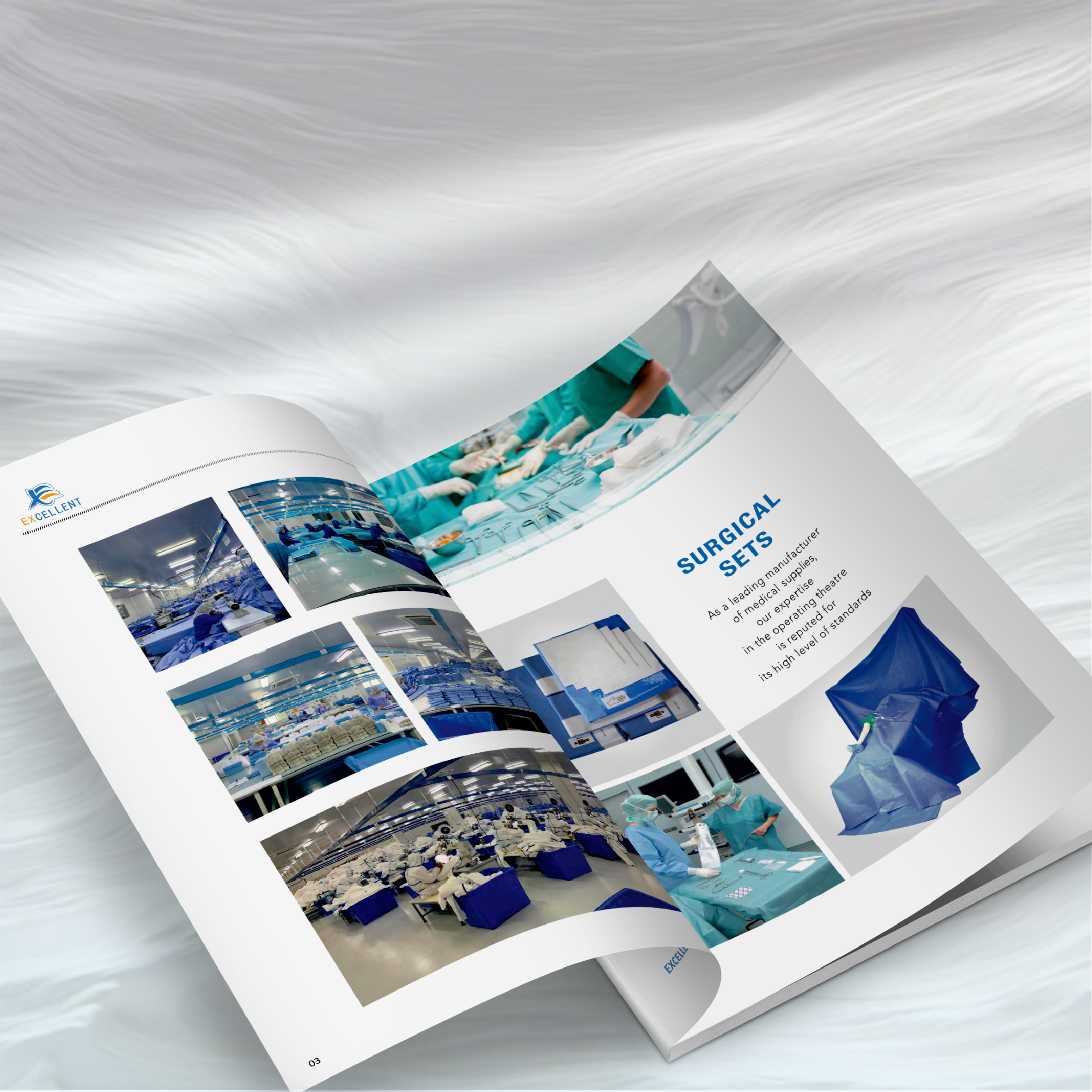
Fourth: Material technology: the touch is upgraded, and the texture is supported by it!
Points to avoid pitfalls: wrong paper selection, printing rollover (inaccurate overprinting, uneven ink color), process abuse (cheap feeling) or mistakes, unreasonable binding (loose pages, difficult to turn), anti-human size and weight, and skipping proofing.
Xiaobian's tips :
Paper matching tonality :
High-end luxury? Choose thick art paper, special paper and tactile film.
Environmental protection concept? With FSC recycled paper, eco-friendly ink.
Color accuracy? Gloss Copper/Matte Powder Paper. Natural texture? Non-coated paper.
Be sure to touch the real sample! Feel is very important.
Printing factories should be reliable: look at equipment, cases and word-of-mouth. Clear requirements (Pantone color number, accuracy), and it is best to follow the machine. The fabric album printing process determines the final texture.
The finishing touch of the craftsmanship is not exaggerated: on the Logo and core product name, high-quality bronzing, UV and embossing are used in a small area. First proofing to see the effect!
Binding is strong and easy to turn :
Few pages: riding nails, circle fitting.
Many pages/to be spread flat: lock thread glue bound, hardcover (with spine slot).
Often updated: binder (D-ring), screw mounted.
Size Weight User-friendly: A4 or slightly smaller is more versatile. The hardcover cover should be wear-resistant, and the corners should be rounded to be safer.
Proofing is a life-saving straw: digital proofing looks at the whole, and on-machine proofing looks at the real printing process binding. Confirm that it is correct before mass production! This is a key step to avoid pitfalls in album making!

Fifth: User experience: convenient and easy to use, guiding action!
Points to avoid pitfalls: the size is not portable, the reading experience is poor (difficult to spread out, difficult to turn pages), lack of action guidance (what to do next?), there is no electronic version, the same book is used in different scenarios, and the cost is out of control (too expensive to send it).
Xiaobian's tips :
The format should feel comfortable: standard size (A4 or 210x210mm square version), the binding should be firm and easy to spread out, and the paper should turn pages smoothly. Home textile product album is for people to use!
Clearly tell customers the next step :
Eye-catching QR codes of official website and online exhibition halls.
Provide sales contact information (telephone, WeChat QR code).
"Scan the code to apply for free samples!" -Guided action is important.
Post small sample pages! Increases interaction and memory points.
The electronic version must be equipped with: high-definition PDF to facilitate email WeChat transmission; Make the H5/mini program version more interactive; The electronic version is updated simultaneously. Album design and production have entered the digital age.
Custom version on demand :
Exhibition version: visual explosion, streamlined core, slightly larger size, super wear-resistant.
Sales version: comprehensive information, light and portable, and easy to explain (samples can be added).
Customer reservation version: the most complete parameters and full of technical details.
The cost should be smart: the cover and core pages are willing to invest, and the secondary pages control the cost. Calculate the print quantity accurately and avoid inventory. Printed on demand or in batches. Home textile album design investment should talk about ROI!
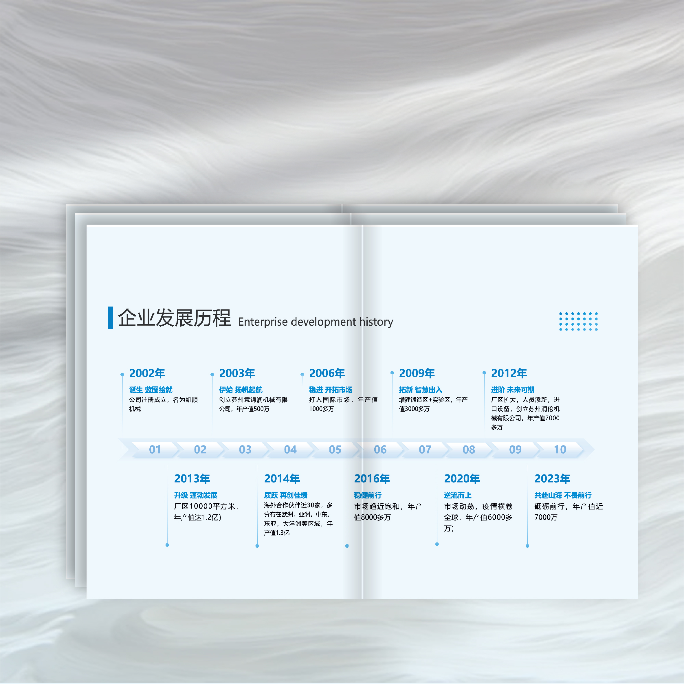
The core of creating a home textile clothing fabric album that can bring goods is to work hard around "user experience" and "accurate communication"! From visual shock (pictures, colors) to information penetration (structure, content), to process texture (paper, printing, binding), every step must be carefully designed and the quality must be strictly controlled. Be sure to keep in mind that color management proofing is the lifeline, accurate and professional information is the cornerstone of trust, and the ultimate goal is for users to turn comfortably, see clearly and know what to do next! Avoid these five-dimensional pits, your Home textile album design Production can truly become a marketing tool to enhance brand image, promote fabric sales and win customers' trust!


