Why do big companies like to use square albums? Ten reasons revealed!
When you get a square brand album at a high-end exhibition, have you ever wondered why big brands such as Apple, Tesla and LV love this design? Today, I'll break it and crush it to tell you about the ten underlying logics of the square album to dominate the propaganda of enterprises. After reading it, you will understand that this is by no means a random shape!
1. Break the unspoken rules of size, and the high-end feel instantly kills the A4 army
When 99% of enterprises are still using A4 vertical albums, a 250 × 250 mm square booklet is like a high-definition dress in a suit and leather shoe. The customer retention rate of square giclees is usually one-third higher than that of regular sizes. After a technology group in Shenzhen upgraded its album, the number of exhibition inquiries directly doubled-there is a game of brand discourse power hidden between square inches.
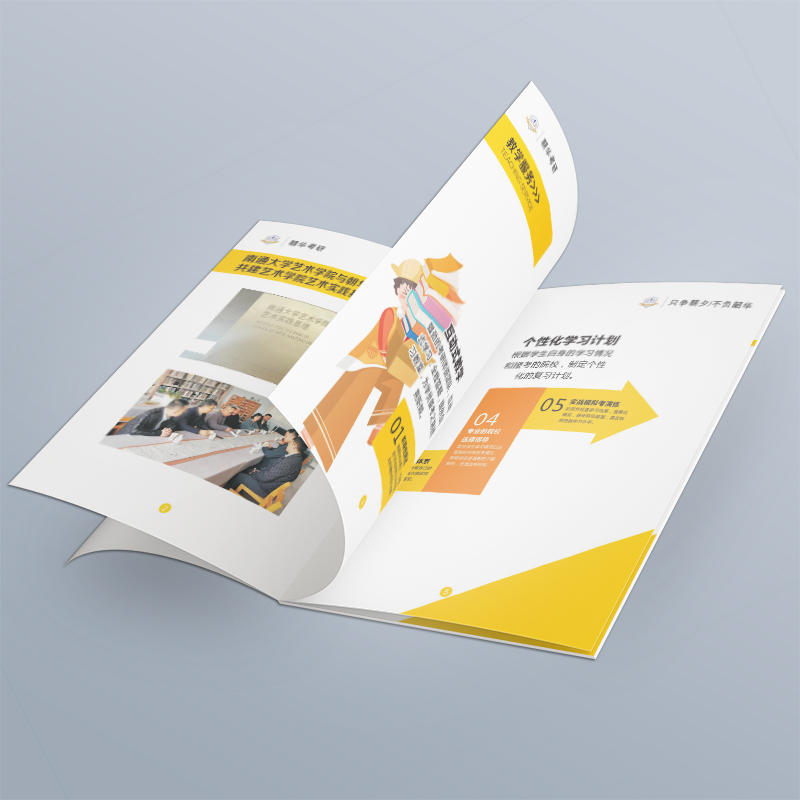
2. The favorite symmetrical aesthetics of obsessive-compulsive disorder
The absolute sense of balance formed by four equilateral right angles of a square is born with the classical genes of the Renaissance. You see, Chanel's picture albums are always square, because this composition can perfectly carry the eternal sense and order beauty pursued by luxury goods. Designer Lao Zhang's original words: "When making a brand brochure for customers, the square inner page makes the product picture look like a museum exhibit, with advanced filters."
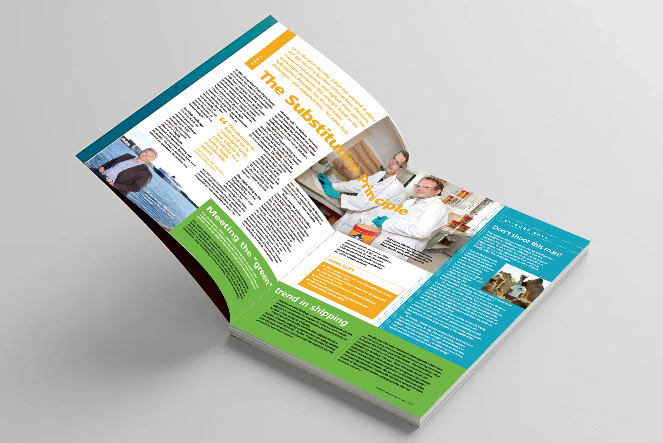
Third, liberate designers' typesetting dilemma
Traditional rectangular albums always have horizontal and vertical restrictions, while squares are simply a free canvas! Because :
Spread Diagonal Typesetting Manufacturing Dynamic Tension
Center-radial architecture enhances sense of technology
Full-page bleeding pictures create an immersive space
What our designers often say is: "The same content, square makes the creative space triple"
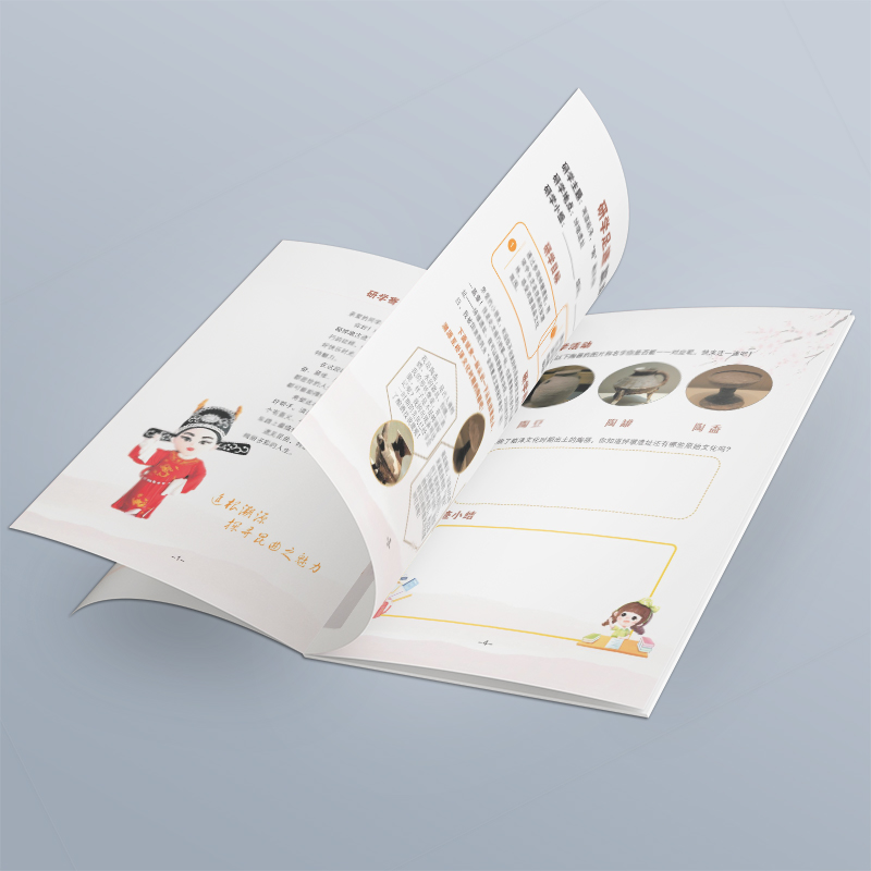
4. Transform into a giant screen cinema across pages
Expanded square spreads can show more information, which real estate companies love most :
A square brand album of a real estate, using 250 × 500 mm spread pages to display the real garden scene
An industrial hot runner brand album covers the cross-sectional view of microfluidic components throughout the page
This kind of visual oppression that comes to your face, the rectangular album simply can't give
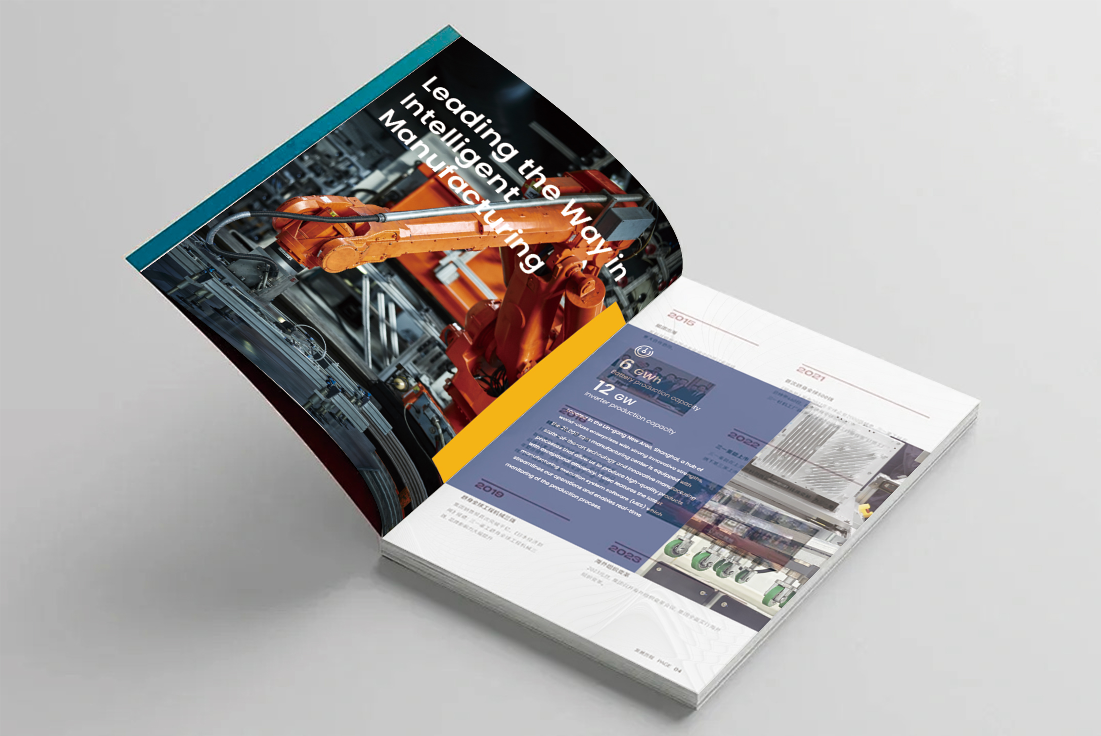
5. Improve the high-end of albums through more album printing techniques
The geometry of the square shape is simply a hotbed of binding magic :
Central organ fold: unfolding instantly becomes a 3D structure
Double door magnetic buckle: opening is like opening a mysterious gift box
Laser hollow nesting: light penetrates to form dynamic light and shadow
These interactive designs greatly increase the probability of customers retaining albums
6. LOGO's golden booth
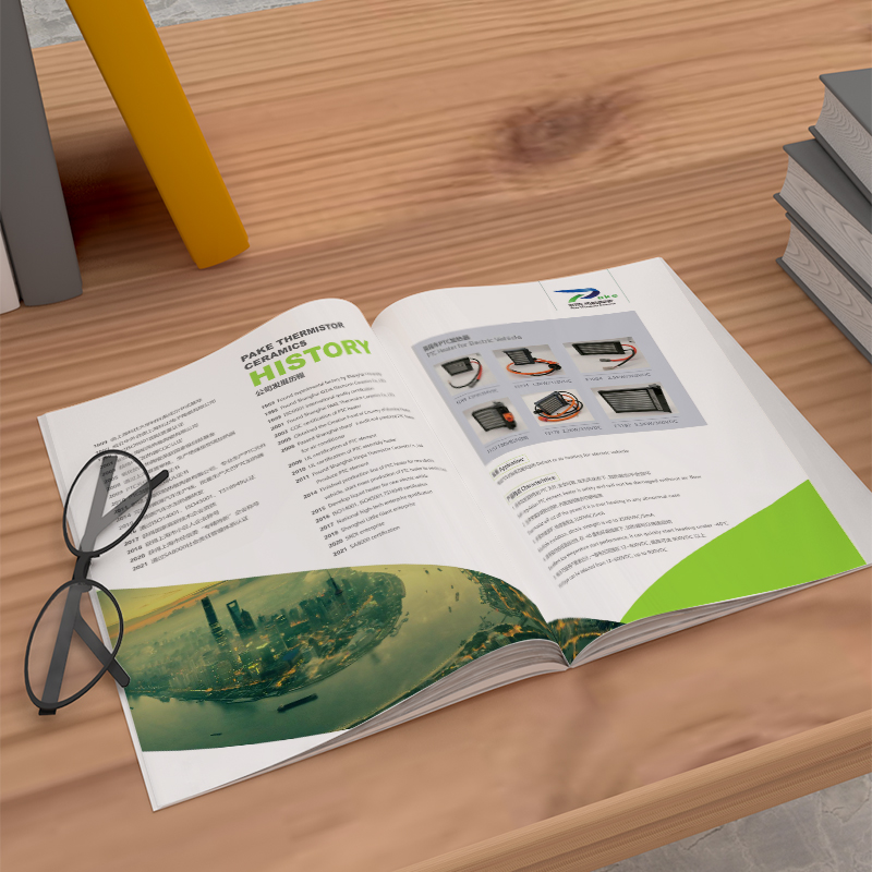
Two-thirds of corporate logos now adopt a square/near-square design. Put the square logo on the square giclee, just like a tailor-made display stand. Comparative case: A circular logo should be placed on the cover of a rectangular album by 30% blank, while the utilization rate of a square album reaches 90%, and the brand recognition immediately rises sharply.
7. Seamless crossing of digital terminals
Silky transition from print to mobile phone screen :
Album pictures are directly cropped to 1: 1 poster
The electronic version is suitable for almost all tablet devices (no longer trouble with black edges)
Website banner can apply the album visual system
The design manuals of many conglomerates specifically require that all primary visuals must be compatible with a 1: 1 ratio
8. Geometric psychological suggestion warfare
Human beings have an instinctive recognition of shapes :
Triangle = radical innovation
Circular = affinity inclusion
Square = stable and reliable
Many foreign-funded or overseas companies know this secret best: Ruke Energy's square picture album deliberately strengthens the subconscious of "production safety"
9. Infinite loop of cultural containers
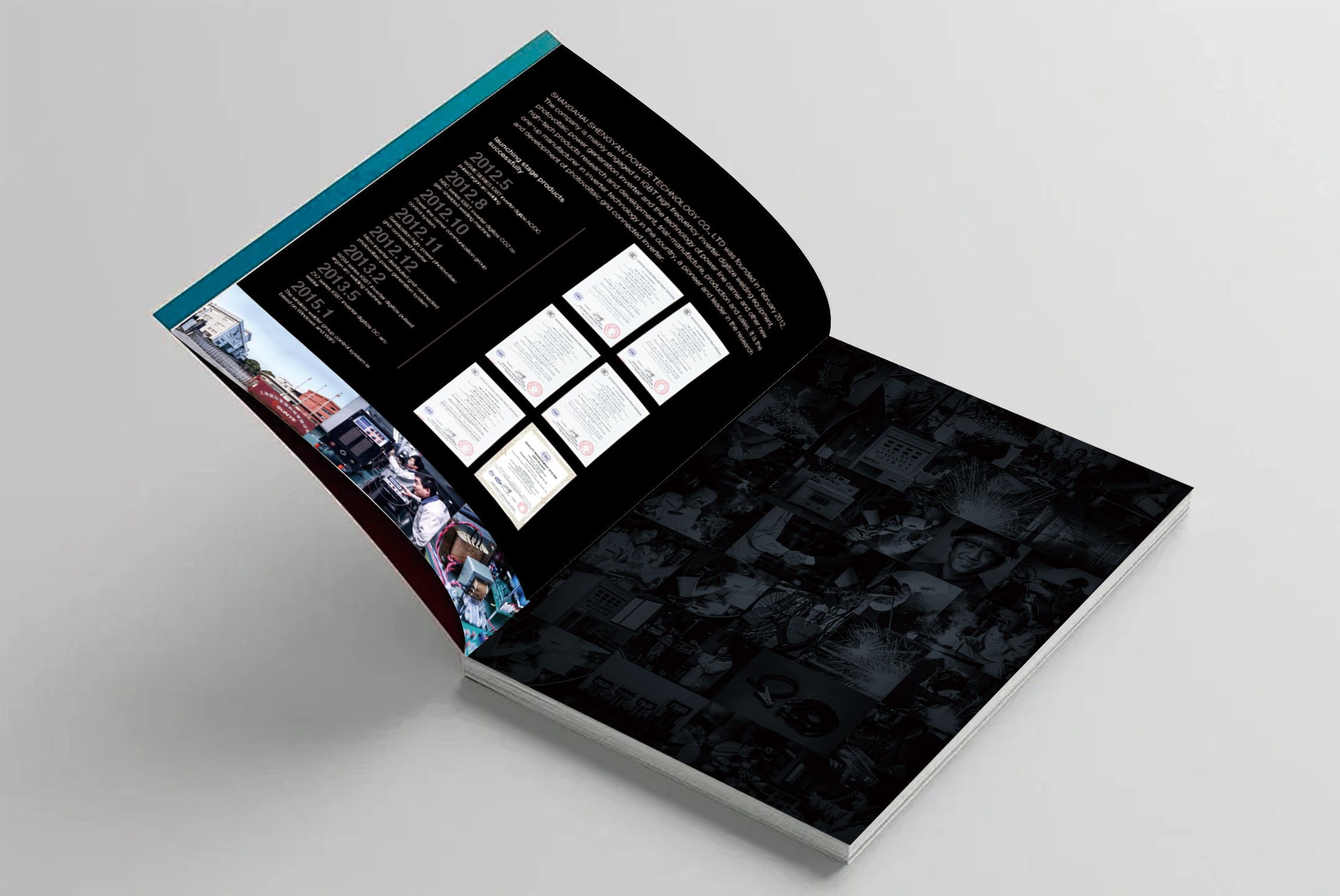
A square without a start and an end point is naturally suitable for expression :
Corporate historical heritage (a century-old pharmaceutical company uses a circular timeline)
Ecological closed-loop concept (new energy brand display circulation system)
Global business network (map radiation connects national branches)
This metaphorical design improves the efficiency of cultural transmission by nearly half.
10. Create a sense of ritual in the display of album content information
Reading the square album is a ritual :
The solemnity of holding hands
Central area of natural focus of line of sight
Information density purification after removing redundant white space
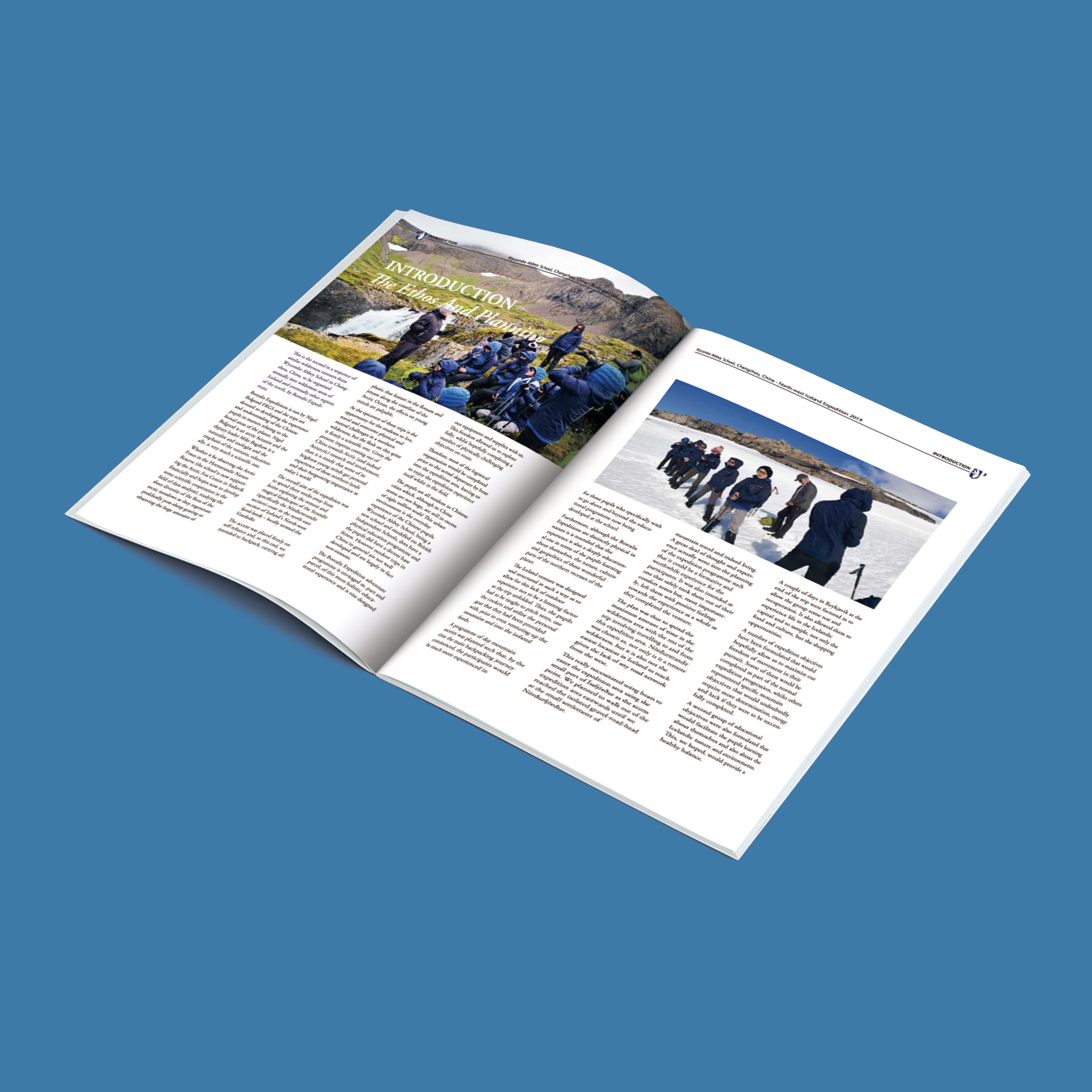
Between square inches, brand Gan Kun. When businesses choose squares album designAt that time, the essence is to carry out a multi-dimensional brand value resonance-it opens a dialogue with a high-end image that breaks the routine, builds a visual hall with symmetrical aesthetics, releases a creative storm with free format, and finally completes the core value of the brand within a square inch. deep carving. This square carrier in your hand is not only a three-dimensional declaration of the strength of the enterprise, but also a golden contact point connecting the minds of users. In the era of information overload, telling a good brand story with one world may be the tacit communication password of top companies.


