

English foreign trade version of valve company brochure design: six puzzles and solutions
Recently, many bosses engaged in valve foreign trade complained to me, saying that the design of English brochures is a big head! The technical parameters are so dense that foreigners can't understand them; The pictures are quite professionally taken, but I always feel bad; I want to highlight my own advantages, but I'm afraid of becoming a "Wang Po selling melons"... Don't worry, today we will take a look at those maddening design pain points and teach you how to make professional manuals that will make foreign customers shine!
Confusion 1: There are mountains of technical terms, and customers look confused after reading them
Root cause of pain point: There are a dime a dozen valve industry terms (such as "Multi-turn actuator", "NEMA 4X"), which engineers think are common sense, but overseas purchasing managers may not understand at all.
Cracking scheme:
Layered expression: The core parameter table remains professional (such as torque, protection level), but uses an ICON (ICON) next to it to explain its actual significance (such as "dustproof and waterproof, can withstand strong spray" next to the ICON).
Glossary is indispensable: a simple Glossary of Chinese and English terms is attached at the end of the manual, explaining professional words in one vernacular.
Multi-use visual substitution: Use 3D rendered structural explosion diagram to show the valve workflow, which is more intuitive than a 200-word technical description.

Confusion 2: Cultural differences step on the thunder, and design aesthetics are acclimatized
Root of pain point: Chinese-style "big red and big gold" festive style, European and American customers find it dazzling; The minimalist design that is too "cold" may not be grand enough for Middle Eastern customers.
Cracking scheme:
Market research first: What do mainstream industrial brand brochures in key target markets (Europe, America/Middle East/Southeast Asia) look like? Collect 10 books to analyze their color scheme, layout and picture style.
Establish a "safe color library": dark blue (sense of professionalism), gray (sense of technology), and green (environmental protection) are highly accepted globally, and avoid using purple (some taboo in South America) and pure black (some unlucky in the Middle East).
Picture localization: Show photos of equipment at project sites in target areas (such as European chemical plants, Middle East oil fields) to enhance the sense of scene substitution.
Confusion 3: The advantages and highlights are not prominent, and it is reduced to a mediocre product list
Root cause of pain point: Make the brochure into a product manual, listing dozens of model parameters, and customers can't remember the core value.
Cracking scheme:
Home page "Value Declaration" bombing: The front page highlights one core advantage in oversized font (such as "150,000 maintenance-free operation" or "48-hour global emergency response").
Pain point resolution copy: The title starts from the customer's perspective, such as: "Worried about valve failure in extremely cold environment?-40 °C to 80 °C full temperature range certification guarantee" (instead of "wide operating temperature range").
Visual presentation of certificates and patents: Combine ISO, ATEX, SGS and other certificate icons into a trust badge wall, which is placed in a conspicuous position on the back cover or company introduction page.
Confusion 4: Production strength is difficult to perceive, and the text description is too pale
Root cause of pain point: descriptions such as "advanced production line" and "strict quality inspection" are empty and unconvincing.
Cracking scheme:
Real shots of key nodes: showing the automated assembly line with LOGO, close-up of the laser detector screen (the values are clearly visible), and screenshots of the quality inspector's operation video (you can watch the full video with QR code attached).
Digital expression of production capacity: Instead of "large production capacity", use the warehousing panorama of "150,000 units annual reserve production capacity, 72-hour emergency order response".
Customer witness blessing: Quote overseas customer reviews next to factory pictures (such as "500 valves in XX project 0 failures").
Confusion 5: Customized services cannot be explained thoroughly, and high-profit orders are missed
Root cause of pain point: only write "support customization", but customers don't know what you can do and how to do it.
Cracking scheme:
Customization process diagram: Use a 4-step visual 2.5 D flow chart to show the customization process: demand communication → 3D design confirmation → prototype testing → mass production, and each step is marked with a typical cycle.
Scenario-based case reminder: Add a reminder box in the corner of the product page: "Need to adapt to deep-sea high pressure? Customizable protection & titanium alloy shell → contact the engineering team".
Quick response commitment: prominently mark "Provide customized plan within 48 hours" on the customized service page.
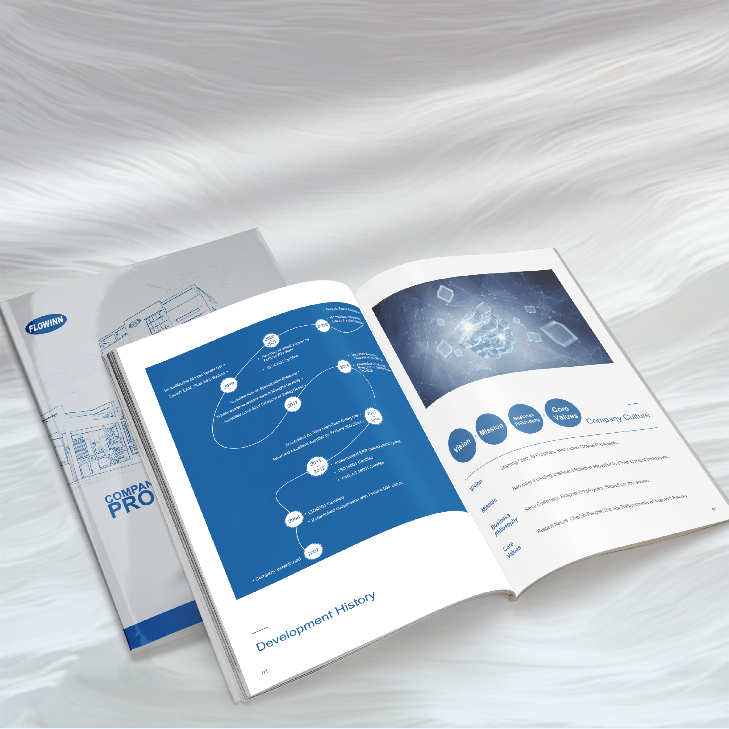
Confusion 6: The brochure is heavy and costly, so customers can throw it away after reading it
Root cause of pain point: The 100-page coated paper manual is expensive to print and difficult to mail, and customers may just look at it and discard it.
Cracking scheme:
Combination of "main volume and sub-volumes": The main volume is streamlined to 16-20 pages (the company's core value star products), and is equipped with electronic versions of segmented scenario manuals (such as "Explosion-proof Solutions for Oil and Gas Industry" and "Selection of Special Valves for Water Treatment").
Each page is an independent contact point: an independent URL QR code is added at the bottom of each page (such as "Scan the code to download the complete collection of explosion-proof certification" on page 8) to facilitate customers to obtain information in blocks.
Digital version priority strategy: Focus on online interactive manuals (you can click to view 3D models and download certificates), and physical books can only be distributed at exhibitions.
An excellent Brochure DesignDon't think about "one step"! First, take the smallest feasible version to test-print 20-30 copies by digital printing and bring them to the exhibition to observe which page foreigners will stay and take photos when they turn. Collecting enough 50 real feedbacks and then revising it is a hundred times better than working behind closed doors! Talk to you next time, I wish you a soft hand in receiving your order ~

