The three primary colors of poster design: how do text, graphics and color weave visual grammar?
Every day we are bombarded by countless posters, subway stations, circles of friends, shop windows... some make your heart move instantly, while others are like passing clouds. What magic is hidden in a successful poster? Today, let's tear apart the appearance and see how the three forces of characters, graphics and colors in poster design bite and rotate like precision gears, quietly capturing your attention.
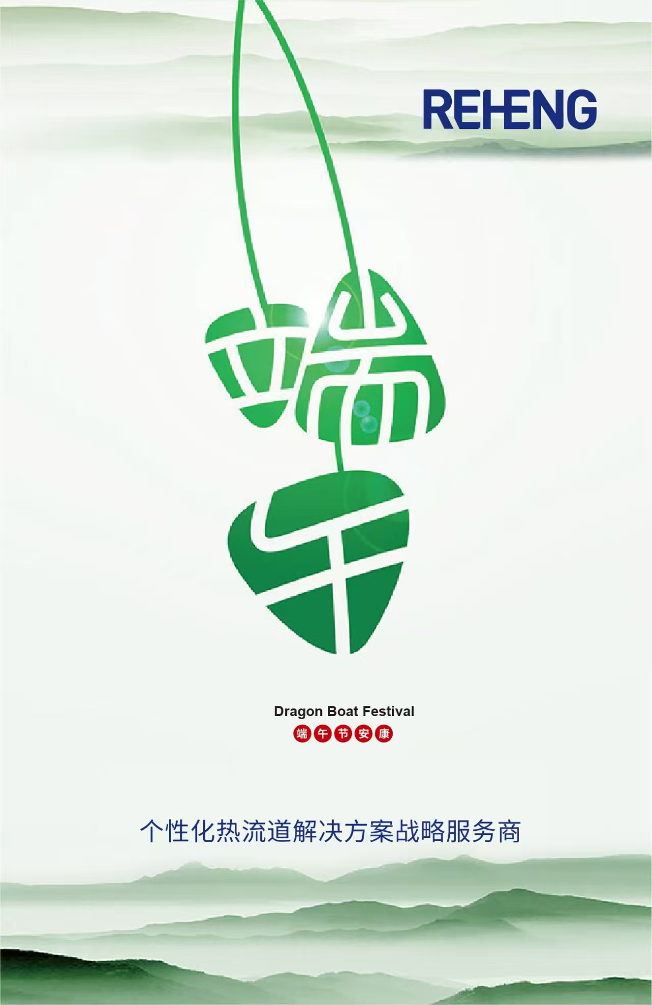
Imagine: on the Dragon Boat Festival poster, a simple and powerful silhouette (graphic) of a dragon boat firmly holds up the blessing (text) of "Dragon Boat Festival Health", and the background is calm industrial blue or warm festive red (color)-needless to say, the festive atmosphere and brand professionalism are instantly established.
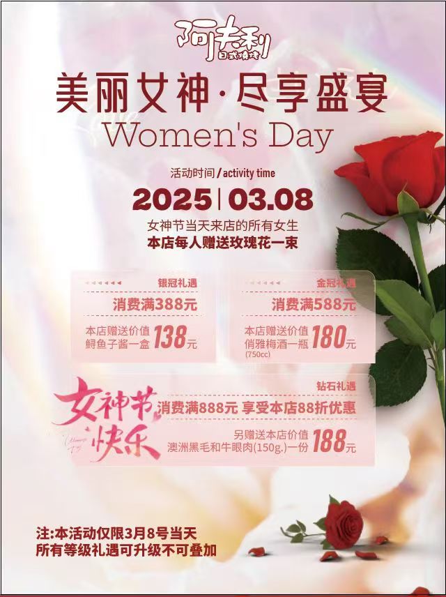
Look at the Goddess Day catering poster again. A soft pink background (color) sets the tone and an elegant rose graphic (graphic) points straight to the theme. The text messages (texts) of "Get plum wine for more than 388" and "Enjoy discount for more than 588" are separated by clear icons and color blocks, and the allure progresses layer by layer. Color, graphics and words do not exist in isolation here, but together weave a web of consumption desire.
Visual grammar is the underlying logic of poster design. It means that every element in a poster-every word, every line, every touch of color-is not a random ornament, but a "visual vocabulary" that undertakes a specific communication task. They follow some kind of "grammatical rules" and together form a complete and powerful "visual sentence", which accurately conveys information, arouses emotions and guides actions to the viewer.
1. Text: Information Skeleton and Emotional Tone
Words are anything but simple message porters in posters. It is the most direct messaging anchor and the key to shaping the tone of your brand.
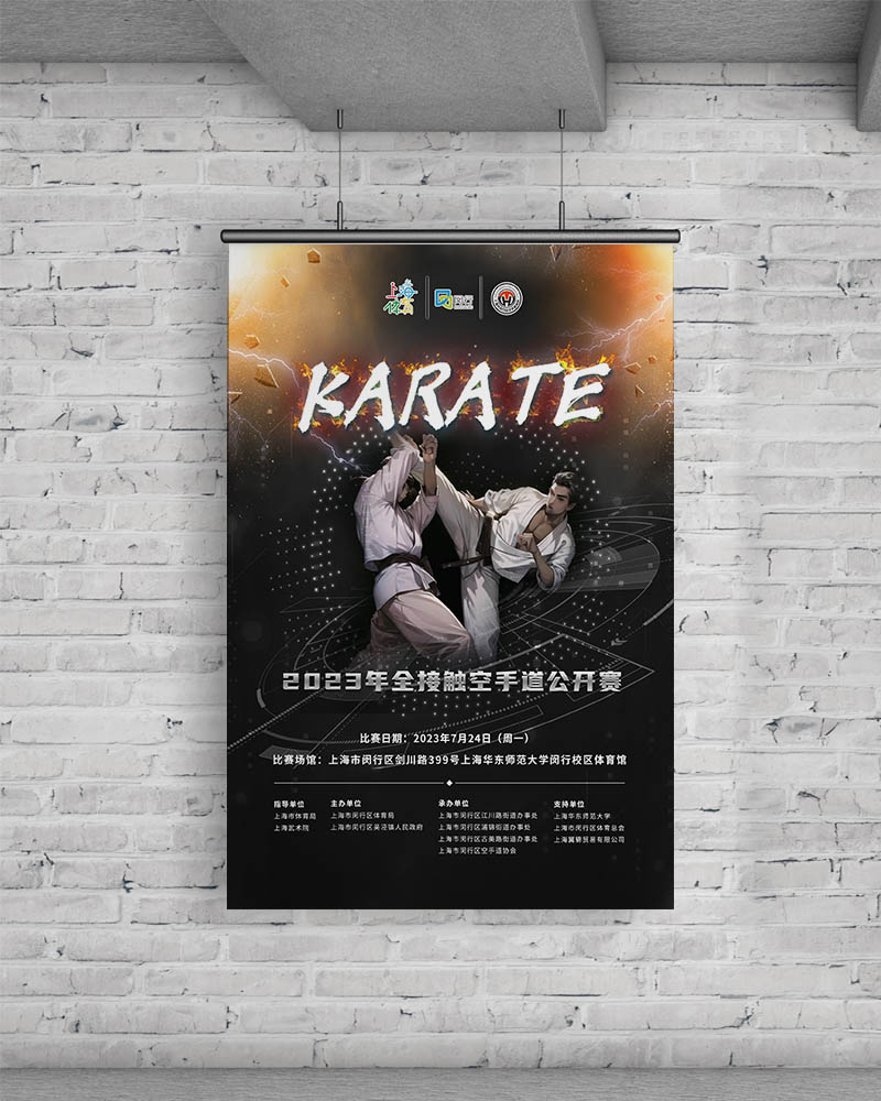
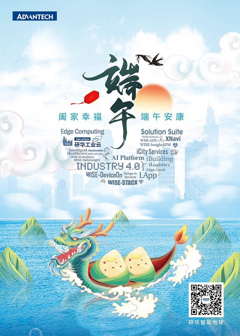
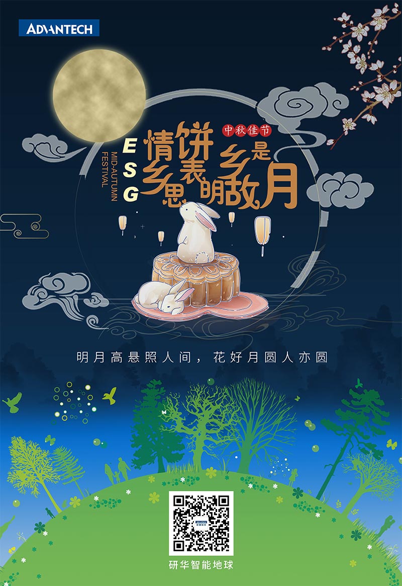
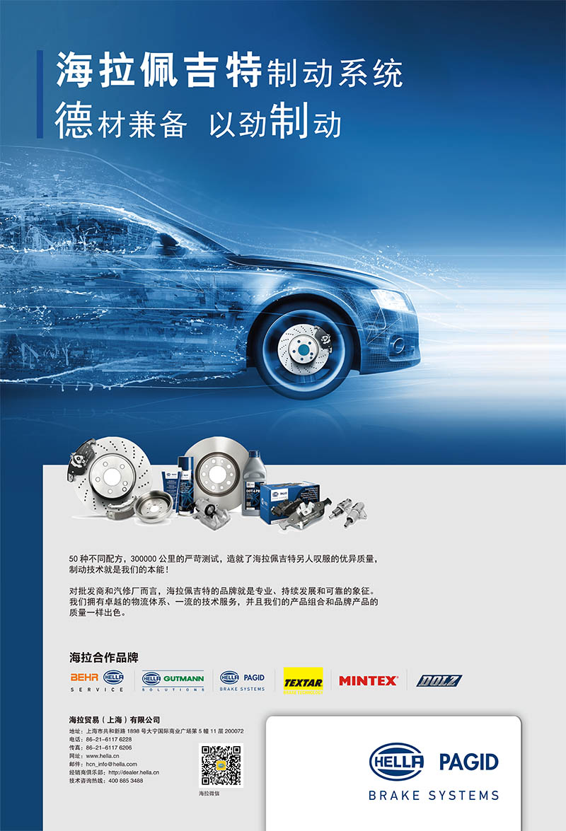
Check out that Karate Open poster. How can the dense information (time, place, organizer) not be confused? The use of the table (visual structure) is the skeleton, while the key information ("Full Contact Karate Open 2023", "July 24") instantly catches the eye by enlarging the font and bolding it (text style). The product posters of Advantech Industrial Cloud take modular text to the extreme. Product names such as "WISE-InsightAPM" and "iLogistics" are clearly divided, and the complex system is clear at a glance. The first task of words here is to organize the information hierarchy clearly and efficiently, ensuring that the core information (competition, product) is captured at the first time. The copywriting of Hella Paget braking system poster "Both virtues and materials, braking with strength" and "Braking technology is our instinct!" Is full of strength and technical confidence. The choice of fonts (usually steady and tough sans serif) and concise and powerful short sentences are all strengthening its brand image of "professional and reliable". On the contrary, the terms "Beautiful Goddess, Enjoy the Feast" and "Happy Goddess" in the poster of Goddess Day are full of affinity and festive pleasure. The tone, style and font choice of the words are all silently telling the audience: "Who am I, I am speaking to you". Good text typography knows how to breathe. Advantech's Mid-Autumn Festival poster, "The bright moon hangs high in the world, and the full moon is full", is arranged in density and alignment, which itself constitutes a visual rhythm and complements the full moon graphic. The blank area in the poster allows the key words to "breathe", but its importance is more prominent. Instead of filling space, words light it up.
2. Graphics: Instant communication and emotional resonance
Graphics are visual lightning bolts across language barriers. It can convey concepts, build atmosphere and stimulate imagination in milliseconds.
The super symbols of the concept: the dragon boat and zongye (or abstract line symbol) on the Dragon Boat Festival poster, the full moon and jade rabbit (or elegant moon halo light and shadow) on the Mid-Autumn Festival poster, and the rose on the Goddess Day poster-these are highly concentrated cultural or thematic symbols. Without explanation, they can instantly arouse the existing cognitive and emotional connections in the audience's mind and achieve efficient communication. Gears, abstract lines of circuit boards, upward arrows, etc. commonly used in industrial posters are also common symbols in the industry, implying technology, connection and progress. The graphic style directly sets the tone of the poster. The soft curves and blooming flower graphics of Goddess Day poster create a romantic and warm atmosphere. Industrial posters (such as Advantech and Hella Paget) tend to use simple lines, geometric blocks, technological light effects or abstract particles to convey modern, precise and professional industrial aesthetics. Whether a poster is passionate or calm and rational, the graphic style has the final say. Graphics are natural visual guides. In Hella Paget posters, product pictures or core brand logos (graphics) often occupy the visual center or key position, and with directional elements (also graphics) such as arrows and lines, they guide the audience's attention to key information (such as "50 Formulas", "Excellent Logistics"). The negative space (blank space) formed by abstract graphics can also skillfully focus the eyes on the core text or subject.
3. Color: the subconscious emotional switch
Color is the most original and emotional force in a poster. It bypasses rational thinking and acts directly on emotions and the subconscious. The pink-purple tone of the Goddess Day poster is naturally related to women, romance and tenderness. Dragon Boat Festival posters are commonly used in green (dumpling leaves), red (festive) and yellow (sunshine) to convey vitality, enthusiasm and vitality. The dark blue, golden and bright white of the Mid-Autumn Festival posters create a quiet, reunion and elegant moonlit night atmosphere. Industrial brands such as Advantech and Hella Paget prefer to use blue (technology, trust, reliability), dark gray/black (professionalism, strength), and corporate standard colors (such as Advantech's orange-vitality, innovation) to build brand awareness and industry attributes. Color is the emotional trigger at first glance. Color is an excellent information partition label. In the promotional poster of Goddess Day, different levels of "courtesy" (silver crown, gold crown, diamond) are distinguished by different background color blocks or icon colors, and the information level is clear at a glance. Core promotional prices or "same day only" key messages are often highlighted with high-contrast, eye-catching colors (e.g. bright yellow, bright red) to ensure that they don't go unnoticed. Long-term stable use of color combinations has become the most intuitive visual asset of the brand. When you see a specific combination of blue and orange, it is easy to think of Advantech; The stable use of brand colors in Hella Paget posters is also constantly strengthening its professional image. Color is an integral and most recognizable part of a brand's visual identity (VI).
Blending of three primary colors: building visual influence together
The magic of poster design lies in the dazzling skills of a single element, but in the deep blending and synergy of words, graphics and colors.
Consistency is the soul: a successful poster must have a high degree of unification in its text style, graphic tonality and color mood. A Children's Day poster with cute cartoon graphics (graphics), but with cold and rigorous bold characters (words) and dark blue and gray color scheme (color) will make people feel extremely fragmented. Advantech's Mid-Autumn Festival posters, elegant calligraphy fonts (words), traditional auspicious clouds or full moon graphics (graphics), and deep and quiet blue/gold tones (colors) jointly serve the theme of "technology enterprises conveying traditional warmth" and are integrated. Harmony is not equal to blandness. Smart contrast is key to catching the eye. In the industrial poster, on the cold technological blue background (color), a touch of bright orange (corporate standard color) marks the core product name (text), and vitality instantly bursts out. In the poster of Goddess Day, the promotion terms (words) are clearly listed in clean white or black on the soft pink background (color), which ensures the readability of the information. The contrast of size and density of graphics can also create visual rhythm and focus in unity. Every design decision-what font to choose, what graphics to use, what colors to match-must ultimately point to the core goal of the poster: is it to inform (such as a karate competition poster)? Is it a promotion (such as a Goddess Day poster)? Is it to build a brand image (such as Hella Paget, Advantech)? Or pass on holiday blessings (Dragon Boat Festival, Mid-Autumn Festival posters)? Words are responsible for accurately conveying "what is", graphics are responsible for quickly attracting and visualizing concepts, and colors are responsible for touching emotions and creating atmosphere. Only by working together can the information not only be seen, but also remembered, understood and responded to.
Poster DesignThe true meaning is to weave cold words, abstract graphics and perceptual colors into a visual network that can instantly capture people's hearts and convey thoughts. Excellent "visual grammar" makes the three, like different parts in a symphony, interdependent and achieve each other, and finally play a clear, powerful and unforgettable communication movement.

