

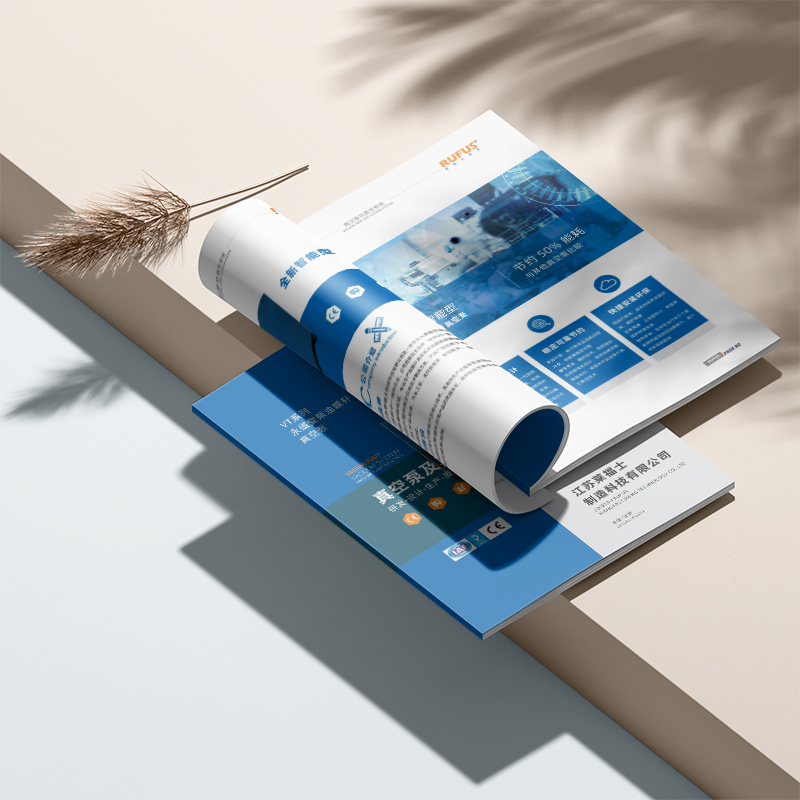
Let corporate brochure design help you realize 5 ideas for your album to speak
Who hasn't printed a few brochures in our enterprises? But most booklets, the fate is to lie on the customer's desk and eat dust, or simply go into the recycling bin. Beautifully designed brochures take less than 30 seconds to read on average, but strategic visual narratives can more than double engagement. Don't let the brochure smashed with real money become "dumb". Today, I will teach you 5 practical ideas to let the brochure "talk" about business by itself!
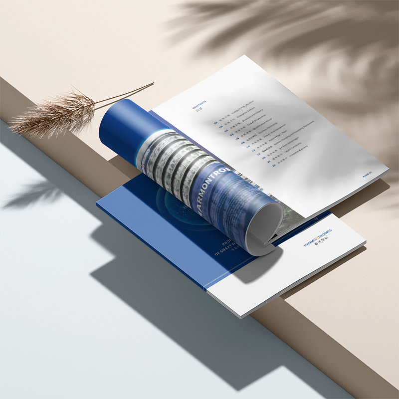
First, the cover comes with a 3-second hook, hook it and don't put it!
Don't expect customers to flip through it patiently. That look on the cover determines life and death. Stop piling up panoramic views of the factory area or founder avatars! Think about what customers care about most? Is it to solve his pain points, or to satisfy his cravings?
We once served a high-end bakery. The cover of its booklet is a close-up of the moment when you cut the cake, with a sentence next to it: "Take a bite and heal your mood". Visual impact and emotional resonance make people want to open it to see what "healing" delicious food is inside.
The cover of another technology company's brochure is designed to look like half a mobile phone screen. The screen displays "Slide to unlock more solutions", which cleverly guides the page turning action.
The cover is not to introduce yourself, but to give the customer a reason why they can't refuse to open it. Use the strongest vision and the most accurate language to "yell" out the core values!
Second, the core pain point page: Don't beat around the corner, just "pierce your heart"!
Customers don't come to hear you talk about the history of the enterprise when they open the brochure. He wants to know most: "Can you solve my headache now?" Visualizing pain point scenes is many times stronger than long text descriptions.
For example, if you do financial software, don't just put on the software interface. Use a picture to show the financial staff who work overtime late at night, overwhelmed by a mountain of bills, with a sentence next to it: "Are you still manually reconciling until the early morning?" The customer instantly substituted: "Isn't this me!"
Or environmental protection equipment manufacturers don't need to talk about "energy saving" in abstraction. Put a comparison chart: on the left is the high monthly electricity bill of traditional equipment, on the right is the figure that has been significantly reduced after using your own equipment, and the big words next to it: "What is saved is pure profit!" Can the boss not be moved after seeing it?
As a brochure for old-age care institutions, there is no need to pose for warm photos. Put a picture of the back of an empty nester sitting alone by the window), and ask next to him: "When you work hard with peace of mind, who is guarding your parents' warmth and coldness?" Hit the softest part of children's hearts.
This page is to "tie" accurately and "tie" hard! Let the customer clearly see that you understand his difficulties, and you have the antidote.
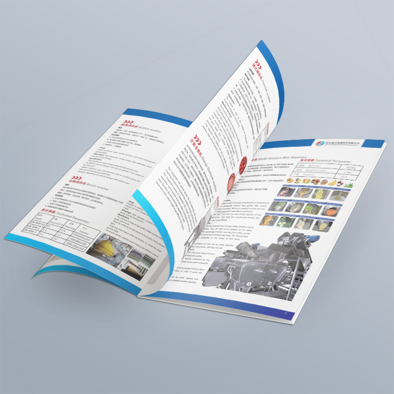
3. Program presentation page: Don't show your muscles, show your "curative effect"!
After talking about the pain points, the customer wants to see the solution. But don't turn it into a boring technical parameter show! The point is not how sophisticated your machine is, but what tangible benefits it can bring to customers.
With a concise comparison chart or infographic. For example: a logistics company shows before using its system (chaotic warehouse, delayed truck) VS after use (orderly and on time delivery). Show "change" intuitively.
Use less "we have..." and more "you will gain...". "Through our intelligent system, the picking efficiency of your warehouse will be increased by 40% and the labor cost will be reduced by 15%" is much more convincing than "our system adopts AI algorithm". Accompanied by pictures of workers working easily.
Select 1-2 of the most representative customer cases/data. Highlight with eye-catching icons or color blocks: "XX customers, 3 months, efficiency improvement by XX%, cost savings by XX yuan". This is the most powerful endorsement of trust.
Have every page answering the customer's question: "How will this help me?" Turn the cold function into the warm value that customers can perceive.
4. Trust building page: Let "others" speak for you!
Wang Po sells melons, so it's better for everyone to praise them. Customers trust peer reviews more. Skillfully displaying social recognition and authoritative endorsement is the key to eliminating doubts.
Selecting representative customer Logo walls in the industry is more powerful than listing a long list of small customers. Mark "Hand in Hand" or "Trusted Choice" next to it. Don't pile up the authoritative certifications and industry awards you have obtained. Choose the 1-2 most important ones, highlight them with certificate pictures or trophy icons, and indicate the gold content (such as "Top 10 in the industry").
This page doesn't require you to boast a word, let the facts and third parties build unbreakable credibility for you.
5. Call to Action page: Don't let customers "guess" the next step!
Customers are impressed, then what? Many books lack this final kick! The customer must be clearly told at the end: what to do now.
The "button" should be conspicuous: design an "action box" that can't be ignored visually. With bright colors, accompanied by clear action instructions: "Get the exclusive plan now", "Scan the code to make an appointment for free consultation", "Limited time offer, get it now!"
The "path" should be simple: provide the most convenient single contact method. Put an oversized QR code (link to the consultation page/WeChat), an eye-catching phone number, and a short exclusive URL. Don't leave customers confused.
Don't let the client close the brochure and look around blankly. In the most direct and eye-catching way, send out the signal of "act now"!
Make company brochure design your "gold sale"
The design of a company brochure that can really "talk" is more than just beautiful layout and beautiful pictures. It's a carefully choreographed visual marketing conversation that guides customers every step of the way, touches pain points, demonstrates value, builds trust and ultimately drives action.
OKCompany Brochure Design, the essence is a silent salesman. It uses visual language to accurately convey value, uses structured information to efficiently build cognition, uses trust endorsement to eliminate decision-making obstacles, and finally uses a clear call to action to promote transformation. Stop letting your brochure lie in the corner "silence is golden". Make good use of these 5 ideas, let it talk about business for you, and turn every penny invested into a visible market return!

