Product album design, don't let it "survive more than three seconds" in the hands of C-end users! Make good use of 5 planning points and 3 typesetting tips
Recently, I looked through the background messages and found that many friends complained that their own product albums were sent out like a rock sinking into the sea, and users threw them aside after turning two pages. To tell the truth, this thing resonates with me so much! In those days, I also made that kind of picture album full of parameters and typesetting, but the result... ahem, the past is unbearable to look back on. After learning from the bitter experience, today, let's put aside those tall design theories and talk about how to make the design of product albums for ordinary consumers really "catch people", make people willing to take them home, and even be a "treasure"!
Think about it, why are you reluctant to throw away IKEA's thick booklet when you move? Not because of how exquisite it is (and certainly not bad), but because it understands you! It allows you to nest in the sofa, imagine the appearance of your new home, and conveniently circle dozens of things you want to buy-this is the magic of a picture album for C-end users! Our goal is not to be a "product manual", but to create a "consumer tour guide map" that can hook our hearts, lead us, and finally make people willing to pay for it.
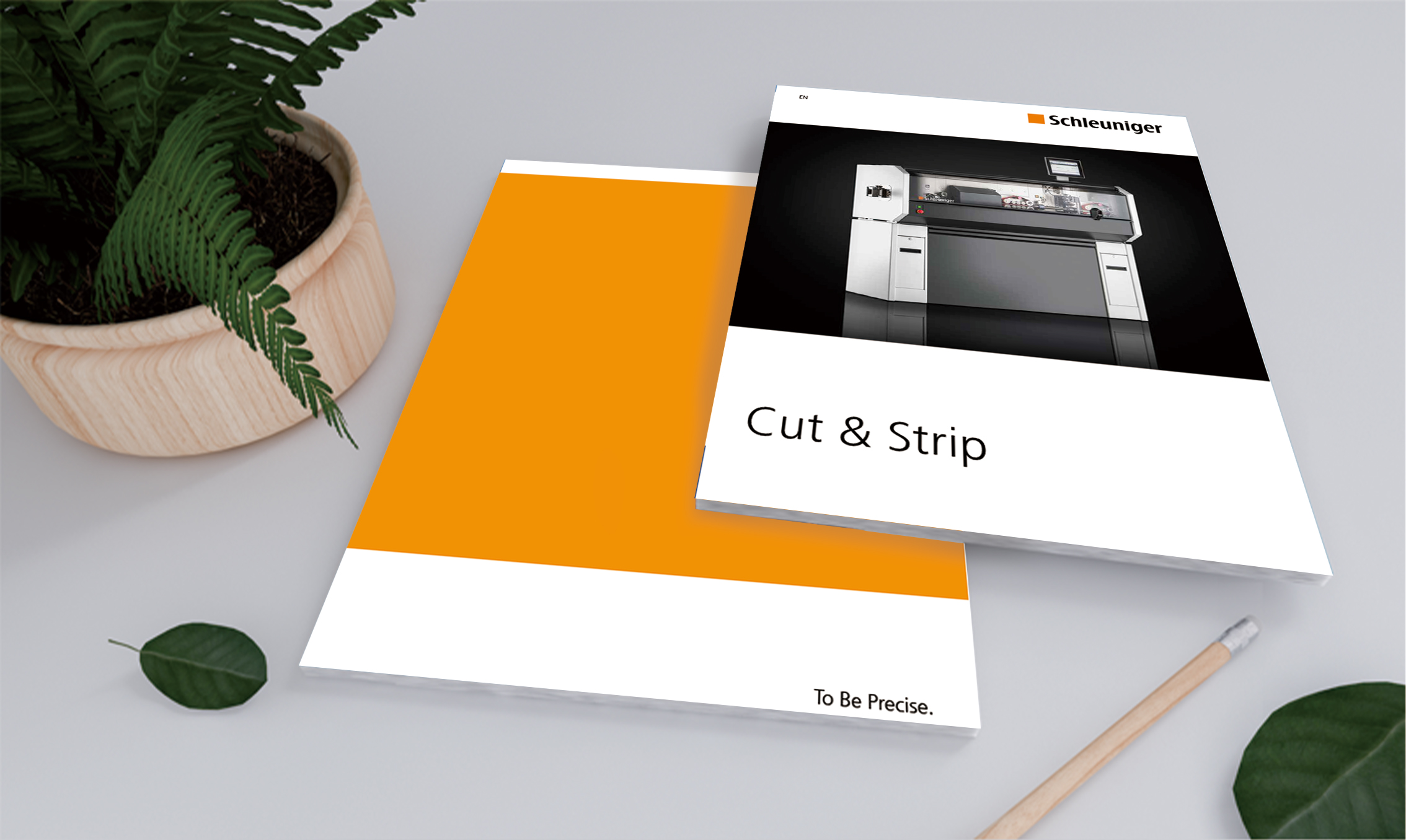
First, planning logic: get the "heart" first, then get the "eyes"
Want users to look at your album twice? It's not enough to rely on the face value alone, you have to "attack the heart" first. These five logics are the "life-saving" experience that I have summed up after stepping on countless pitfalls :
First of all, tell the story, don't read the parameters!
What users buy is not cold "things", but "feelings" and "changes". I can't wait to print all the product development reports. After reading them, users just think "Oh, it's pretty awesome", and then... nothing more. What to do? Dig hard! Dig hard at the point behind the product that can make people's nose sore or smile. For example, if you sell maternal and child products, don't just blow "polymer water-absorbing materials". Try taking a photo of the baby sleeping peacefully at three o'clock in the morning, and the mother can finally catch her breath and smile against the bedside, with a sentence next to it: "A dry night, a good night's sleep, and your mother's smile is more precious." Users understand in seconds! Pet food sellers, don't make a bunch of ingredient lists, put a dog who hears the bell, wags its tail into a propeller and rushes over, and write "Happy Planet for Dry Rice Dogs". Doesn't this work better than any parameter?
Secondly, make the benefits visible! Don't be dumb, put the word "value" on the user's face.
"Comfortable experience", "convenient life", "high efficiency and energy saving"... Users can hear these words in their ears. After reading them, they have no waves in their hearts, and even want to laugh. How to deal with it? Turn the benefits of abstraction into "paintings" that the eyes can understand at a glance! What's so great about air fryers? Don't just say "less oil is healthy", go directly to the comparison chart: on the left are the traditional fried chicken wings, which are shiny and greasy; The right side is made by an air fryer, golden, crispy and not greasy, with big words next to it: "Reduce oil by 80%, crispy and not discounted!" This impact is stronger than saying "health" 10,000 times! Sell a health-preserving tea, don't fix those mysterious words of "regulating the body and mind", and draw a little person who is refreshed and rosy after drinking tea, with the caption "One cup a day to recharge the body", which is simple, rude and effective.
Then there's the scene! The scene! The scene! Put products into users' lives!
The product is "solitary and self-admiring" on a pure white background, and the beauty is beautiful. Users simply don't know what they can do or where to put it when they buy it.
We can make the product "live" in the album! Play a "small movie" of users' lives. Selling sneakers? Don't just take close-ups of shoes, take pictures of them accompanying their owners to squeeze the morning rush hour subway, conquering suburban hills on weekends, and sweating profusely in the gym after work. Selling coffee machines? Don't just take pictures of the machine, take pictures of its fragrance floating in the kitchen where the morning sun shines into it, next to freshly baked bread and the smiling faces of your family. The title is "It's not the alarm clock that wakes you up, but this cup of freshly ground fragrance". The user looked at it: "Hey, isn't this the life I want to live?" The sense of substitution is immediately there!
Fourth, don't just let users see it, hook up with ta to "move"!
No matter how beautiful the album is, users forget it after reading it and closing it. How can they be converted? Scratch your head! Bury some "hooks" in the album, so that users can't help but want to "click", "sweep" and "tear". For example, put a conspicuous QR code and scan it to watch the cool use video of the product; Design an exclusive small coupon that "tears it off and can be used" (don't be too big, just mean it, mainly for manufacturing actions); Get a small test: "Test which lipstick is best for you?" The answer points to your product; Or encourage users to take pictures of their favorite scenes in the album and share them on social platforms with topics... Turn the album from an "end point" to a "starting point".
Fifth, give users a reason to "bask in"! Let ta volunteer to be your "tap water".
The content is mediocre, users have no desire to share it after reading it, and the life cycle of the album stops at the trash can.
Add some "social currency" to the album-something that makes people want to take photos and send them to friends and show off to friends. It can be: off the charts design, golden sentences that poke the heart, exclusive little eggs, fun and interesting ideas, such as postcards and stickers that can be cut out on the inner pages, and the copywriting is cool and cool.
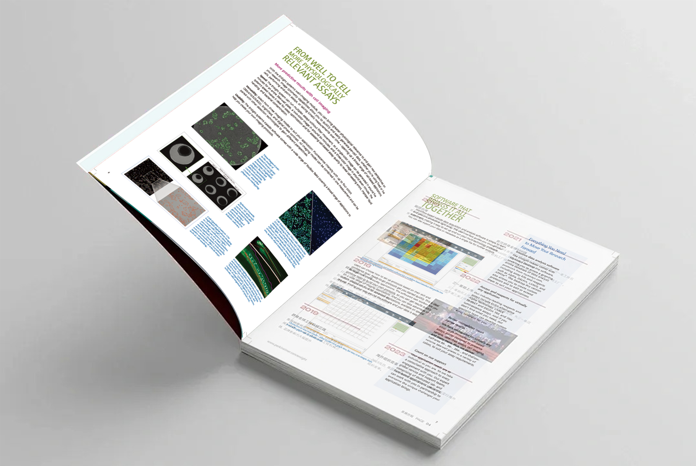
Second, typesetting elements: let the eyes eat the information "comfortably"
If the planning is careful, the typesetting has to be responsible for making users "pleasing to the eye" and "pleasing to the eye". These three elements are the keys to effectively transmit information without adding congestion :
One: Take the user's "eyes" and don't let it get lost!
Let users, like reading a story book, unconsciously read the key points according to the route you set, and never fall behind. How to do it? The "C position" should be eye-catching enough: each page (or spread) must have a "protagonist" who catches people at a glance-it may be the main product, a big picture of a super-emotional scene, or a title that hits the soul directly. Make it bigger, the color jumps out, and leave more white space around it. It's hard to be out of sight!
Follow the "eye habits" row: Most people read books and look at mobile phones, and they are used to scanning from left to right and from top to bottom (like writing "Z" or "F"). When typesetting, put important things in the upper left corner (attractive at the beginning), and then guide your eyes to the right and then down. Don't dazzle the user's eyes with a hammer and a stick. Use the direction of the eyes and fingers of the characters in the picture, or design some small arrows and lines, or even use color blocks to naturally "lead the way", so that the user's eyes can slide smoothly to the next place you want ta to see.
Why is IKEA easy to find? When you open its brochure, your eyes will be attracted by the warm big scene picture first, and then you will naturally see the small product picture and small item number integrated into it, and finally fall on the clear price. This "visual path" is clearly paved, and it is easy to find things!
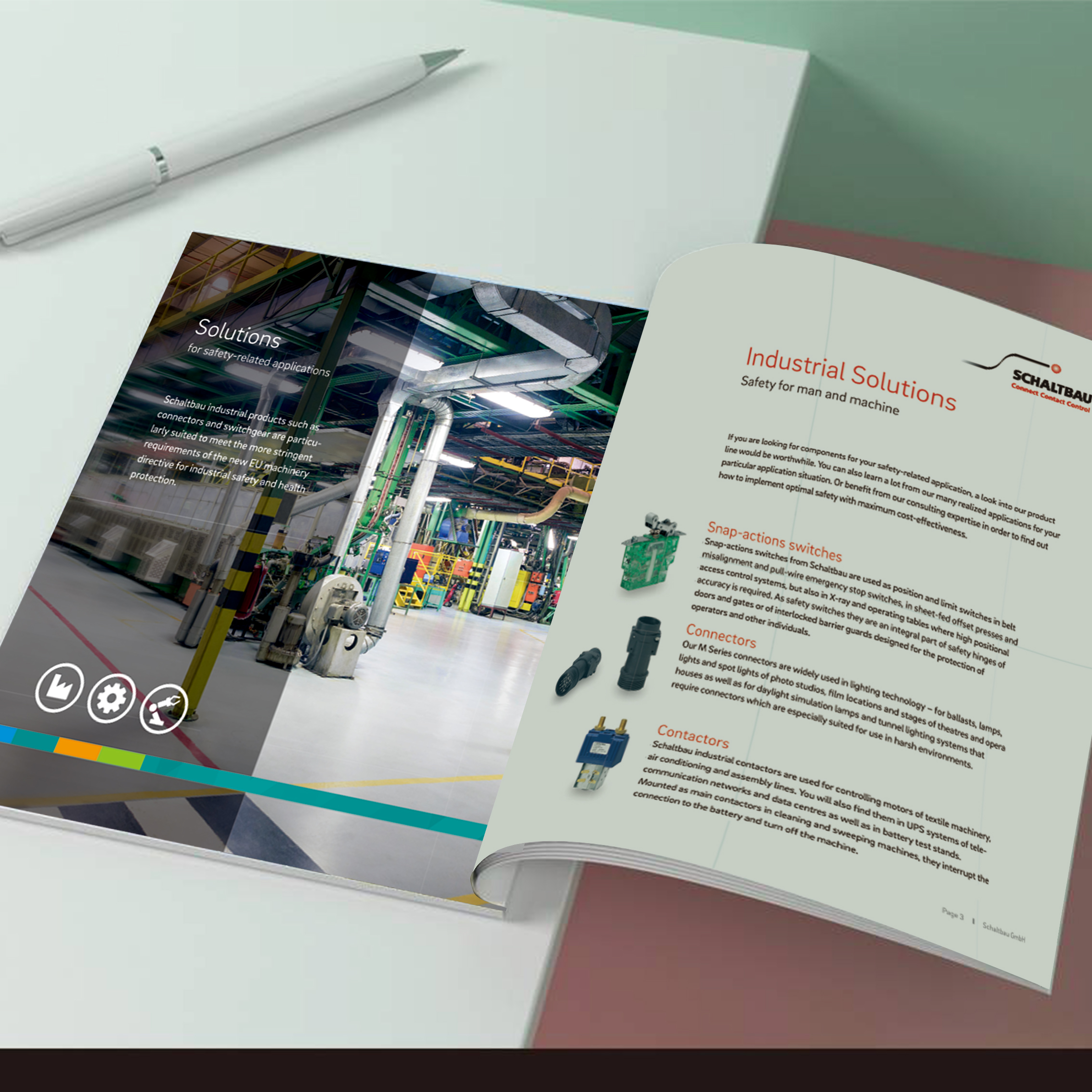
Second, blank space is not a waste! It is space for information to "catch its breath".
Don't stuff the page like a Spring Festival travel rush train car! Leaving blank space can make the page look refreshing and advanced, but the key points are more prominent, and users are not tired. Dare! Yu! Stay! White! Especially around important pictures and title text, leave more blank space. Don't feel distressed, these blanks are not waste, but a stage for important information to "shine"! Imagine a crowded wet market or a spacious art exhibition hall, which makes you prefer to stay longer? Put related things (such as a product picture, product name, and a core selling point) closer together, like an intimate small group. Between different "small groups", there should be enough distance and clear boundaries. The words in the text should be loose between lines (line spacing) (about 1.5 times more comfortable), and the words should not be too crowded (word spacing). The dense small print causes a headache when you look at it, and users skip it directly!
Where does the sense of luxury come from? Look at those big-name skin care albums, often only one bottle of essence is put on one page, with a concise and powerful copy, and a large blank space around it. What comes to you is a feeling of purity, luxury and style. Less information can be remembered firmly.
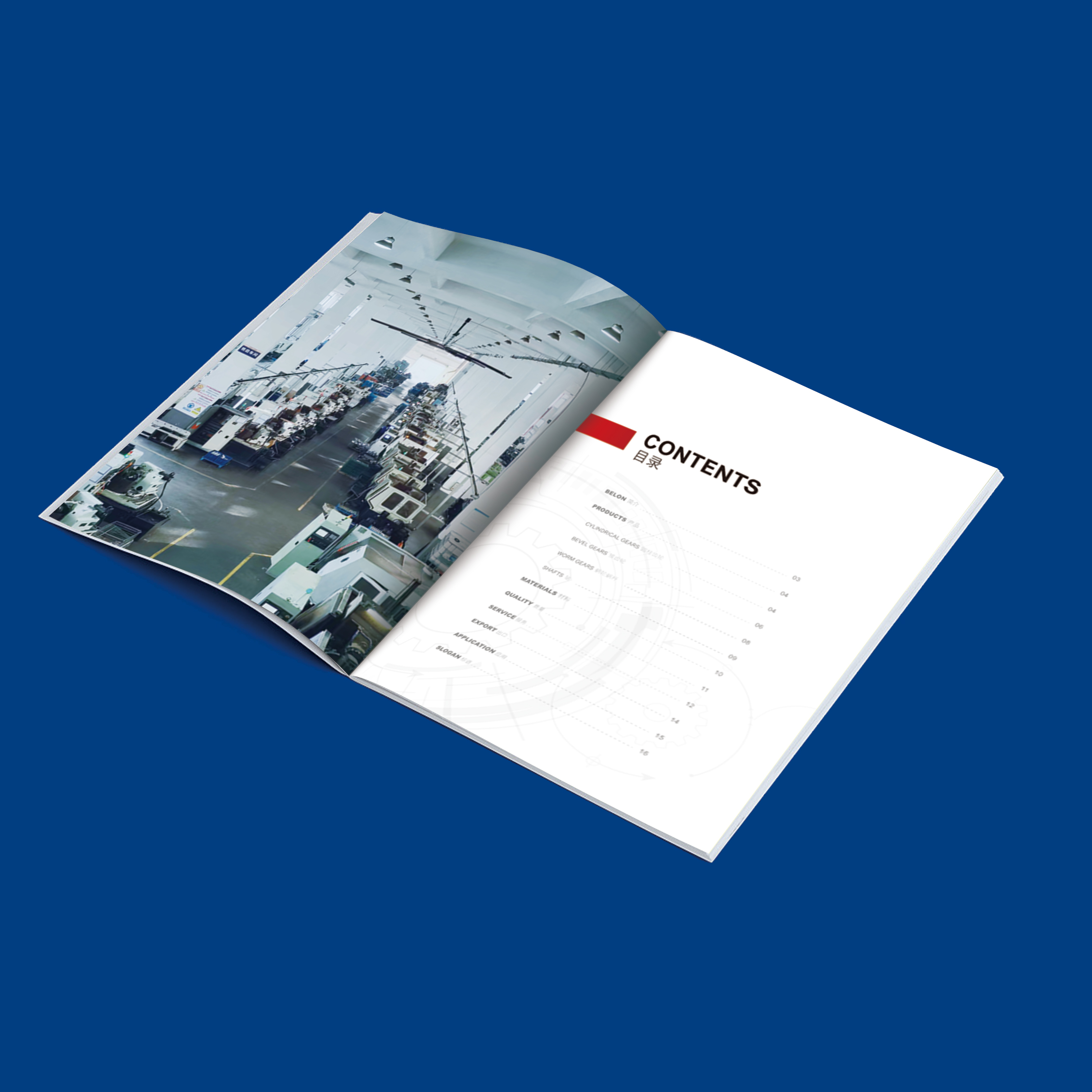
Third, let the "touch" feeling speak for you!
Giclee albums are not just for eyes! The touch of paper, special craftsmanship and ingenious structure, these physical experiences can create deep memory points and make the brand impression more three-dimensional. The tonality obtained by "touching": you can't choose paper casually! Environmentally friendly brands use recycled paper with natural texture, which feels rough and feels "green"; If you take the high-end route, choose a thick and smooth one or cover it with a tactile film. It feels warm and delicate, and your nobility will come out. The feel of paper is an extension of the brand character. Use some special processes in key places (such as Logo, core copywriting, main product pictures): partial UV (shiny or frosted), hot stamping/hot stamping (the nobility of Bling Bling), convex/concave striking (feels concave and convex), die cutting (cutting paper into special shapes). These small details can make users "wow" and can't help but touch them twice. Pull pages, three-dimensional pop-up, special binding methods. These interactive designs can turn the album itself into an interesting "toy", and users are absolutely impressed.
"A family should be neat": the color of the album and the style of graphic elements used must be consistent with the packaging of your products, official website, APP and so on! Users know at a glance: "Well, it's that smell!" The brand image can stand up.
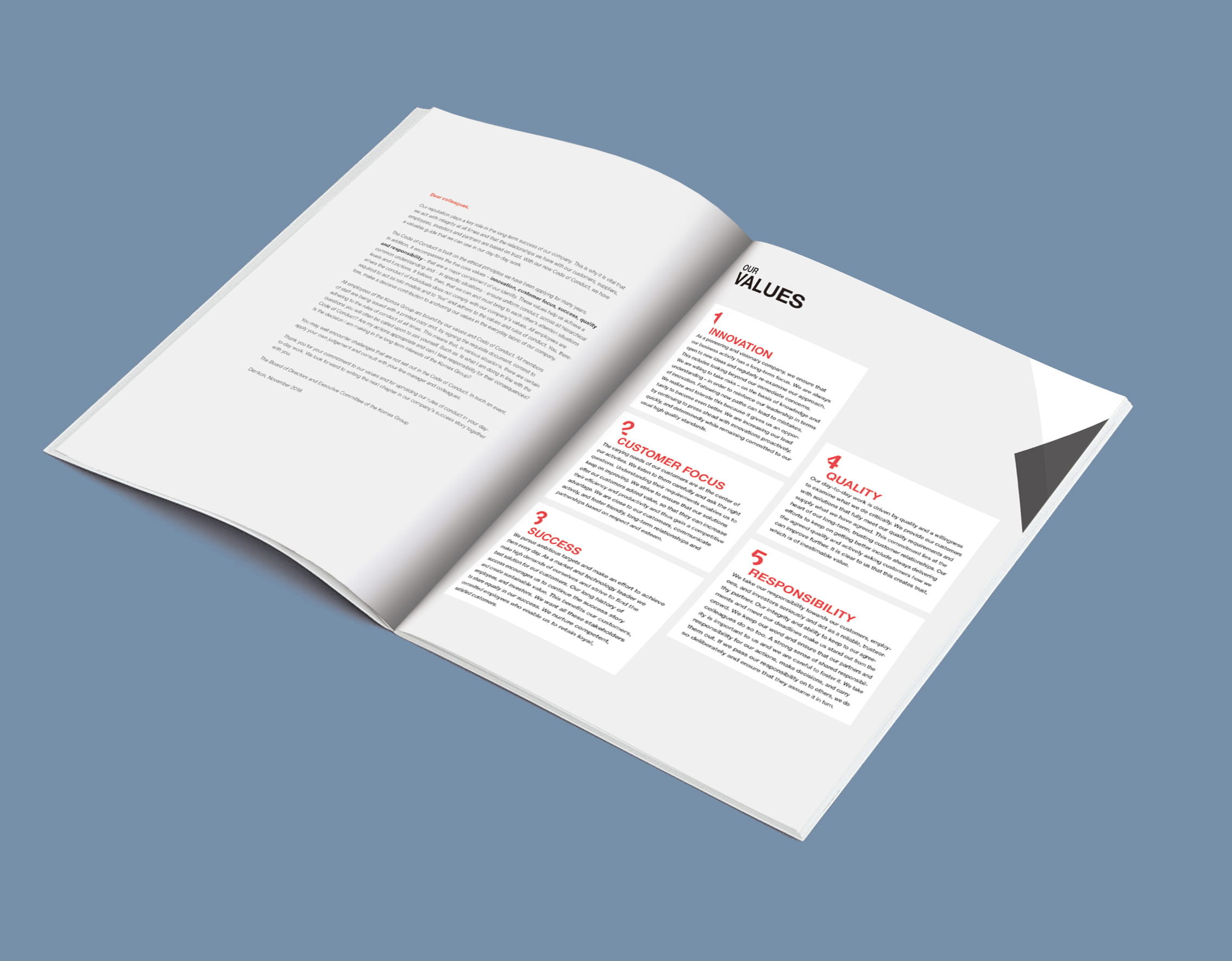
After all, the design of product albums for C-end users is really not a simple "typesetting job". It has to be a "psychologist" who can tell stories, a "magician" who can create a beautiful experience, and a "gold seller" who can quietly guide users to place orders.
Thoroughly understand the above five "heart-attacking" planning logic, and then use the three typesetting tricks that make your eyes and fingers comfortable, so that your picture album can truly get rid of the fate of "disposable promotional materials" and become a "favorite" that users are willing to put on the coffee table or even recommend to friends. Before designing next time, you might as well ask yourself: Would I like to take this album home and flip through it? Can it make me feel the urge to share? If the answer is a bit hesitant... Hey, come back and read this heartfelt sharing! Remember, Product Album DesignThe ultimate goal is to make it "hook people" by itself and let users rush to "shout" for you!

