

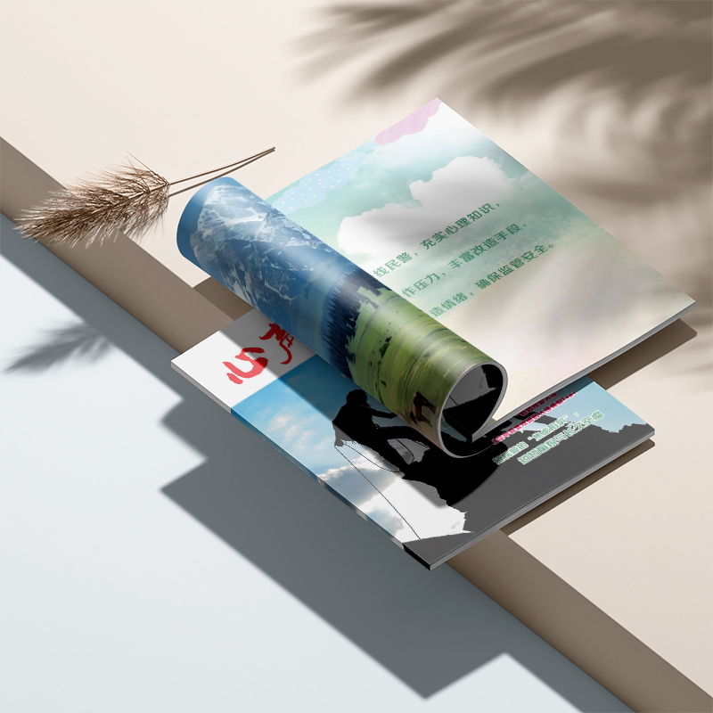
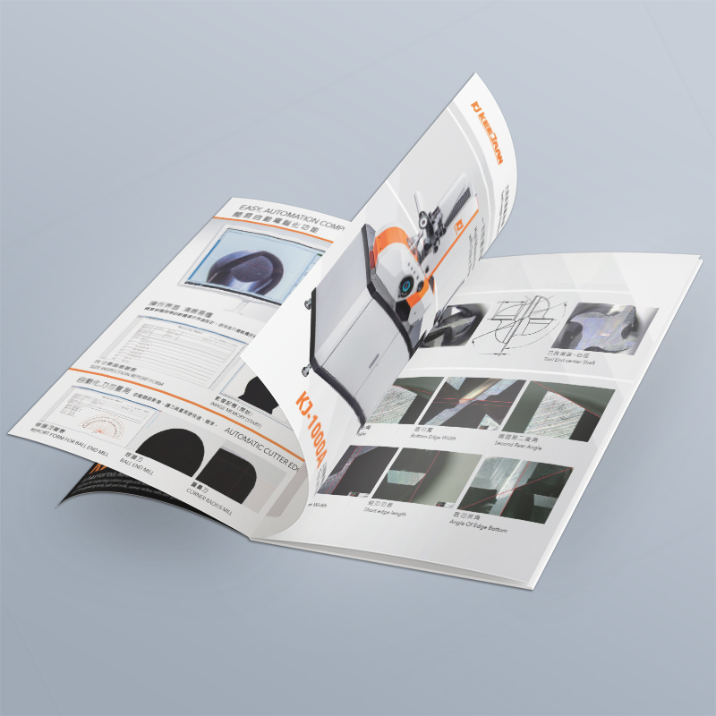
Guide to avoiding pitfalls in brochure design and production cycle-analysis of the entire process of album printing
Recently, I met several anxious bosses: "Can you get the album done in three days at the exhibition next week?" Truth be told, my head buzzed hearing this demand... It's not that I don't want to be fast, but I'm really afraid of smashing your signboard! A brochure that can "speak" and convey brand value, behind which is interlocking and precise collaboration. Today, let's not talk about the dry "Step 123", but like an old friend, let's break it clearly: Where has the "gestation" time of a good book gone? How to avoid those pitfalls and make your "brand business card" appear on time and stunning? Find out this "time account", and it's really worry-free and efficient to cooperate!
1. "Deep dive" before starting: sharpening the knife does not mistake cutting wood (don't underestimate these 1-2 weeks!)
It's not "filling out the questionnaire", it's "digging for treasure"! Come up and ask, "How many days will it take to get better?" Why don't you ask yourself some heart-wrenching questions first:
For whom is this booklet? (Is it to impress picky investors, or to attract uncles and aunts on the street?)
After reading it, what do you want them to do? (Remember the brand? Call for consultation? Place an order immediately?)
What do you want people to remember? (Is it a sense of science and technology, or is it full of human touch?)
How much "ammunition" do you have in your pocket? (Budget directly affects paper thickness, process complexity and final result)
Who can decide on the inside? (I'm most afraid that the design draft will not be finalized in your company's "Around the World"!)
Xiaobian's heart: The more thorough and specific you talk at this stage, the smaller the chance of "turning sesame cakes" back! All you save is real money and time! Common "procrastination" minefields: Boss A says to be "tall", manager B says to be "down-to-earth", marketing department C says "think again"... Unifying your thinking internally first is the key!
"Ammunition Depot" Inventory: High-definition artwork is the lifeblood!
Transcript? Please make sure it is the final version, proofread, and free of language faults! Don't let designers work part-time as "Chinese teachers" while typesetting.
Pictures? The "paste picture" taken by mobile phone and downloaded by friends circle is a taboo! Forcibly enlarge and print it out, the effect is comparable to "mosaic art", and immortals can't save it. If conditions permit, it is recommended to find a professional photographer to "handle the knife". Missing pictures? We can also help find or shoot, but you have to recognize this "make-up class" time.
Logo, VI specification? Please pack it and send it! The brand tonality can't deviate.
"Gentleman's Agreement" falls on the nib of the pen: Is it settled? Don't verbally! A contract in black and white and a clear timetable are reassurance. As soon as the first payment is paid, we will officially "start running"!
Second, "Building Dreams" on Paper: Design is not magic, but meticulous craftsmanship (be patient, these 2-4 weeks are worth!)
Direction is more important than speed! Set the "tune" first! The designer is not a "human flesh PS machine". They will refine the core ideas according to the "treasures" we dug in the early stage, and create 2-3 sets of "cover inner page samples" with different styles (professionally called "style draft"). You choose the most eye-catching "tone", so that the later design will not deviate. This step cannot be saved! If you choose the wrong style, it will be all in vain!
The delicate work of "arranging troops": the information should be good-looking and easy to understand!
Now it's the "drawing" link you are familiar with. Designers, like directors, "line up" your words and pictures on the page.
Which font to choose is professional? What is the font size and looks comfortable? How much line spacing doesn't tire your eyes? How to match colors to be advanced? Where to put the picture for the strongest impact?... It's all learning! There is only one goal: to make the information as smooth as telling a story, to make the eyes comfortable, and to let the brand tonality penetrate silently.
Xiaobian knocks on the blackboard: At this stage, I am most afraid of "piecemeal" feedback! "Xiao Wang felt that the title was not big enough, and Xiao Li felt that the color was too dark. Mr. Zhang said to change the picture..." Please summarize your opinions internally and give them to us at one time and clearly! With repeated minor revisions many times, time slips away like sand.
"Looking at the Demon Mirror" link: proofing! Proofing! Proofing! (Say important things three times)
Computer screen ≠ printed finished product! Color, texture, details, the slight difference is a thousand miles away!
It is highly recommended to spend money to make a physical sample! Get it and look carefully like an inspection:
Is the color correct? (Especially the Logo color and product picture, don't even know your mother!)
Is there any wrong word? Is the picture clear enough? (At this time, typos are found, and the cost of correcting them is the lowest!)
Is the cutting position of edges and corners accurate? (Don't cut out important information!)
Skip proofing? Bet on Luck! Batch printing broken? It's too late to cry! Time and money are all wasted! This is the last bumper to block the big mistake!
3. The "Birth Story" of the Factory: Ingenious machines make paper butterflies reborn (steady and steady for 1-2 weeks)
You can only get on the plane after passing the "physical examination"! The documents are sent to the printing factory, and the old masters will wear a "magnifying glass" for professional inspection:
Is the picture "strong" enough (the resolution takes off at 300dpi)?
Is the color mode correct (it must be CMYK for printing, don't use RGB on the computer screen)?
Has the text been "locked" (changed to avoid missing fonts)?
Is there enough "safe space" (usually 3mm) left in the bleeding site?
Is the special craft labeled clearly?... This professional check can avoid 90% of "printing car accidents"!
The machine roars and the color flows: according to the "figure" (number of pages in size), "appetite" (quantity), "taste" (paper: thicker cover? Smooth inner pages or textured?) and "skin color requirements" (whether the color is accurate or not), choose the right printing press to start. The coloring master, like an old Chinese medicine doctor, repeatedly "looks, smells, asks and feels" the coloring card, striving for the color to be close to the proofing draft we confirmed. Printing more, the unit price is cheaper, but the total time is definitely longer.
The magic of "icing on the cake": craftsmanship makes the brochure shine! (Time & budget superimposed here)
Wear a "raincoat": The cover is covered with a film (bright film Bling Bling, matte film is low-key and luxurious), which is more durable against dirt and scratches.
Partial "highlight": UV partial glazing makes the key Logo or pattern light up and feel textured!
"Inlaid with gold edge": hot stamping and silver stamping, the aristocratic temperament is instantly full, and the recognition soars!
Play with "three-dimensional": hit convex/emboss, "engrave" concave-convex texture on paper, win-win feel and vision!
Xiaobian reminds: Every more cool process requires one more process, and the time and cost will naturally go up. You have to weigh fish and bear's paw.
"Styling and framing": the last shiver! Select "Binding Package" according to "Fat and Thin" (Thickness) of the booklet:
"Staple" type (saddle staple): fast, cheap, suitable for thin booklets (do not exceed 64 pages), otherwise the "belly" will bulge.
"Brush glue" type (wireless glue bonding): the most common! The spine is flat, and the thick booklet can be held. It is easy to turn over, and it is the king of cost performance.
"Needlework" style (thread-locking glue binding): more reliable! Books can be spread out flat, suitable for high-grade booklets or "tomes" that are often turned over.
"Hardcover hard shell" style: top-of-the-line! Like a book, it has a hard shell cover, which is costly and time-consuming, and is suitable for the treasure-level picture album of the town store.
After binding, you have to "trim the edges"-cut them accurately to ensure that each book is square and beautiful.
4. Perfect "marriage": strict inspection and escort, safe access (finishing in 3-7 days)
"Beauty Pageant" Quality Inspection: When big goods come out, we don't pack them directly! Randomly draw a few "beauty pageants" :
Is the color even throughout the book? Are there any "freckles" (dirty spots) or "scars" (scratches)?
Is the binding secure? Is the spine straight or not? Uneven cutting?
Is the bronzing UV position "nailed" correctly? Is it solid?
Make sure that everything delivered to you is "face value responsibility", and there is absolutely no "crooked melon cracked date"!
Travel "fully armed": According to the quantity and distance of the journey, put "armor" on the brochures (thick carton corner protectors, wrapping film), and choose reliable "bodyguards" (logistics) to ensure that they reach you safely after traveling through mountains and rivers. Offsite shipping? Time must be counted in!
Practical Guide: How to say goodbye to the "time black hole"? 6 Tips for Efficient Delivery!
Don't be a "fire captain", early start is king! Cramming? It's hard to have both quality and speed! From planning to picking up the goods, 6-8 weeks is the comfort zone. Want hardcover cool craftsmanship? You have to have more time!
Internal "customs clearance" must be fast! The biggest "drag bottle" of a project is often internal review! The design draft and proofing draft have arrived. Please quickly call key figures to concentrate on "consultation" and make a final word! Reduce "reincarnation modification".
The quality of "ammunition" determines the duration of the battle! HD Large Picture (300dpi) and Ultimate Proofreading Edition Copywriting is an accelerator! Fuzzy graphs, temporary copywriting? That's "putting the brakes on" the progress bar!
Professional matters, leave them to those who understand! Express your requirements clearly, but also listen to the advice of design and printing experts (especially on process feasibility and time estimation). Find a reliable single docking person and double the communication efficiency!
Don't save proofing money! This is a "talisman" to spend a small amount of money to prevent major disasters! The real thing is in hand, check it carefully, confirm it is correct before printing! Otherwise batch error? I can't even find the key to crying!
Leave some "breathing feeling" for the plan! In the overall schedule, reserve a buffer period (recommended 3-5 days) for key nodes (especially review and proofing confirmation). Add an insurance margin of 10%-15% to the total estimated time to deal with minor accidents without panicking.
The "one-stop" partner is really fragrant! Find a team like us who understands both design aesthetics and print! When designing, you know the "rules" of printing, and the documents are in place in one step, so as to avoid the "tragedy" of the design draft being called back for rework by the printing factory, and seamlessly connect, saving time, effort and worry!
Guide to avoiding pitfalls: Beware of these "time thieves"!
"Roughly the same" thinking: the early demand is ambiguous? In the later period, it will "sink" in repeated revisions! Time-consuming, labor-consuming and emotion-consuming!
"Last Billion Draft" Syndrome: The style proofing has been set, but you always want to "disruptive innovation"? Project Progress Killer! Focus on error correction (typos, severe chromatic aberration) in the later stage, rather than big changes!
Skip the "physical examination" and run a red light: go directly to the machine without pre-press inspection or physical proofing confirmation? Getting wrong is tons of scrap and time lost! It's too late to regret!
Underestimate the cost of "showing off skills": special craftsmanship = extra time money! Want a cool effect? Plan ahead!
Forget that the "courier brother" is on his way: especially in different places or large batches, logistics time must be counted into the total cycle! Don't let the brochure "block" the road and miss a big event!
A brochure that can truly carry the brand power and impress the target customers is by no means the product of "rushing to work". It requires in-depth communication like exploring treasures in the early stage, inspiration and rigor dancing at the fingertips of designers in the middle stage, and precise control of color and paper in the hands of printing craftsmen in the later stage. Looking through the "Time Classic" of brochure design and production is essentially a cherish of your brand value and an awe of professional processes.
When you understand the complete journey from "one thought" to "holding in your palm", you can dance more tacitly with partners like us and plan scientificallyBrochure Design and ProductionEvery step of the process, firmly grasp every key node. In the end, the harvest is not only a beautiful album that people can't put down, but also an efficient, smooth journey of brochure design and production full of trust and sense of accomplishment. Let your carefully prepared brand story, through this painstaking book, blossom in the hearts of customers with the most perfect attitude. Time is spent on the cutting edge, and quality naturally speaks.

